Muana Grotesque

Muhittin Güneş
Posts: 7
Hello,
I am really young guy, really want to be type designer future. I am just design some monospace and little exprimental grotesque before. The world don't need an another grotesque I know but this is what I want for me. I design all things from beginning, not change another typeface, I just look different grotesque to see what solutions they use for letter, like Helvetica Neue. I design on Fontlab, I use the masters for different weight, create another weight and make them bold height change. I am not sure this is correct way to create weight.
Try to design good for eye, little different solutions for WMN letters. Bold and black weight have more inktraps in small letter, also I am not sure is it called ink traps. Really want to hear your opinion, I am ask everyone because I want to change the typeface more stable for selling I hope.
I am realizing now, the metrics and kerning are not designed. I am sorry but I am gonna ask either if this works for reivewing.
I want to hear your advice also about type design. Thank you.
0
Comments
-
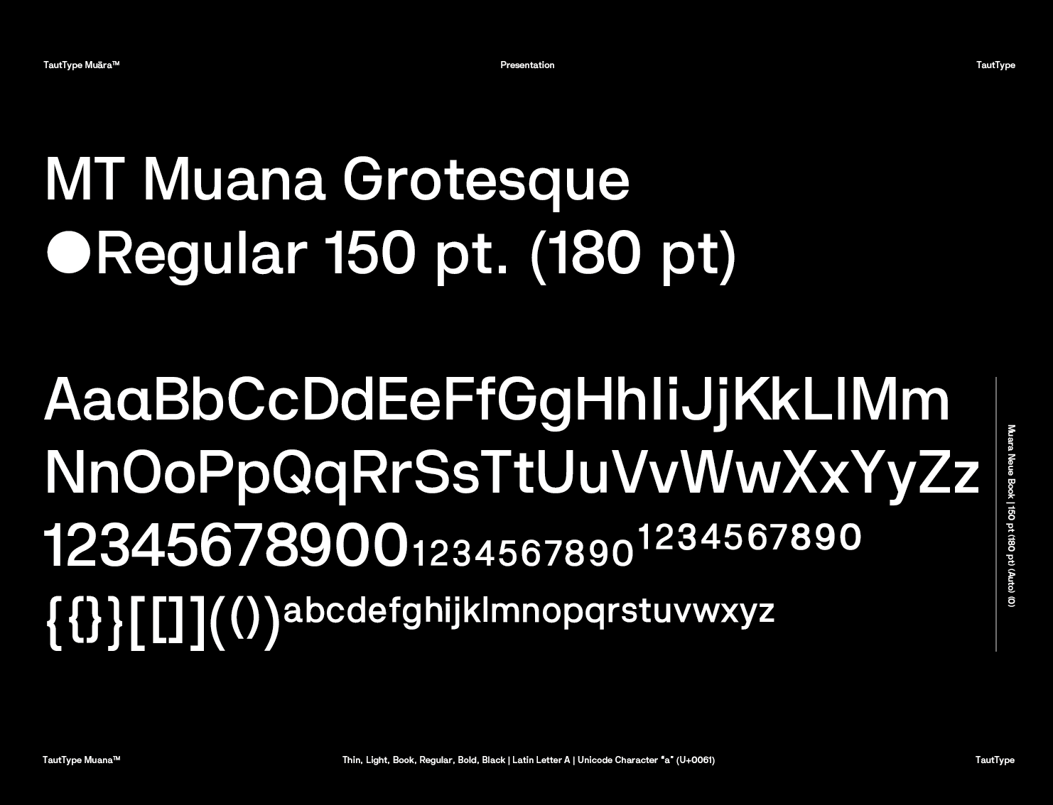
Because all specimen are white on black, it is hard for me to evaluate stroke contrast, letter shapes, etc. Do you have examples with black on white as well?0
-
Yes, very poor specimen and example. Sorry about that.

 0
0 -
The belly of the lowercase has an inconsistent stroke width that doesn’t agree with the rest of the letter-shape and your alphabet. It shows most prominently in the interpolated versions of the font.It’s important to understand that stroke width is never mathematically the same across the board of a font, so using a subtly thicker or less pronounced stroke width is okay, it depends on the overall glyph and its typical behaviour.Optically it should show consistency across each cut of the font, and for canon and harmony, it should also look consistent across the font family. So each letter-shape and stroke-width is harmonic with one and another within one font, and inside a family one cut doesn’t fall apart with disharmonious stroke width.Developing an eye for this and adjusting a type design to “feel right” is one of the things in this craft that take up time to develop the experience. This is one of your earliest works and in a few years from now, you’ll be looking back thinking: “Why didn’t I notice that?” for a hundred things in your font. But don’t despair, it is part of the learning curve!
These letters need more work:
/a/e/g/w have inconsistent stroke width (optically imbalanced). You mentioned you looked at other fonts to learn from them. Have a look at Akkurat, for instance, and compare the lowercase /a to yours. The lowercase /k has too thick strokes in the upper example (where you used languages as words).
Almost all your numbers need more work, except perhaps /8 and /0. The /6 and /9 could be indeed copies of one and another, 180º moved around, but they are currently not ‘stable’. Try reducing the height of the round shaped belly and give the upper (and lower with /9) stroke more space to breathe. Then you can also make it more consistent in optical stroke width.
Your uppercase /W, /G needs more work; the middle stroke of the uppercase /G is too high (although it could be slightly higher than usual as a pronounced characterisation of the typeface), and the uppercase /T is slightly too narrow. Overall some glyphs seem too wide and some too narrow. I suggest you don’t look only at fonts like Helvetica Neue to learn, but also at Franklin Gothic and other sans serif typefaces. You’ll find that the general, optical width of an individual letter often falls into a theme. Your uppercase /R will show as a bit too broad and your uppercase /D a little too narrow.
One more thing about your notion, “the world needs not another Grotesk” – that has been debated for ages. The question is never really: Do we need another one? The question rather is: What brings the new one to the table others don’t have?2 -
Thank you Henning, really thank you. I am not good at writing in english, but I understand what you said completely. I will work on stroke width, some letter narrow some wide, G's middle stroke and to make look optically right every letter. Also every letter have to chance. I understand working on these font I hope educate the eye.
I am not sure which letter stroke weight have to be less or more. But I understand it is have to be solved with eye. And lastly I aware there are hundreds of problems, but not sure how do I fix it now, because it is the first time I face this problem.
Yes, The typeface have the bring something new on the table, this is what I try to say, I see this typeface is a learning process, hope this process ends with a typeface.
I will look also Akkurat and Franklin Gothic. Really thanks for your time.
0 -
Other fonts that look slightly like yours, which you may find helpful or inspiring for stroke-width comparison: Arimo by Steve Mattison, Chivo by Omnibus Type, Nimbus Sans by URW++, Folio by URW++, Pragmatica by Para Type, Aktiv Grotesk by Dalton Maag.
0 -
I will look all of them. Just looking Chivo by Omnibus Type now and all of the small letter are same on the stroke weight at some point, but the Majiscul Capital letter are 4 pt more on regular weight. I was thinking this thing is not a big deal, but I guess it is. I will make more bold the capital letters first then looking for a's optical correct without mathematical correction for example. Thanks.0
-
Your M and N are thick on the verticals and thin on the diagonals
||\/||
||\||
but the conventional modulation is thin on the upstrokes and thick on the downstrokes.
|\\/||
|\\|2 -
It most often is, I agree. It stems from the angle of quill drawing. In some cases (for instance, Univers), you’ll find fonts that make an exception of this rule.Craig Eliason said:Your M and N are thick on the verticals and thin on the diagonals
||\/||
||\||
but the conventional modulation is thin on the upstrokes and thick on the downstrokes.
|\\/||
|\\|2 -
Thanks, I do this vertical and diagonals little different because I want to look little different most of grotesques. I was seen some grotesque have M,N and W like this letter. But I guess I have work with the thinnest and boldest part, maybe little bit more bold on verticals to make them more normal.Henning von Vogelsang said:
It most often is, I agree. It stems from the angle of quill drawing. In some cases (for instance, Univers), you’ll find fonts that make an exception of this rule.Craig Eliason said:Your M and N are thick on the verticals and thin on the diagonals
||\/||
||\||
but the conventional modulation is thin on the upstrokes and thick on the downstrokes.
|\\/||
|\\|0 -
Grotesks are overabundand but they still seem to get the largest part of the sales overall, judging from what I gather.1
-
One of the criticisms often aimed at Helvetica is that the round numerals with their narrow apertures look too alike and are hard to tell apart in haste, particularly with poor vision/reproduction. As your /6/9 certainly need to be remade from the start anyway, maybe a different design for these could be a thing to "bring to the table." The terminals could be more open and horizontal, ending at a vertical cut. I know that is more typical of humanist, but I think you could make them work in grotesque; it could harmonize with /f/t/j/y. The join could be not completely rounded, more like /a. Perhaps /6 and /9 could even be formed differently from each other!
1 -
Chivo has little to do with what Muhittin is attempting here, in my opinion. I would say looking at Folio and Aktive Grotesk (among those you mentioned) would be the best, given that they’re likely very well drawn as well.Henning von Vogelsang said:Other fonts that look slightly like yours, which you may find helpful or inspiring for stroke-width comparison: Arimo by Steve Mattison, Chivo by Omnibus Type, Nimbus Sans by URW++, Folio by URW++, Pragmatica by Para Type, Aktiv Grotesk by Dalton Maag.1 -
Fair enough, @Claudio, aside of the lowercase /g/ shape, I figured the rather squarish shape language was similar to Chivo. My quick and dirty list wasn’t intended to show exact copies but rather provide reference points.
1 -
Chivo is a weird take, as it‘s very geometric. Not geometric in the fashion of the very original Alias' Elephant, but still quite rigid compared to the "Helvetica-quality" dominating Muhittin's one. I would say it would also benefit for him to look at the digital rendition of Recta by David Ross, given Ross' care for drawing and he admits he needs to improve his own drawing skills with bezier curves.Henning von Vogelsang said:Fair enough, @Claudio, aside of the lowercase /g/ shape, I figured the rather squarish shape language was similar to Chivo. My quick and dirty list wasn’t intended to show exact copies but rather provide reference points.
A thing I would suggest to no end to novices is to actually draw on paper, as it’s very hard to grasp and assimilate a sense of balance and proportions while drawing letterforms directly on screen without having done experience on paper, especially for weight distribution.3 -
I agree with a lot of your last statements you made, @Claudio, but I find Recta is quite far away from Helvetica (or any font in that Grotesk category). Recta, if we mean the same font, has more Geometric qualities to my eyes. Its lowercase /a/ also looks a lot like Colfax by Process Type, even though that one again is more squarish.
When I saw the first draft of Muana at the top, I saw the imperfections, but the design’s direction strongly reminded of Apple’s San Francisco, just with the difference that the lowercase /a/ retains its single serif (not sure if that’s what it is called).
1 -
I read all of comments, really thank you.
You help me to understand I hope. I just try to solve the stroke weight problem little bit. Not enough time to solve completely I guess but I add more stroke on capital letter and little change with small letter -like less stroke weight on ''a''s right side-. I can't work on numbers but little change on 6 and 9, I make circle on 6 less height on bold versions, not solve problem for now but will work on it. And also I will work on WwVv letter on they're bold versions. These are new versions, I work on last night, but read all new comments, and hopefully learn something.
And I can see there is a problem when I'm looking at the font, but really hard to understand how to change to look normal. This is why comment help me to understand. And If all letters going to be normal after every change, then not all font going to be not different from another grotesque, I hope some time I can work with some letter going to be more different then normal.
Wish you a nice day.

 0
0 -
This is looking much improved, @Muhittin. The uppercase /M/ in the extra bold (?) or black version has still a lot of imbalance in the stroke width. I suggest to make the sidebars subtly slimmer and increase the middle V-shape in strength. I’d do the same with the other masters of your fonts, but it shows most prominently with the extra bold version.
Your numbers /9/ and /6/ are almost there! Keep in mind that with your choice of genre, the strong stroke width is with the down-strokes, so everything vertical is generally stronger than the horizontal (the exception making letters like the uppercase /S/). Looking at your /9/ and /6/ I see the bowl and the o-shape are not equalized in vertical stroke width. They can be subtly different, but right now the difference appears to be too strong.
The lowercase /a/ has still a too thin belly stroke (downwards, vertically). If you compare it to your alternate /a/ and /b/c/e/, you’ll see it. By the way, your alternate /a/ also suffers from too thin vertical strength on the belly side, but it’s more subtle than with the regular, two-story /a/.
The uppercase /S/ appears to be a tad (really very little) too broad in comparison with all other letters. Similarly, your number /3/ is a tad too slim.1 -
Regarding your notion of wanting to create a typeface that differentiates itself from others – I know you want to add character to it, but adding that after you chose the genre/class is really difficult. The whole idea of Helvetica-like fonts is to be neutral and use “equalized” letters. If you’re looking at Graphik or Frutiger’s Univers, you see more modern interpretations of the older Helvetica font-canon. You’ll also see that a lot of a font’s perception as a whole depends on the spacing and kerning.
Character is not necessarily gained through little imperfections (it depends on the typeface class/category). They can be more annoying than helping and putting the whole font off, in terms of feeling wholesome and well crafted. So I think the fact you are able to improve it harmonically and aesthetically is a good thing! I‘d play with alternate letters (as you already did) and perhaps think about giving the whole design a push towards Geometric or Neo Grotesk interpretations (as Graphik is, for instance), but this is entirely up to you. I’m only reflecting what I would do to give the font a more unique place of its own among its predecessors.0 -
Before worrying about weight distribution (which overall is not bad at all) I would try to grasp better how the bezier curves work. It’s clear that you have familiarity with the forms, but well-drawn bezier forms are not easy to obtain at first – that’s why I suggested to sketch/adjust (even after you have done some printouts) in pencil.
The /g and the /s (and also the /e), for example, still have problems not chiefly with weight, but with lack of harmony in the curves.
Look at these letters in your favorite models (e.g. Helvetica, Folio, Akzidenz Grotesk) to see what I mean.
0 -
You should see how they historically (and thus chronologically) came by. It makes no sense to refer to a Process typeface considering when Recta was designed. Recta involved endless hours of work from several designers, it’s not just a typeface "thrown out" on screen by some accidental nowadays designer (not despising the work of Process Type Foundry, just making a general observation on historicity/relevance).Henning von Vogelsang said:I agree with a lot of your last statements you made, @Claudio, but I find Recta is quite far away from Helvetica (or any font in that Grotesk category). Recta, if we mean the same font, has more Geometric qualities to my eyes. Its lowercase /a/ also looks a lot like Colfax by Process Type, even though that one again is more squarish.0 -
Claudio Piccinini said:I don’t see how that is relevant to the task at hand. We were talking about a design direction inspired by other fonts, independently of their heritage.
It makes no sense to refer to a Process typeface considering when Recta was designed.0


Categories
- All Categories
- 47 Introductions
- 4K Typeface Design
- 494 Type Design Critiques
- 576 Type Design Software
- 1.1K Type Design Technique & Theory
- 670 Type Business
- 884 Font Technology
- 29 Punchcutting
- 537 Typography
- 124 Type Education
- 332 Type History
- 81 Type Resources
- 113 Lettering and Calligraphy
- 33 Lettering Critiques
- 80 Lettering Technique & Theory
- 569 Announcements
- 100 Events
- 116 Job Postings
- 170 Type Releases
- 182 Miscellaneous News
- 270 About TypeDrawers
- 54 TypeDrawers Announcements
- 114 Suggestions and Bug Reports