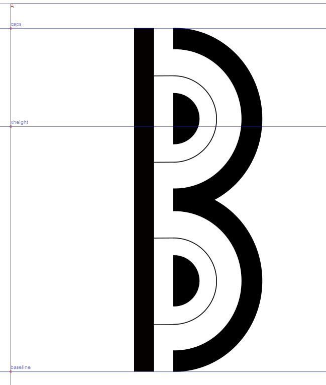
Issue with importing SVG Glyphs from Inkscape to FontForge

Michel Kern
Posts: 20
Hi All
I wish I could buy a FontLab licence later on but ATM, I try to learn and progress with Inkscape and FontForge. When I import SVG glyphs created with Inkscape they have a very bad aspect in FontForge since I used group/ungroup or "binary" (e.g. substract) of simple shapes (e.g. a black circle inside a white circle). All the shapes are displayed and I dont see ATM if I have to build the shapes without combinations or if there are solutions to make the SVG import inline with what is displayed by Inkscape.
Best Regards
Michel Kern
0
Comments
-
Perhaps this is a path direction problem, once you get it in FontForge?0
-
@Michel Kern, can you show a screenshot of the outlines in Inkscape and then what they look like in a FontForge?1
-
Thanks for answering, please find here the screenshots of Inkscape vs FontForge


0 -
Makes sense now. What I would recommend is that you *flatten* your glyph in Inkscape. This will require you to turn anything that’s just a path into an object and anywhere you might be using masks for clipping, instead use true boolean operations. That should import properly. I can help do that later if that doesn’t make sense.2
-
Thanks @Abraham Lee, Do you mean "use boolean operations instead of clipping" or the opposite ? I dont think I used clipping, but as I wasnt able to make boolean substraction work properly, I used "hiding half of shape with a white rectangle then group", is it this that you call "clipping" ?0
-
Ah, yes, that makes more sense now! Since the UI canvas background is white in inkscape, that goes you the impression of “clipped” shapes, but FF knows better. So, yes, I still recommend proper booleans on the shapes to get them isolated. You can do that in FF, too, if you’d rather.0
-
You should keep your current SVG as the 'parent source', and then duplicate the file as a 'child source' file (likely with today's date) and then edit it to make the glyph you showed only 4 contours, and import that into FontForge.
0
Categories
- All Categories
- 46 Introductions
- 3.9K Typeface Design
- 489 Type Design Critiques
- 572 Type Design Software
- 1.1K Type Design Technique & Theory
- 663 Type Business
- 875 Font Technology
- 29 Punchcutting
- 529 Typography
- 121 Type Education
- 328 Type History
- 80 Type Resources
- 111 Lettering and Calligraphy
- 32 Lettering Critiques
- 79 Lettering Technique & Theory
- 561 Announcements
- 96 Events
- 116 Job Postings
- 169 Type Releases
- 179 Miscellaneous News
- 269 About TypeDrawers
- 53 TypeDrawers Announcements
- 114 Suggestions and Bug Reports

