autohint: AFDKO vs FontForge

Linus Romer
Posts: 210
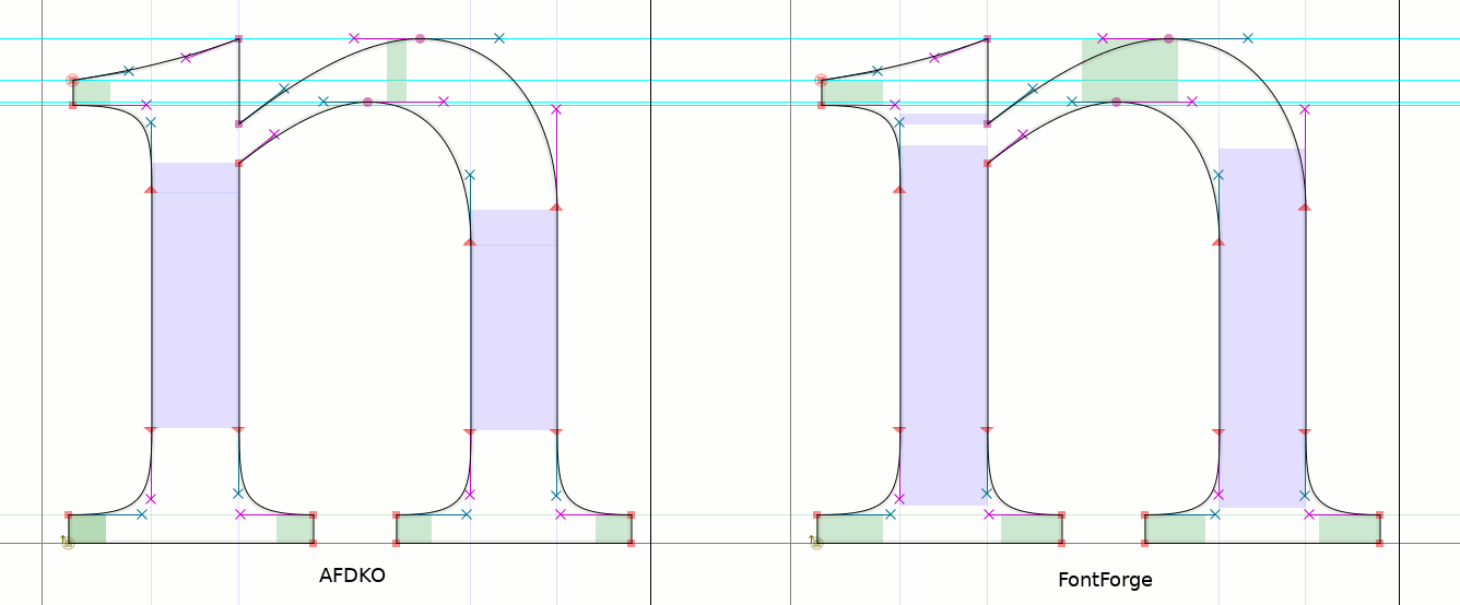
AFDKO as well as FontForge include an autohint (the following image shows hints as blue and green rectangles):

FontForge's autohint is much more eager to fill the white spaces. Does anybody have experience with the different quality of the resulting bitmaps (AFDKO vs FontForge)? Which one should be preferred?
0
Comments
-
I'm not clear on the difference between the above two. What exactly are the differences in the heights of the blue rectangles or widths of the green rectangles supposed to represent?0
-
@André G. Isaak As far as I understand, the widths of the green rectangles indicate where the horizontal hints are active: https://fontforge.github.io/hinting.html explains it. In short:
PostScript originally required that hints should not overlap. Now it requires that any active set of hints be non-overlapping, but it allows you to change sets as you move through the glyph.
So to implement hinting with hint substitution FontForge needs to know not only the position and width of the stem being hinted, but also where the stem should be active. And it needs to know what stems overlap which other stems.
0 -
That would make sense, but there's nothing in the above diagram which suggests hint replacement is present in these glyphs, and there aren't any additional points in the right example which the 'longer' hints could affect. Are you sure it isn't simply that FontForge displays hints which it generates differently from ones added to the font by an external program? N.b. I don't normally work with FontForge and have only minimal familiarity with it.
Could you possibly post another example using a two-story lowercase g? (Since that's a place where hint replacement is more likely to be needed.)1 -
Also, what happens if you generate .otf's from the above two examples and then reopen these in FontForge? Do they display the same way as in the original .sfd or do they suddenly look the same?0
-
@André G. Isaak Your questions point in the right direction:
 After exporting to OTF (mid), the hinting from FontForges autohint (left) becomes nearly identical to the hinting in the ADFKO OTF (right). Only difference inside the glyph /g: The spur of the /g and the lower mid bar. I have compared other glyphs and found most glyph to be hinted nearly identical by ADFKO and FontForge+OTFExport.Hence, I guess the differences are not that big.0
 -
The way FontForge displays hints seems very strange. I don't understand what those varying heights and widths are indicating (if anything).
PostScript hints are usually shown in font editors as bands that run completely horizontally or vertically to the edges of the character width and height, not segments like this.
The part you mentioned about overlapping hints refers to hints going the same direction, not intersections of horizontal and vertical hints. In the /g, the three vertical hints on the left overlap and the two on the right overlap. This is where replacement hints are used.1 -
I suspect that when you ask FontForge to create hints, it starts by identifying what it considers to be stems with rectangles, and then creates hints based on these stems. However, when you open an existing font it uses the hints themselves to create rectangles which identify which control points will be affected by those hints. In the former case it creates larger rectangles than in the latter case. Hence the difference in representation when you generate and reopen a font.2
-
That difference in hinting of the “middle bar” is worth paying attention to.The slight curvature to that element will get lost at smaller sizes and lower resolutions. When it does, the FF hinting will tend to render it slightly heavier than the ADFKO hinting. FF has identified the distance of two corresponding points to hint, whereas AFDKO has taken the lesser distance between the two closest points out of the four.You would have to proof the two options at a variety of sizes to decide which is actually preferable.
1
Categories
- All Categories
- 46 Introductions
- 3.9K Typeface Design
- 489 Type Design Critiques
- 572 Type Design Software
- 1.1K Type Design Technique & Theory
- 663 Type Business
- 877 Font Technology
- 29 Punchcutting
- 530 Typography
- 121 Type Education
- 328 Type History
- 81 Type Resources
- 111 Lettering and Calligraphy
- 32 Lettering Critiques
- 79 Lettering Technique & Theory
- 561 Announcements
- 96 Events
- 116 Job Postings
- 169 Type Releases
- 179 Miscellaneous News
- 269 About TypeDrawers
- 53 TypeDrawers Announcements
- 114 Suggestions and Bug Reports


