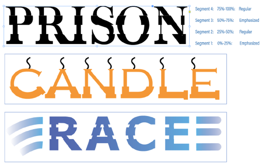
Usefulness for the below type of fancy fonts and hybrid glyphs
We wanted to know if there is any usefulness to generate custom fonts whose glyphs are a combination of bold and italic typeface. We call these glyphs “Hybrid Glyphs”. So, to say, each glyph is segmented into regions and each region may have a different typeface replicated .
In terms of workflow, the user selects the font, say regular, and defines the segment marks in terms of how low it is from the font ascender line. Let say he marks two points at 20% and 50% above from the fonts descender (total font height=ascender-descender). This will generate three segments. For each segment he then may choose a different typeface to be replicated. For example, he may choose Bold-Italic-Bold. This will even be possible if the designer does not have the bold and italic typefaces of the font. In such cases, it will replicate a false bold in the first segment, a false italic in the middle segment and a false bold in the third segment. In case the user has the required typefaces of the font family, then that portion of the glyph will be taken from the corresponding font. The user may choose any typeface like semi-bold, semi-italic, condensed etc
Some key aspects:
We primarily want to know…
- Will this “feature” be useful to designers?
- How often will you use this capability?
- Under which scenarios and product will this most likely be useful? (maybe for Logos in AI? and titles in InDesign?)
- Do you see any missing aspects to this which can increase its usage?
- In light of the latest typography advancements (SVG fonts, variable fonts) how do you place this capability?
Comments
-
It’s an interesting idea, but these typefaces look like relics from the postmodern era. I don’t think many designers would be using them for contemporary work.4
-
1. Mostly, not. The people who would find this interesting or fun are mostly not professional designers.
2. Personally: probably never.
3. The people who will be intrigued by this are almost entirely not the people who license high-end pro apps such as InDesign and Illustrator.
4. Not immediately.
5. SVG fonts and variable fonts provide exciting capabilities that interest professional typographers. This does not.4 -
I would assume that if someone were to find this useful at all, it would be for some one-off usage, and since this effect would be easy enough to achieve in any graphic or layout program, I doubt anyone would be willing to invest money in software specifically for this purpose.4
-
Not sure about the current examples but it's an interesting idea. I'd say something like a ripple/glass effect + as a variable font may get the attention of designers ?
 Because the idea you have could be incorporated into something like the above, or even glitch maybe? 0
 -
This is part of an experimental work I am involved in and wanted to know if this is something in any form be useful for typographers.
Also I have created a small demo video to showcase a glimpse of how this is implemented in InDesign CC. Here is the link: https://youtu.be/aDGYcCs3wfg
0
Categories
- All Categories
- 46 Introductions
- 3.9K Typeface Design
- 489 Type Design Critiques
- 572 Type Design Software
- 1.1K Type Design Technique & Theory
- 663 Type Business
- 875 Font Technology
- 29 Punchcutting
- 530 Typography
- 121 Type Education
- 328 Type History
- 81 Type Resources
- 111 Lettering and Calligraphy
- 32 Lettering Critiques
- 79 Lettering Technique & Theory
- 561 Announcements
- 96 Events
- 116 Job Postings
- 169 Type Releases
- 179 Miscellaneous News
- 269 About TypeDrawers
- 53 TypeDrawers Announcements
- 114 Suggestions and Bug Reports


