Infant type revisited


Comments
-
Forgive my ignorance, but google wasn't much help. What exactly is infant type?0
-
I think here it means a single-story /a/ and /g/ in a design in which you’d usually expect double-. Maybe “upright cursive” forms of letters like /k/w/y/ go along with that as here.
Originally intended (or at least marketed) as easier for beginning readers. http://www.typophile.com/node/675380 -
0
-
I'm just a bit skeptical about single-story a's and g's making reading easier for children.
When learning to read, children learn the difference between caps and lower case, they learn to recognize what punctuation marks are for and, hardest of all, they learn that specific sequences of these things form words and sentences.
With all that to learn and more, recognizing a couple of characters that sometimes come in two different forms seems trivial. For that matter, their uniqueness might even make them more memorable.
4 -
yes Cory that has been discussed previously, but the question of this thread is: is there some practice/tradition of the kind in other countries/languages.
1 -
Sorry, Andreas, but I reserve the right to respond politely in whatever way I choose.
0 -
I know you didn't ask which countries don't have that tradition but I can confirm that in Japan, infants are taught precisely the same stroke order and construction as adults are expected to use and they read the same typefaces.1
-
Yes and no, Ray. The kana letterforms are the same for sure, but progressive teaching of kanji (unavoidably) rather complicates that story. What makes it particularly interesting is that kana-only books have interword spacing, whereas mixed script books don't.

So you could argue that the space character is an infant letterform in Japan!5 -
BTW, is this Andron?
0 -
yes, a customized version for a publisher based in Warsaw.Christian Thalmann said:is this Andron?
0 -
I designed a custom typeface for a Canadian children’s book publisher, and infant type was stipulated. As well as serifs on capital I, like Verdana.
That would be for English and French, as Canada is officially bilingual.2 -
Here in Dublin our family has a mix of US and UK children's books. The UK books generally use infant forms; the US ones seldom if ever do.2
-
Andreas, what’s with the loopy “k”?—that’s much too complex for an infant!
And the “h” that looks like a “b”?
The overall departure from a standard roman style is as much fraktur as infant.
1 -
An "h" that looks like a "b" (like in many italics of Garamond) is the pits for any age group.0
-
yes its interesting, this loopy k is quite the shape we learned at school – in Germany. It is also commonly known in Italic type, if I’m right.Nick Shinn said:Andreas, what’s with the loopy “k”?—that’s much too complex for an infant!
As far as I remember the Polish who approached me for this font related their request for certain shapes to the Deutsch/English special set in the 1st place, and not just to Andron ABC. Independently from this work (and later) I noticed a certain affinity in Poland for round w, y and k (true?). This vernacular aspect of alternate glyph traditions in connection with the idea of an ‘infant’ path of choices interests me, therefore the initial question of this thread.
And yes, Nick: And. DEU/ENG is actually a fraktur-flavoured Roman set. Maybe this is the opposite to the typographic infancy concept? Never thought about it that way …
0 -
It could also be argued that, along with Fraktur and Infant, Futuristic (after Paul Renner’s design) is another valid description of the single-bowl a and g configuration.1
-
Antykwa Półtawskiego (1923–1928) was designed to meet the special requirements of the Polish language by minimizing diagonals in the frequent letters ‘k’, ‘w’, ‘y’. There are a few other designs that follow this idea, especially for the ‘y’, see Adam’s visual overview of Polish type design 1918-1990, or this example of a localized Permanent Headline.Andreas Stötzner said:
I noticed a certain affinity in Poland for round w, y and k (true?).
2 -
Hey I guess infant forms need language tags!1
-
Looped ‘k’ is found interesting and quirky in Poland, I guess, once the initial frowning upon its similarity to ‘R’ ceases. Infant, not so much.
0 -
I had heard the name of Andron, but I was not familiar with it. Once I saw the image of the many variant forms it had, I went and searched: I found what used to be Andreas Stötzner's page for offering it for sale - but the page has many dead links to images, so I presume it is not the one he currently uses.
This is a brilliant effort to make a typeface usable for many languages - even including Serbian forms for Cyrillic.
That would seem to me to be an unwarranted conclusion.Nick Shinn said:I designed a custom typeface for a Canadian children’s book publisher, and infant type was stipulated. As well as serifs on capital I, like Verdana.
That would be for English and French, as Canada is officially bilingual.
If you designed the typeface for a Canadian manufacturer of breakfast cereal, one could indeed be confident that each box of cereal would contain all its text duplicated in English and French.
But when it comes to Canadian book publishers, some are specialized in serving the English-language market, and others serve only the French-language market; the fact that both languages have official recognition in no way prevents this. Of course, your client may well have been one that you knew to publish children's books in both languages, perhaps because it's a very major publisher of children's books, but that isn't because Canada is bilingual.
(After I followed your link, though, I see it identified the client. From that client's web page, I see that they do publish textbooks on French as a second language, and they sell textbooks for use in Quebec schools - but apparently for Quebec English-language schools only. They don't even seem to have a French version of their web site. Of course, they might well have a subsidiary under another name that publishes a full line of French-language textbooks for all I know. - EDIT: Further searching finds that they once had one, called Groupe Modulo, but they sold it off to another outfit.)
0 -
Good point John.
They do things differently in Quebec, often as a matter of principle, changing things that originate in the ROC (Rest of Canada), just because!
I wasn’t speaking to what is traditional in a country, which was Andreas’ request, just recounting my own experience. That’s hard to verify, as I designed the type 15 years ago, and since then the company has changed hands and I’ve forgotten the name of the person who hired me.
You raise an interesting issue—that infant type is not just a language-specific phenomenon, but also geographical. So Andreas’ assumption “It is known practice … in the English world…” is a generalization that may not be true for the same language in different countries.0 -
I learned to read in The Netherlands in the nineteensixties. The typeface in our little books made quite an impression then because I can still remember: Gill Sans Infant.Andreas Stötzner said:in which countries else such a tradition can be detected?
0 -
This is amazing: I also learned reading in that time, in then GDR. I also remember the letters in our Fibel (primer): Gill semibold with simple a’s and g’s. I’m not sure, however, if this was meant to be an infant typeface, at that time; I guess it may have been a sort of “Continental Gill”.alex scholing said:… I can still remember: Gill Sans Infant.
0 -
“Euro-Gill”: that’s some mash-up!

0 -
It see it being called Gill Sans Infant today, but I don’t know how it was called back then. Note the curved ‘y’ and straight bottom and top of ‘d’ and ‘p’.

0 -
How old is Gill Sans Infant? And who designed it? I remember reading that it was Rosemary Sassoon, the British handwriting expert, who had formulated the principles for types of this kind and designed a number of fonts herself.
I have no expertise in this subject, but as the parent of three children born over a period of 22 years, I’ve always found it a little suspect. When my older daughter was a first-grader, I did a little workshop in her classroom about letterforms. I brought with me hundreds of photocopied sheets of alphabets, taken largely from my friend Dan X. Solo’s many books. All of the letters were cut apart. First, I did a little identification quiz, to see how many of the letters the kids could identify. Included were many highly ornate and obscure forms. I was surprised to find that the kids, aged six and seven (it was a combined first- and second-grade class), could identify nearly all of them. Only a few letters, such as some forms of blackletter cap A and the like, eluded their grasp. But when the letters were shown in context, in words they knew, they able to understand them, even suspecting that the unknown letterforms were misspellings. Next, I asked them to gather all the letters they could find that seemed to go together—which is to say, organize them into fonts. Their accuracy was amazing. The year was 1988 or 1989, early in Macintosh era, so this new-found awareness of fonts amongst these kids probably led to many future font sales.
The essence of Sassoon’s theory is that young kids should read in print letterforms similar to those they are learning to write, such as single-story a and g. On the surface, that would appear to make unimpeachable good sense, but I found that as soon as kids have learned to identify words, they are innately able to understand and substitute alternate letterforms, having become familiar with them, even subliminally, from the world around them—road signs, TV ads, printed work—as if by osmosis.
By the way, I find the term “infant” as applied to these fonts a little annoying. Infant comes from the Latin infans, which means “doesn’t speak.” “Youth” or “primary” would be better choices.
3 -
You see a lot of the infant Gill Sans in German and French books of the 1950s–60s, and not only for children. It was likely seen as an alternative geometric sans that didn’t venture as far from Futura as the original Gill Sans.
Here’s a sampling of the alts as they were available in the 1937: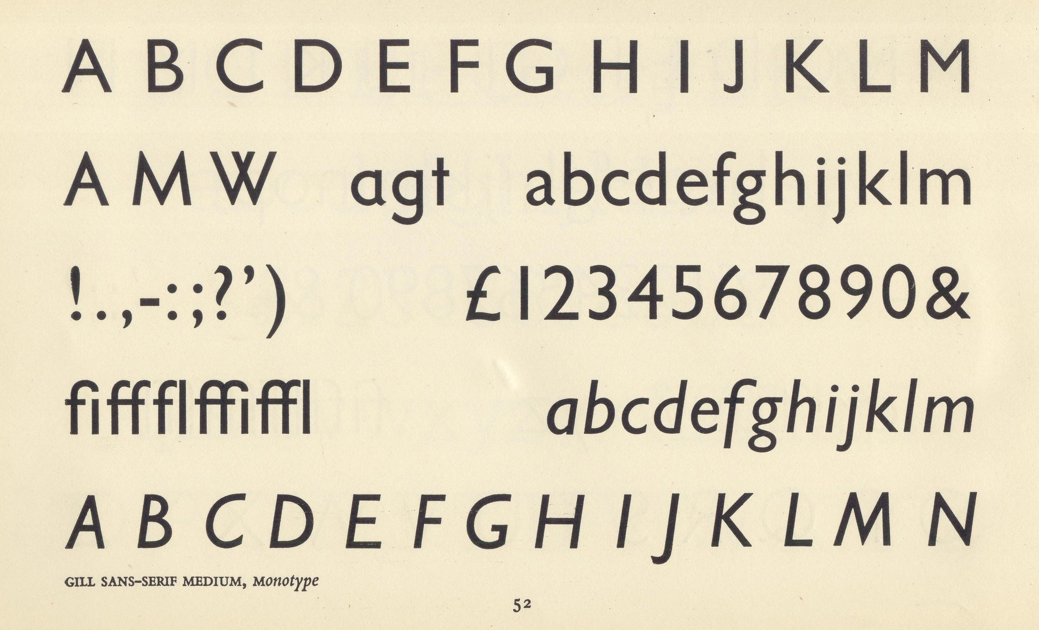
Even more Futura-like alts were available in 1968: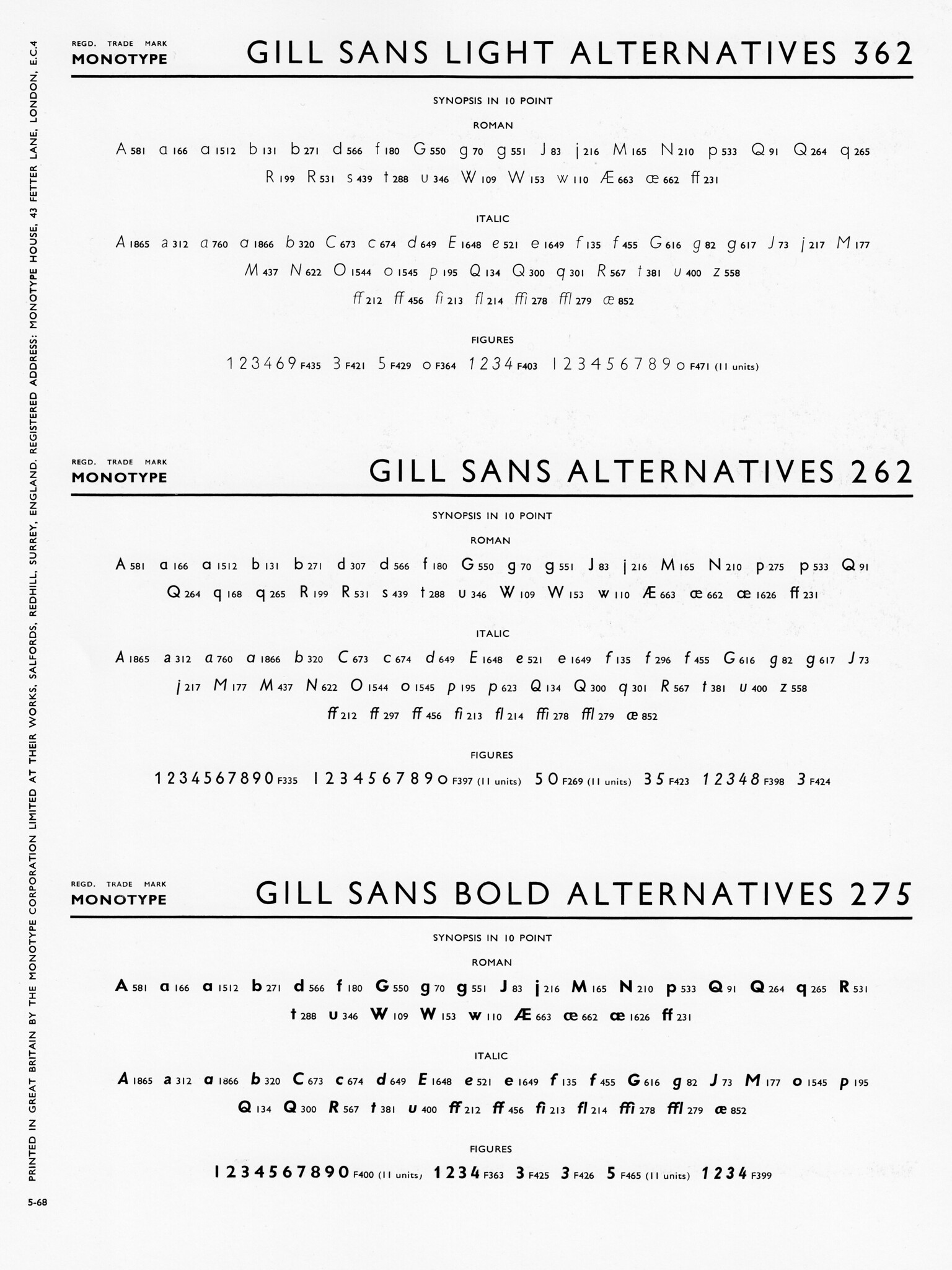
4 -
I don’t think this 20th century style-mixing was specific to any one alphabetic concept (infant, fraktur or geometric), but rather emerged as something foundries did “because they could”.
It was an inexpensive way to extend the scope of their offerings—similar to how we now enlarge a font to contain more than one alphabetic style, by putting such alternates in Stylistic Sets.
So, a printer/typesetter could buy one main font, and a much smaller (and less expensive) sort of alternates to augment it, et voilà, two typefaces for the price of one and a bit.
The marketing of the alternate as an “Infant” typeface is, I suspect, a more recent idea.
Here’s another example of the practice, from 1952, in which a basic, conventional style was freshened up and doubled by the addition of a few rounded alternates, enabling a quite distinctive and consistent effect (in the capitals, at least)—without diagonals.
1 -
I was not aware how far the futuraisation of Gill actually went, back then, rather shocking.
The offering of alternative rounded capitals looks familiar to me; I have seen a couple of typeface samples from German foundries who advertised Rundbuchstaben as an extra in the 1920ies/30ies.
1 -
A working proof of Gill Sans Cyrillic, date-stamped 15 December 1959. Please note the single-storey form of the l.c. a.

Compare with the bicameral а in Humanist 521 Cyrillic (Bitstream/ParaType):
or with a more recent version, Gill Sans Nova (Monotype):
This book was typeset on Monophoto in 1977: 2
2


Categories
- All Categories
- 47 Introductions
- 4K Typeface Design
- 495 Type Design Critiques
- 577 Type Design Software
- 1.1K Type Design Technique & Theory
- 670 Type Business
- 884 Font Technology
- 29 Punchcutting
- 538 Typography
- 125 Type Education
- 332 Type History
- 81 Type Resources
- 113 Lettering and Calligraphy
- 33 Lettering Critiques
- 80 Lettering Technique & Theory
- 569 Announcements
- 100 Events
- 116 Job Postings
- 170 Type Releases
- 182 Miscellaneous News
- 270 About TypeDrawers
- 54 TypeDrawers Announcements
- 114 Suggestions and Bug Reports