What are the names for styles of the digit one?
bjherbison
Posts: 3
in Type History
I collect coins and I see variations in the style of the digit one ("1") on coins and I would like to learn the correct terminology to discuss
the variations. Is there a good resource for font questions like this?
One type is Roman, horizontal lines top and bottom. See the denomination in https://en.numista.com/catalogue/pieces74426.html .
Two other styles I call "old style" and "new style" (based on the years
I've seen them used) but there must be standard names used by font
historians.
The old has rounded serifs and the bottom isn't flat. The image below comes from https://en.numista.com/catalogue/pieces18190.html (Bavaria Pfenning 1816).

The new has straighter edges, usually with sharper corners. The image below comes from https://en.numista.com/catalogue/pieces96271.html (Appenzell Pfennig 1816).

There are variations in other digits (open versus closed 4 for example), and there are significant variations in other number systems (such as Arabic digits), but currently I'm looking at the transition of styles for the digit one.
Tagged:
0
Comments
-
Basic variations are: Serif, Sans Serif, and Slab Serif but there are many variations within each.0
-
That is not an Old Style figure 1. In Typography, "OldStyle" refers to figures that align with x-height, like the font used in this forum 0123456789 (Georgia is another font with OldStyle figures).bjherbison said:Note that the example I used for the Roman style uses the "old style" in the date.1 -
First: the lettering on coins has nothing to do with fonts. It has’nt even anything to do (directly) with typefaces (in the lead-type era sense of the word).
The lettering on coins is rather a field belonging to epigraphy, that is (mainly) individually crafted hand-lettering in the mode of punch-cutting, engraving, stamping, carving or similar techniques.
The interesting thing about the digit 1 in epigraphy (works in stone, wood, metal; continental Europe) is, that its serifs tended to evolve into various peculiar exuberant or flourishing shapes, of which you may find reminiscences on coinage. I know of discussions where the term geschwänzte Eins (caudated One) has been used, but, apart from that, I did not came across any deeper approach into morphologic terminology of the phenomenon.
7 -
The first one can be described as 1 with flat top (and bottom) serif(s), it looks like a seriffed Roman numeral Ⅰ or Latin capital I. The other two have an angled entry stroke (also: nose, flag). The second one (“old”) is distinguished by its bifurcated base. “Bifurcated” means that the stem (or its endings) is split in two. This is an established term in typography, too, see especially the so-called Tuscan genre (examples: HWT Brylski, Inkwell Tuscan). In the specific case of the Bavaria Pfenning 1809, the left part ends in a ball terminal.
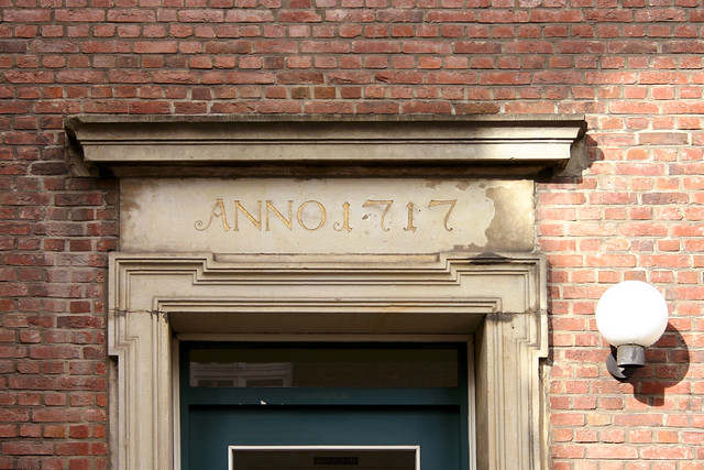
Caudated emphasizes the presence of a tail-like extension (also used for certain shapes of Q or R etc.). This Amsterdam house number features a 1 that may be described as caudated, but it does not have a bifurcated base. A tower clock face in Venice is another example of such a J-like 1 – here without ball terminal and top right serif.
Sometimes the cauda (more general: swash, flourish) only appears when the 1 is in initial position, but not when in medial or final position. Such a contextual variation can be found at the St. Joseph Church in Hamburg. Both 1s have a bifurcated base. Instead of an angled entry stroke, these numerals have a diamond-shaped top terminal (German: Quadrangel).
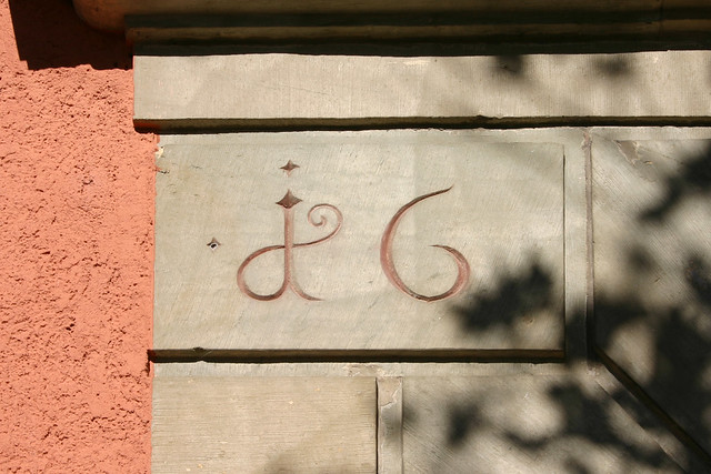
The 1 can additionally have a dot, see this tombstone from a Berlin cemetery. This dotted 1 from an inscription on a building in Künzelsau features an extreme flourish.
12 -
Excellent examples. Such delicate detailing was actually rather common and widespread in Germany (as a few more samples may illustrate).

5 -
Wonderful! Thanks for sharing. Here’s an extreme – historicizing? – case of bifurcation, from the Wittelsbacher Cycle (1826–29) in Munich’s Hofgarten Arcades.

0 -
… love it. 1 on its way to become a cyrillic El (!).
By the way, that loopy lc a once attracted my attention, on gravestones at the old Leipsic St John cemetery (always worth a visit). Note also the bifurcated top terminal of h.
0 -
but back to the 1 issue. Here are a few more recent examples


1 -
Thank you all for an education in the terminology, and for the great examples.
0 -
I have been collecting this number for quite some time; no matter where I am, I can find some of them. Especially in southern Germany, Switzerland and Austria there are many of these "tailed ones". A few times ago I wanted to publish a small contribution in Stötzner's wonderful booklet "SIGNA", but there was (and still is) a lack of scientific facts. But the thoughts of Florian further above are a very good start...A small part of my hunting trophies can be viewed at Flickr: https://www.flickr.com/photos/preusss/3
-
That's a nice set of trophies.Follow-on question: Any idea what caused the general transition from a bifurcated base to a flat base? Did the bifurcated base just go out of style?
The transition in coins happened over a long period. I see a large number of examples with a bifurcated base in the early 18th century, fewer in the second half, and many fewer in the early 19th century. The most recent example I've found are in coins from Bavaria. The 1 Heller and 1 Pfenning coins issued until 1835 used a bifurcated base in the year and the denomination, but the Heller and Pfenning coins issued from 1839 on used a flat base.
0
Categories
- All Categories
- 46 Introductions
- 3.9K Typeface Design
- 489 Type Design Critiques
- 572 Type Design Software
- 1.1K Type Design Technique & Theory
- 663 Type Business
- 875 Font Technology
- 29 Punchcutting
- 529 Typography
- 121 Type Education
- 328 Type History
- 80 Type Resources
- 111 Lettering and Calligraphy
- 32 Lettering Critiques
- 79 Lettering Technique & Theory
- 561 Announcements
- 96 Events
- 116 Job Postings
- 169 Type Releases
- 179 Miscellaneous News
- 269 About TypeDrawers
- 53 TypeDrawers Announcements
- 114 Suggestions and Bug Reports


