Misurina (Critique)

Christian Thalmann
Posts: 2,059
Dear TypeDrawers,
I would like to hear your opinions and advice on Misurina, a high-contrast calligraphic font. It is a spin-off product of my work on the much more ambitious Maestrale font, which features exuberant ascenders, descenders, and swashes extending two x-heights above and below the x-height. In contrast, Misurina has almost child-like chubby proportions hugging the x-height. While it will take me a while longer to bring Maestrale to its due completion, I feel like releasing Misurina as a freefont in the near future (I was even considering the name «Maestrale Baby») to generate visibility and interest for Maestrale.
If you're interested in the evolution of the Maestrale family so far, you can read up on the Typophile thread: http://typophile.com/node/97898
Here's a quick-and-dirty PDF for Misurina: http://www.cinga.ch/type/misurina.pdf
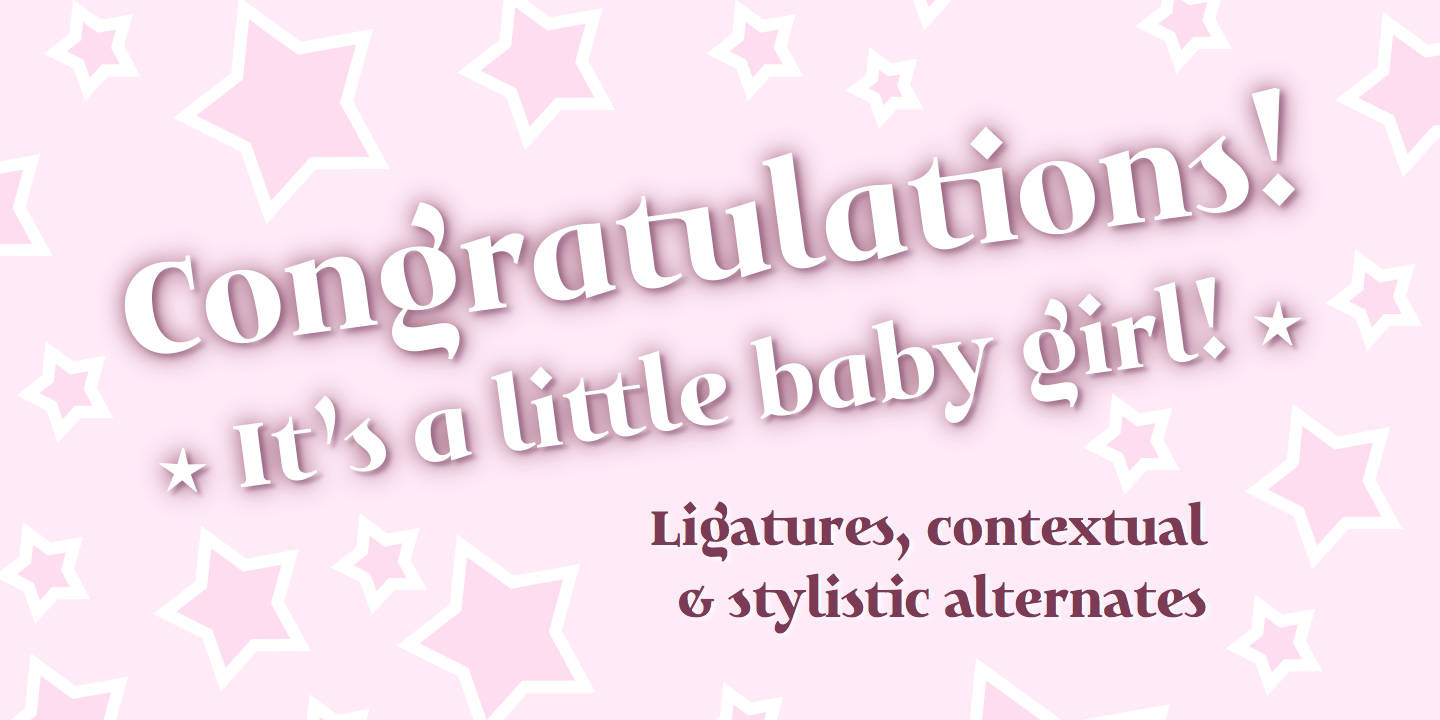
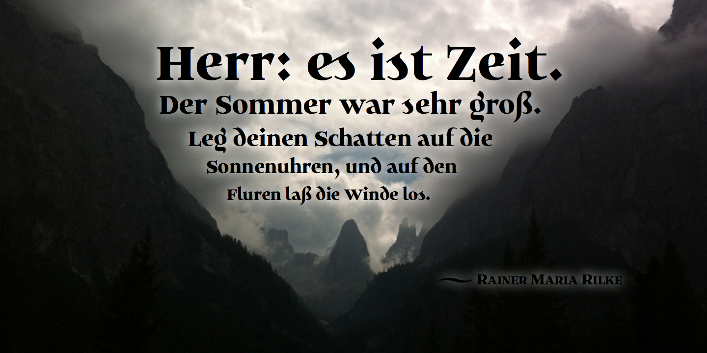
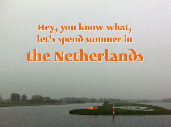
And here are some pictures:

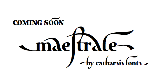
And finally, here's a teaser for Maestrale:
Whaddya think?
Kind regards,
I would like to hear your opinions and advice on Misurina, a high-contrast calligraphic font. It is a spin-off product of my work on the much more ambitious Maestrale font, which features exuberant ascenders, descenders, and swashes extending two x-heights above and below the x-height. In contrast, Misurina has almost child-like chubby proportions hugging the x-height. While it will take me a while longer to bring Maestrale to its due completion, I feel like releasing Misurina as a freefont in the near future (I was even considering the name «Maestrale Baby») to generate visibility and interest for Maestrale.
If you're interested in the evolution of the Maestrale family so far, you can read up on the Typophile thread: http://typophile.com/node/97898
Here's a quick-and-dirty PDF for Misurina: http://www.cinga.ch/type/misurina.pdf
And here are some pictures:


And finally, here's a teaser for Maestrale:

Whaddya think?
Kind regards,
0
Comments
-
/g/'s ear seems a bit too big to me (compare the tittle).0
-
My immediate impression is that if you’re going to have calligraphic forms in the lower case, then the caps should somewhat swashy, to harmonize.0
-
I can’t say I like the calligraphic spur on the “e”; it seems distracting. if it were me, I’d make it a contextual alternate when it precedes the “s” or just keep it in the “es” ligature.0
-
Thanks for the feedback, everyone!
@ Craig: True, the generous ear of |g| is a holdover from the epic ears in Maestrale...
... and I guess I wanted to compensate for the minimalism of the descender. But I'll try reducing the ear to match the tittle's weight and see whether I like it better that way. Overall, the |g| is one of my favorite character in Misurina (which I guess I should call Maestrale Baby after all; it does belong to the family conceptually), it represents the "Baby" character quite well.
@ Nick: I understand the sentiment, but I feel that Maestrale and, by extension, Maestrale Baby are not traditional calligraphy fonts. I've heard it described as a calligraphy/serif hybrid, and even that is probably too prescriptive. I see them much closer to the carolingian minuscule and uncial rather than to, say, Spencerian script.
In fact, I find Maestrale the most beautiful when it eschews caps entirely, as in the signature above. Originally, I made its caps at x-height so they could be interspersed freely with the lowercase. In Baby, I've now declared these as smallcaps and added some slightly bigger actual caps, which allows it to function well even in longer texts (such as the Human Rights text included in the PDF sample). I hadn't planned that, but I like how it turned out.
In short, I'd rather further explore the genre-defying area between minuscule and serif font than turn this into something mainstream... as an amateur, I'd have a hard time competing in a mainstream genre, but I might just have the right lack of common wisdom to come up with something original. ;o) Do tell me if I'm painting myself into a corner, though.
@ James: I already have an alternate form of the |e|, as seen in the word "little" on the pink poster (along with the single-story |a|). Looking at my samples, I agree with you that the spur seems a bit out of place, especially at smaller sizes. I think I'm going to keep the spurred |e| as the default shape in the Pro version of Maestrale, which is made for big sizes, and adopt the more versatile unspurred |e| as the default in Baby.
Incidentally, I also just made a script-style alternate for |k|, which currently looks very serify. I'm thinking of making it the default cut in Baby.

1 -
To be honest Christian, I think you need to decide whether it is going to be calligraphic or not. At present it is "sporadically" calligraphic and that makes it disconcerting and quirky to me. Not sure that it is cohesive. And I would totally rethink the s.1
-
The user and all related content has been deleted.0
-
@ Typerror: I'd rather not squeeze Maestrale Baby into a labeled box too much, but if anything, I'd describe it as an attempt to recreate the compact, high-impact, high-contrast aesthetic of carolingian minuscule within the framework of contemporary typography. It's meant to be original, and that necessarily involves breaking some conventions.
Now, if there's just one or two things that spoil the cohesion of the font, as your use of "sporadic" suggests, I may be able to address that. What exactly is it that trips you up? The |s|, you say? Maybe the |d| as well?
Frankly, I like my current |s| and |d| a lot, but if this sentiment of yours is wide-spread, I could just release a second, more conventional cut of the font that addresses these issues. Maybe the more "callligraphic" cut could use the current forms for |a d k s|, and maybe the tailed |z|, while the more "conventional" cut would use the one-story |a|, an upright |d|, an regular serif forms for |s z|... (Apart from the upright |d|, these forms already exist as alternates, but I doubt they'd see much use hidden away in OpenType features.)
@ James: Not much I can do about that kind of opinion.0 -
James’ critiques may come across as harsh but, as I’ve found firsthand, they are often a great reality check.2
-
@ James Todd: The message I'm getting from that critique is "scrap it and make something else", and that doesn't help me.
Anyway, here's a little experiment using my alternate shapes for |a d k s|.

In your opinion, does the second version avoid those sporadic pangs of calligraphicity?
Personally, I prefer the first version.0 -
I'd curl /e's terminal a bit more.
There are too many different terminals: /f, /y, /c, /r, /g, etc. Variety can be desirable, but as it increases the typeface starts to resemble a collage and the whole idea becomes vague. In typography a glyph doesn't stand for itself.
First, I would accurately define what your purpose for this typeface is. Being unsure makes you vulnerable to dull your work after a critique. While Maestrale shows characteristics which clearly point it out as a display face, Misurina is wobbling between a display and a text font. If you want to make a text companion to Maestrale, make it full text.
Personally, I don't see a reason for making Misurina. I like the idea behind Maestrale. Shrinking all terminals turns Maestrale into both a shy and a glamourous font. Just my opinion.0 -
Hi Lex,
thanks for your helpful and constructive critique — now that's something I can work with!There are too many different terminals: /f, /y, /c, /r, /g, etc. Variety can be desirable, but as it increases the typeface starts to resemble a collage and the whole idea becomes vague. In typography a glyph doesn't stand for itself.
Interesting — I was under the impression that these letters generally have distinct terminal types. I checked a few text fonts and found they usually have something like 2 basic types, with some weight variation (e.g. more weight on the |r|).
On the other hand, Misurina is not simply a serif font; it's supposed to be evoke the carolingian minuscule. Probably one of the most "quill-written" fonts I have on my computer is Cochin, which shows a surprising variety of terminals: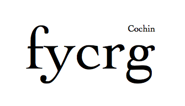
I see what you mean, though. I'll look into making the |f|'s terminal heavy or the |y|'s light (probably the former). Maybe I could give the |f| and |c| a terminal similar to the current |r|... I'll doodle around a bit and see what happens. I quite like my current |f|, but you're right in that it's not much of a teamplayer at the moment.First, I would accurately define what your purpose for this typeface is. Being unsure makes you vulnerable to dull your work after a critique. While Maestrale shows characteristics which clearly point it out as a display face, Misurina is wobbling between a display and a text font. If you want to make a text companion to Maestrale, make it full text.
I definitely see Misurina as a display face that can be used to set short texts, not as a text face that can be used for display. While I find Misurina pleasantly legible in its current form, a large block of text such as on page 2 of my PDF sample gives me an impression of "oof, do I have to read all of that"? That's not necessarily a sign of bad quality; an ultra-bold Bodoni would no doubt evoke the same impression. Misurina is too heavy for body copy, and if I were to slim it down, it would stop being Misurina. If I needed a text companion to Maestrale, I would likely just use Alegreya or Satyr.Personally, I don't see a reason for making Misurina. I like the idea behind Maestrale. Shrinking all terminals turns Maestrale into both a shy and a glamourous font. Just my opinion.
Misurina's raison d'être is mostly that the one thing I dislike about Maestrale is its diva-like demands on vertical space, which restricts its uses. As a result, I had the idea to experiment with very short ascenders and descenders to allow for the setting of compact lines of text to complement Maestrale. I put them into a separate font file so I could redefine the vertical size of the font (it's 450 em-units as opposed to Maestrale's 1000). Hence, Misurina was born.
Since Misurina didn't have room to be as inventive as Maestrale, I greatly reduced its inventory of alternate characters and swashes. This made it a less complicated font to work on, and I soon started using it as a testbed for the later stages of font production. I added proper caps to complement the existing small caps, implemented OpenType code for contextual alternates (such as |f t u r s v w y| linking to a preceding |f| or |t| crossbar), and did some spacing and kerning. I dread having to port all those new developments back to Maestrale at some point, but I figure I first want to release Misurina to put a "foot in the door" and maybe playtest my ligature-based "stylistic alternates for dummies" system on live font users before I tackle the harder job of completing Maestrale.
Utilitarian functions aside, I quite like Misurina for itself. What you call "wobbling between a display face and a text face", I call "filling a conceptual void". What you call "shy", I call "bashfully charming". I didn't propose the name "Maestrale Baby" by accident; its pudgy proportions suggest feel like the Kindchenschema version of Maestrale. That sounds like a feature rather than a bug.
1 -
I've been experimenting with some more harmonious terminal designs, and I quite like the results.
Old/new: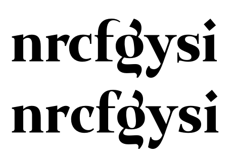
I still hope to include the script-style |s| in the more "calligraphic" of the two cuts of Misurina, though. What exactly is so wrong with it? I rather like it.0 -
Once again, it is all going to depend on what you do with the a, e, s, d etc and the Carolingian ethos.0
-
The user and all related content has been deleted.0
-
Could you elaborate, both of you...? I don't quite see through this yet.0
-
The user and all related content has been deleted.0
-
I'm finally getting Maestrale published (hopefully by the end of the week), so I've also dug up Maestrale Baby again (previously known as Misurina). I'm giving it away as a freebie to draw attention to Maestrale.
Based on the feedback from this forum, I've separated the mixed forms I orginally had into two separate font faces, Maestrale Baby Boy and Girl. I've tried to achieve coherent styles for each of the two fonts, with "roman serif"-style glyphs in Boy and "upright cursive"-style glyphs in Girl.
Boy:
Girl:
Does that address some of the concerns you had about the stylistic coherence of Maestrale Baby?0 -
Maestrale may be the show, but this one is the substance. Some of the folks in this thread are neglecting the practicality of use as part of the design equation, and Maestrale Baby has more potential as a useful face. It’s also a very handy companion to Maestrale (as you demonstrated in the sample images) for longer, legible text. I don’t think you should give it away. It should be part of a family package as well as available individually.
Splitting the baby (ouch) into two styles makes sense but I would avoid ascribing male/female names to them or you’ll get yourself into a political mess that will distract from this nice work. I also think “Baby” isn’t really a fitting name. Just “Text” could do.
Other thoughts:
- The new beak terminals on arch strokes are great. Must stronger than the hairline serifs.
- The cursive ‘s’ doesn't work as a connecting glyph. It’s just too tightly spaced without room to its left. I think it was ok as a separate shape.
- I don’t buy the straight stroke on the cursive ‘w’. Works better in the ‘v’ for some reason.
- Try round dots for the roman style.
- The cursive ‘k’ is a delight.1 -
Thanks Stephen!
I agree on the nomenclature — "Baby" and the gender assignment squeeze the font into an unnecessarily limited niche. I'll call the font Maestrale Text, and its faces Roman and Cursive. I'll also make a slanted version of Cursive to be called Italic.
As for not giving it away... hm. I don't feel like giving up the public attention that free fonts generate, but if you think Text is going to be more widely used than Maestrale, it would be foolish to make it all free. How about I make the Text Cursive free, then? It's usable as a standalone font, yet the Roman and Italic are probably more universally useful.
On {s}: It actually only links to preceding round letters, crossbars {f t} or other instances of {s}. Do you think giving the linked version just a bit more leading space to compensate for the ink would do the trick? Otherwise, I'll just restrict the contextual rule to the latter two cases.
Cursive {w}: Hm, it works for me. I almost used a textura-style high link for the first counter, so this is already a compromise. ;o)
Round tittle: Yeah, that could work. Wouldn't it hurt the family likeness though? The font does not need to be legible at extremely small sizes, since it's not a true text font (it would be way too black for that anyway).
Cheers0 -
What do you know, round points actually work very nicely with Roman.

And I'm really liking the look of the Italic:
(I just noticed I didn't have contextual alternates and ligatures activated for this sample, so disregard the collisions.)
Also, I'm slowly converting to the idea of not offering any of the fonts for free. I can save that trick as an emergency measure if sales don't go well.0 -
You're right, the cursive one slanted is very nice. I'd be tempted to simplify further and just release Roman and Italic. Editing down the design, and keeping it simple, may be a good idea given that there's already an associated display font too.0
-
I've released Maestrale now, and Maestrale Text along with it. For some reason the announcement thread doesn't show up in the overview, though... in any case, here's the Behance link: http://www.behance.net/gallery/Maestrale-a-unique-calligraphic-font-family/9855321
@ Craig: I've kept the upright Cursive in — the fonts are available separately, so people can just pick the Roman and Italic if they're not interested in the Cursive...0
Categories
- All Categories
- 46 Introductions
- 3.9K Typeface Design
- 489 Type Design Critiques
- 572 Type Design Software
- 1.1K Type Design Technique & Theory
- 663 Type Business
- 875 Font Technology
- 29 Punchcutting
- 530 Typography
- 121 Type Education
- 328 Type History
- 81 Type Resources
- 111 Lettering and Calligraphy
- 32 Lettering Critiques
- 79 Lettering Technique & Theory
- 561 Announcements
- 96 Events
- 116 Job Postings
- 169 Type Releases
- 179 Miscellaneous News
- 269 About TypeDrawers
- 53 TypeDrawers Announcements
- 114 Suggestions and Bug Reports


