Web Fonts Guide

Thierry Blancpain
Posts: 223
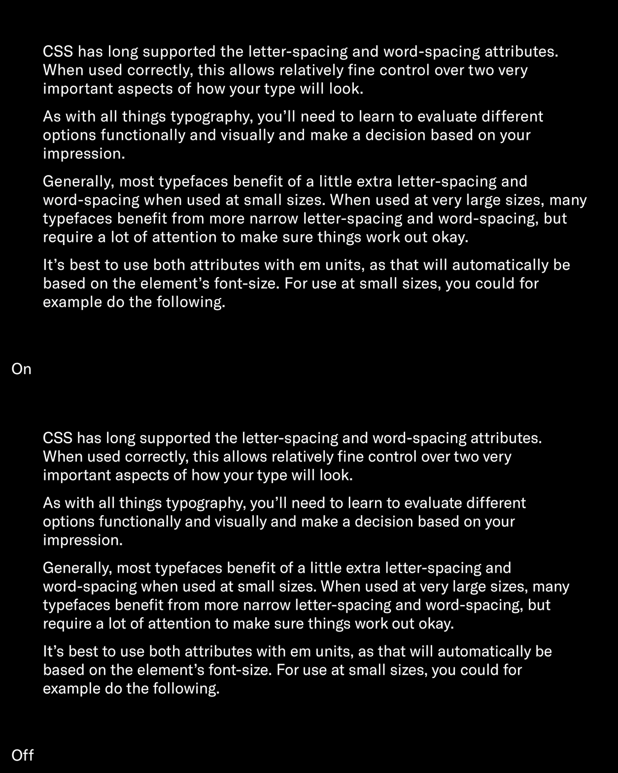
Today we released a a guide for using web fonts that we’ve created over the last few months. It covers the basics as well as more advanced topics – the required HTML & CSS for self-hosted fonts, activating kerning and other OpenType features, letter- and word-spacing, font rendering, and so on.
We’d appreciate your feedback!

We’d appreciate your feedback!

7
Comments
-
Re letter-spacing, I have to say that I’m yet to see a web page where letter spacing is used that does not make the text uncomfortable to read. I don’t claim to have a good eye for spacing (the only time I tried to space Latin glyphs the result was horrible), but I can’t count the times I’m reading a random web page and wondering why this text looks shitty, opening the browser dev tools to find that letter spacing is used, disabling it and all good again. So I’d rather have a strong warning about fiddling with letter spacing.
1 -
How about: you probably don’t notice it when it’s well done?4
-
Good typography is largely subvisible, not something people have to notice to be affected by. Otherwise: we have enough text fonts...Thierry Blancpain said:How about: you probably don’t notice it when it’s well done?0 -
Sure, that is a possibility. The point is, it is an often misused tool. I don’t notice web pages misusing word space, or line height, or smallcaps or whatever, so IMHO it is plausible that letter-space is often misused.Thierry Blancpain said:How about: you probably don’t notice it when it’s well done?0 -
Agreed that bad letterspacing is common, and sucks. But I am all for careful, subtle tracking of the typeface when it is used at a size significantly different than its design size.1
-
Very good effort, and very approachable information.
Regarding letter spacing I think oftentimes the problem is web developers adjusting tracking in full pixels, which is almost always too coarse. It's great to see the example uses fractions of em values.0 -
Can we please drop EOT and TTF from the webfont formats already?
 Especially TTF is not needed for anything. If a client absolutely targets obsolete Android devices, they will know they need TTF and ask for it. 5
 -
is TTF still valid for app embedding?0
-
If you want to support Android devices older than 4.4, OTF/TTF is your best choice. Otherwise WOFF will do.Miles Newlyn said:is TTF still valid for app embedding?2
Categories
- All Categories
- 46 Introductions
- 3.9K Typeface Design
- 489 Type Design Critiques
- 572 Type Design Software
- 1.1K Type Design Technique & Theory
- 663 Type Business
- 876 Font Technology
- 29 Punchcutting
- 530 Typography
- 121 Type Education
- 328 Type History
- 81 Type Resources
- 111 Lettering and Calligraphy
- 32 Lettering Critiques
- 79 Lettering Technique & Theory
- 561 Announcements
- 96 Events
- 116 Job Postings
- 169 Type Releases
- 179 Miscellaneous News
- 269 About TypeDrawers
- 53 TypeDrawers Announcements
- 114 Suggestions and Bug Reports


