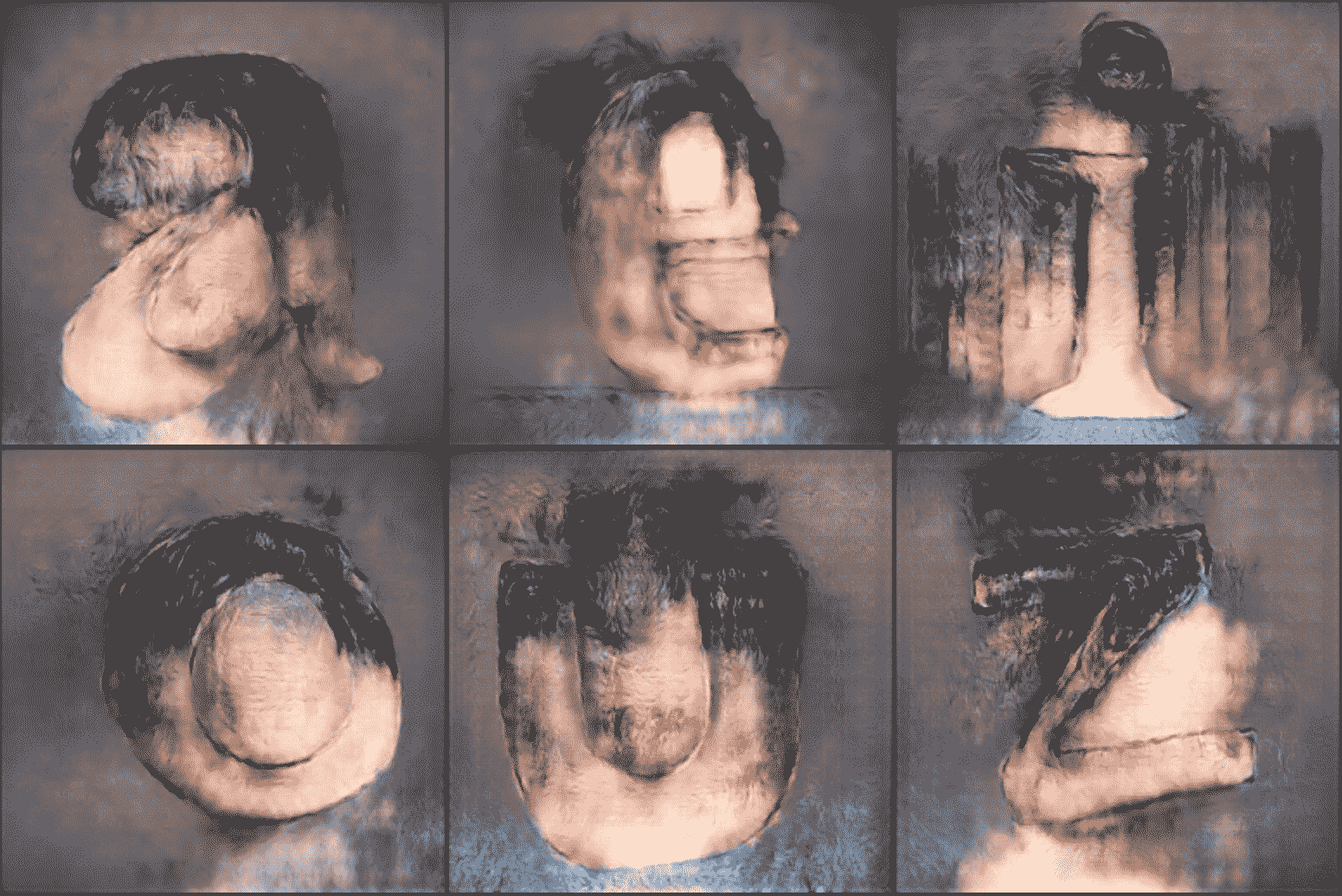
Abusing a Neural Network Drawing Tool intended for faces… (makying TYPE-FACES?)

Wolf Böse
Posts: 35
This morning i came across http://fotogenerator.npocloud.nl/
it allows you to draw faces and have it blend with a source image in an intelligent fashion.
Warning - it's highly addictive.
Now drawing with a mouse the results of the letter shapes are crude,
however, I thought it was an interesting enough experience that id like to share the results with you here.
Further it would be interesting to see what could happen if the underlying
reference is typographic instead of a human portrait,
David Březina presented some materials during one typostammtisch in berlin
that showed computer generated letter shapes based on a small number defined of glyphs
somehow interpolated from a huge database, kind of makes me wonder how human intervention
could manipulate the results in a not unsimilar fashion to what is seen here. simply by scribbbling a little here and there…
so instead of your drawing being blended with a face it could be blended with a didot, haettenschweiler or whatever…
the experience also reminded me of lucas de groots porno font.


––––––––––––––––––––––
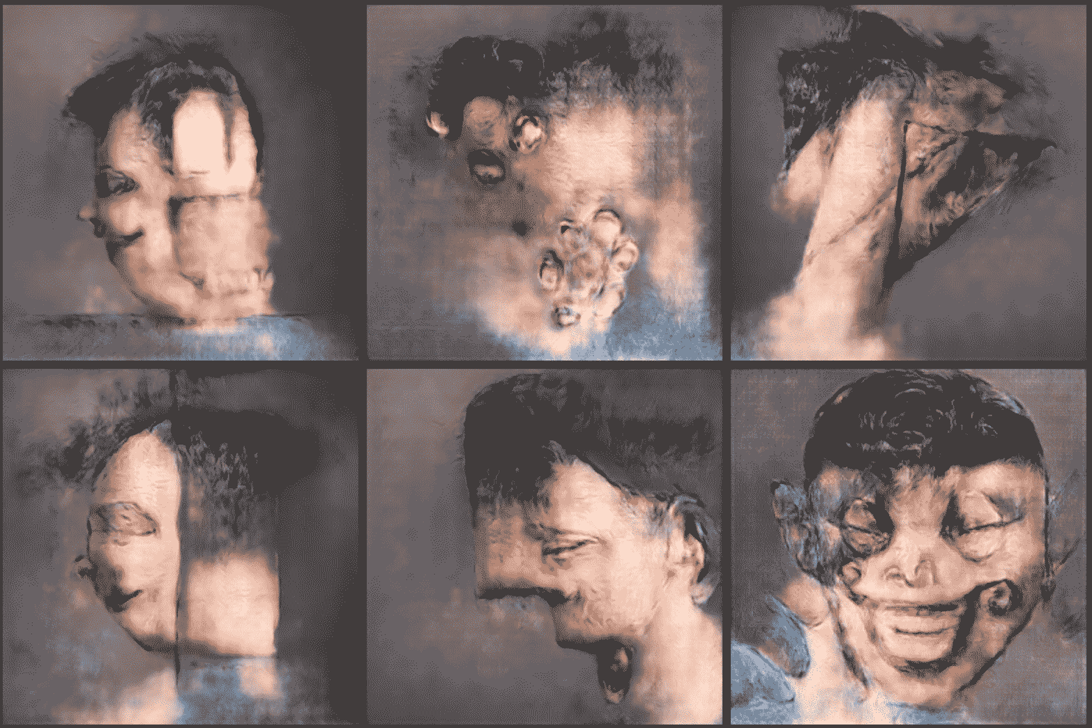
some more faces

it allows you to draw faces and have it blend with a source image in an intelligent fashion.
Warning - it's highly addictive.
Now drawing with a mouse the results of the letter shapes are crude,
however, I thought it was an interesting enough experience that id like to share the results with you here.
Further it would be interesting to see what could happen if the underlying
reference is typographic instead of a human portrait,
David Březina presented some materials during one typostammtisch in berlin
that showed computer generated letter shapes based on a small number defined of glyphs
somehow interpolated from a huge database, kind of makes me wonder how human intervention
could manipulate the results in a not unsimilar fashion to what is seen here. simply by scribbbling a little here and there…
so instead of your drawing being blended with a face it could be blended with a didot, haettenschweiler or whatever…
the experience also reminded me of lucas de groots porno font.


––––––––––––––––––––––
some more faces

5
Comments
-
3
-
hehe yea thats spot on.0
-
did a second batch
 2
2
Categories
- All Categories
- 46 Introductions
- 3.9K Typeface Design
- 489 Type Design Critiques
- 572 Type Design Software
- 1.1K Type Design Technique & Theory
- 660 Type Business
- 875 Font Technology
- 29 Punchcutting
- 529 Typography
- 121 Type Education
- 328 Type History
- 80 Type Resources
- 111 Lettering and Calligraphy
- 32 Lettering Critiques
- 79 Lettering Technique & Theory
- 561 Announcements
- 96 Events
- 116 Job Postings
- 169 Type Releases
- 179 Miscellaneous News
- 269 About TypeDrawers
- 53 TypeDrawers Announcements
- 114 Suggestions and Bug Reports
