Rue Charon


Comments
-
I don’t see what use this would have in contemporary design. It feels like one of those felt-pen “calligraphy” fonts that scrapbookers were using fifteen years ago. It’s also not a very harmonious design. Compare the typographic stiffness of E and F to the naive bits of K and Q. And the mixing of roman and italic ideas isn’t resolved consistently.
0 -
I think some glyphs are quirky and fun and others look plain and staid. If this were my project, I'd scrap the lowercase. The lowercase doesn't make a lick of sense. I like BDGKNRSTUZ. If you make the other letters match that style, you'll end up with an amusing version of a Federal Reserve Bank Note type of idea. The flip thing you're doing with the O isn't working. Q's tail doesn't have the same personality as the mustache stroke on the R. You need to spend more time on the 8...look at some examples of the style you're modeling this on for ideas.
2 -
Well, I've done some work on it. Imagine for the moment that I don't want to abandon the lowercase. I did understand that I was mixing some roman and italic elements. I've tried to divide them somewhat in the image below. I suppose I should work up full sets of both. Very good advice about the tail of the 'Q'. I'm sure I knew that it should match, but I admit I did not think about it.The flip thing you're doing with the O isn't working.Please explain. The only thing I can imagine you mean is that my 'O' is longer than it is high, but so are all the letters. I am missing something. I've been looking deeply at the letters you (Ray) are pointing out and honestly don't see how they are out of character with the rest. You mention liking some that I feel are the weakest (hello 'U').It feels like one of those felt-pen “calligraphy” fonts
Hmmm. My original inspiration was a woodtype slab. I wanted to use the proportions for an original design. I know I am making it more fluid, but I don't see either felt tip or brush here. I want it to have a hint of hand lettering. Not too tight and exact, if you catch my meaning, but not rough either.
You need to spend more time on the 8...look at some examples of the style you're modeling this on for ideas.Yes, the eight didn't look quite done to me either. Though the models I'm looking up use pretty much that same form for the eight. I don't see any way to make it more elegant without also making it too skinny. I've tweaked it into a more refined version for now. I would still appreciate any advice on the forms (again, imaging that I don't want to abandon the lowercase, though I am quite willing to scrap any of the individual letters.) Was the main problem the mix of italic and roman forms?
 0
0 -
Here is a first draft of the two lowercase alphabets... obviously a lot of issues still.

0 -
The O
Make the thick parts a little thinner and make the curve slightly less square. It's probably the same thickness as the left side of the C but with this kind of typeface. Logically, an O can be created by mirroring the C or D but usually doesn't work out that way.
Lowercase
Look at the left side of the u. Now look at the left side of the n. It's okay to try to make your lowercase interesting but you could do more to keep the relationships between letters more consistent. Look at tu in your example. There's some pleasant interplay with the tails. But tr won't have that. Keep looking for those relationships and you'll start to feel it flow.
8
I'd keep the lines on the top left and bottom right, thin to make it harmonize better with 6 and 9.0 -
Beau, this isn't an attractive type design overall—too many inconsistent visual cues throughout. Basically what others here have already pointed out.
You did improve a few things in your second bottom lower case attempt, but you also made things worst with some other glyphs. I do like, and I do think that the "cursive" bottom lower case attempt is better—I especially like the improvement of lower case glyphs "a, g, h, m, n, u and y". Much more fluid and relaxed. I think you should stay with this approach. The "f" and "x" are no good—try again. Also, please do something about that "r"—put a ball on it, similar to the ball on "k" and "f". Stay with the "slight" natural slant of the new cursive lower case—avoid uprighting the "f" as you did. Makes the typeface wiggle back-and-forth.
If you want to send me your font data—I'm willing to make a few adjustments for you directly. Just to get you on the right track. Keep at it and you should be able to make it work. Good luck!-1 -
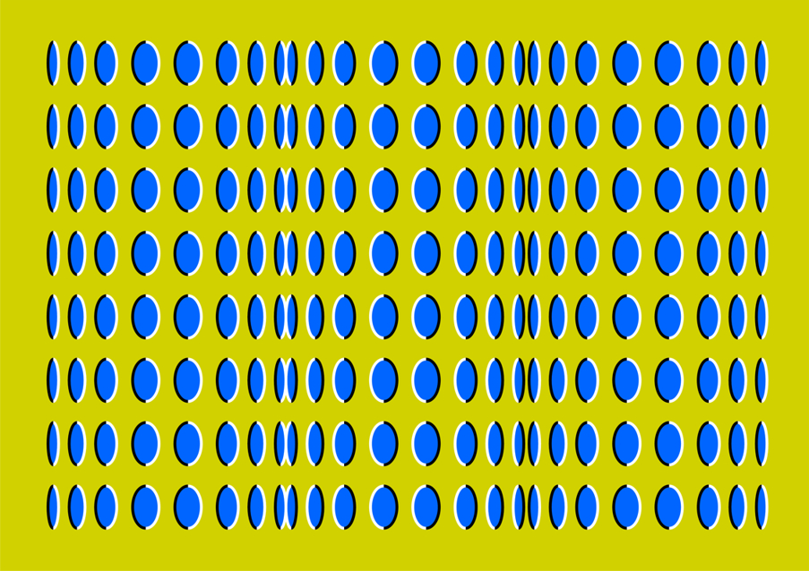
Yeah. I hate to be totally negative but this isn't working for me at all. The different slants and curved strokes in the original lowercase, and the second one of your new lowercases, mean that my eyes are forever being led in different directions. It reminds me of one of Akiyoshi Kitaoka's anomalous motion illusions.

3 -
One reason you're having difficulty with this typeface is that it's a difficult project. While imitating a centuries old style isn't the hardest thing in the world, you're trying to add you own creative twist to it. But what you're discovering, as I did when I started monkeying with history is that there are all these parts that interact with one another. When you change one part, the other parts don't work together properly. You end up trying to patch together a mix of old hardware and new hardware, perhaps without a full understanding of how those parts work. TypeDrawers readers brace yourself for another Larabie analogy. It's like you want to sketch an innovative car design but you're basing it on a horse and buggy. You're drawing a spoiler on the back of the buggy, a hood scoop on the horse's head and chrome spinners on the wheels. I'm not saying it's not possible to design an innovative horse and buggy but it helps to have years of experience and knowledge of horses and buggies as well as modern vehicles. It's not impossible but what you're trying to do is very difficult so expect it to take a long time. You'll need to do a lot of experimentation, research and testing.
@Simon Cozens
The image above made all the letters bounce around while I was typing. It reminded me of that gpos thread. 0
0 -
Well,
I suppose I've let this go before ironing out the kinks. In the end I did get a lot of inspiration from what you said Ray. Gave me new eyes to look at the work. I've been tinkering with typedesign for years, but this one is a new style for me.
It will take some time to digest. When I've reached a more finished form I hope you will look at it again.I'm willing to make a few adjustments for you directly.
Thanks for the offer Alex, but for now I will work through it alone. I'm feeling stubborn about some of the letters. I've learned through my years as a designer that my work looks very rough until I reach the finished goal. That's one reason I usually don't show my work-in-progress to people.0
Categories
- All Categories
- 46 Introductions
- 3.9K Typeface Design
- 489 Type Design Critiques
- 572 Type Design Software
- 1.1K Type Design Technique & Theory
- 663 Type Business
- 876 Font Technology
- 29 Punchcutting
- 530 Typography
- 121 Type Education
- 328 Type History
- 81 Type Resources
- 111 Lettering and Calligraphy
- 32 Lettering Critiques
- 79 Lettering Technique & Theory
- 561 Announcements
- 96 Events
- 116 Job Postings
- 169 Type Releases
- 179 Miscellaneous News
- 269 About TypeDrawers
- 53 TypeDrawers Announcements
- 114 Suggestions and Bug Reports


