Roijer

peggo (Pedro González)
Posts: 60
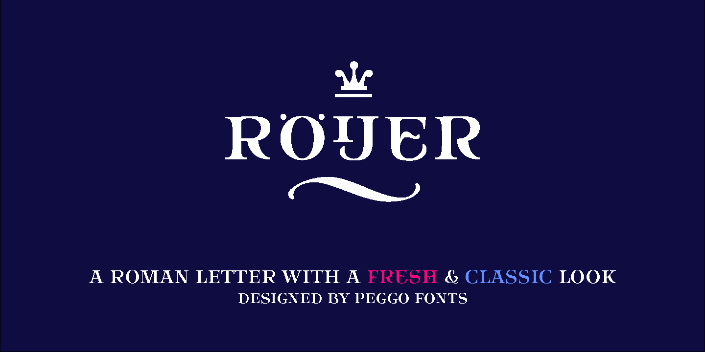
Finally I launched "Röijer" Family font a couple days ago via MyFonts: http://www.myfonts.com/fonts/peggo/roijer/
Which take about a year of work to finish on this first delivery part, which contain:


Which take about a year of work to finish on this first delivery part, which contain:
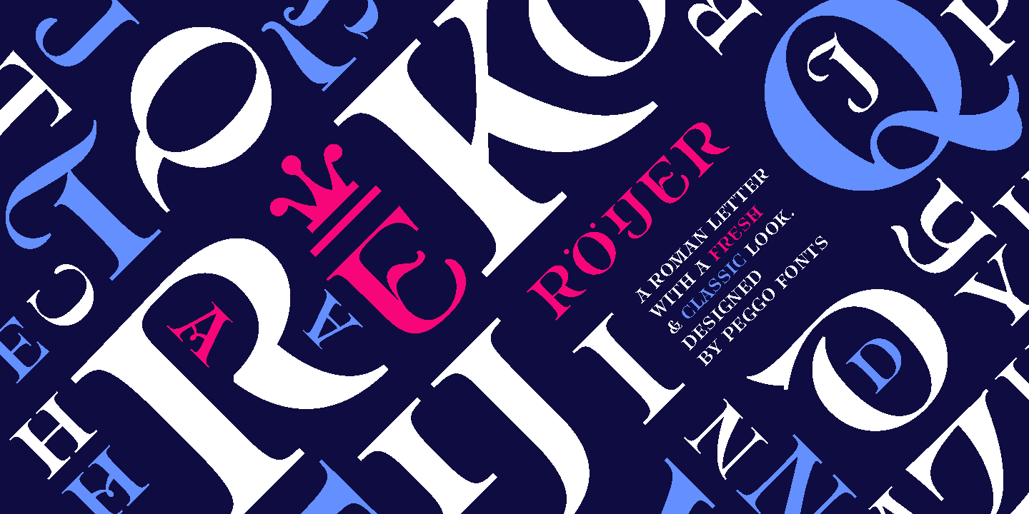
- "Roijer" a dual uppercase system, a classic on the lowercase box and an alternative model of each letter on uppercase box.
- "Roijer II" a volumetric version of the same design but with their own metric and Kerning adjustments, in order to offer a better typographic behavior on the surface where could be applied.
- "Roijer Ornaments" a complementary set that allows to extend designs up to labels and posters as every designer skill can.
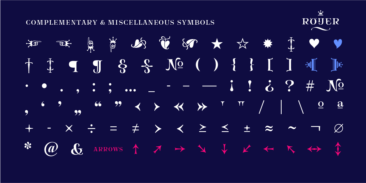
- "Roijer Dingbats" complete set of objects and symbols that follows the same graphic concept and visual style of the font.
“Röijer” started as a branding exercise for “Pierre Röijer” parfum brand, it was graphically developed thanks to the valuable help of designer Marcela Aguilera & me.
Is a dual capital model; a classic Roman and a fresh contemporary alternative (with a Lombardic and Art Nouveau touch), on each letter: the first one located on lowercase box which looks formal and sober, and the alternative one on the uppercase box.
Planned to be used branding design but also for titling, headline composition, label design, fashion and luxury stuff.
1
Categories
- All Categories
- 47 Introductions
- 4K Typeface Design
- 495 Type Design Critiques
- 577 Type Design Software
- 1.1K Type Design Technique & Theory
- 670 Type Business
- 884 Font Technology
- 29 Punchcutting
- 537 Typography
- 124 Type Education
- 332 Type History
- 81 Type Resources
- 113 Lettering and Calligraphy
- 33 Lettering Critiques
- 80 Lettering Technique & Theory
- 569 Announcements
- 100 Events
- 116 Job Postings
- 170 Type Releases
- 182 Miscellaneous News
- 270 About TypeDrawers
- 54 TypeDrawers Announcements
- 114 Suggestions and Bug Reports