Fun type draft

Ofir Shavit
Posts: 404
I have started this typeface yesterday, to clear up my mind a bit. At the beginning I thought about making only the upper case set but then decided to see how it goes with a relatively standard lower case set. I quite like it.
Any feedback welcome.
Any feedback welcome.
4
Comments
-
The lowercase could lead to just a mainstream font, but the uppercase exhibits a novel feature: centering on a line, instead of fitting within bounds. I would explore that.
1 -
Funny and interesting too. I like it a lot ! Please continue !
ivan
1 -
Cassandre already experimented centering on a line, but I didn't find back the picture of this unpublished alphabet.
1 -
-
Looks cool ! Only thing I notice is the lower h, m, n shoulders look a little out of place where they meet the vertical. reference b/p perhaps just looks a little high ...1
-
A lot to investigate here.Hrant H. Papazian said:The lowercase could lead to just a mainstream font, but the uppercase exhibits a novel feature: centering on a line, instead of fitting within bounds. I would explore that.
Few tests I made by your comment led me to something that looks like Arabbed English") (see attached file as well)
(see attached file as well)
Imagine this (with the UCs) as calligraphy!
Simon Dunford said:
Good point, thanks!... I notice is the lower h, m, n shoulders look a little out of place where they meet the vertical. reference b/p perhaps just looks a little high ...4 -
This is awesome.
1 -
It's surprisingly readable. I'm getting tripped up on the lowercase a. Would it still work without the mini descender?0
-
-
-
Very, very interesting. This /o reminds me of some Moscow Metro station fonts, but I think it should be mixed with the smaller /o and perhaps /c could be sometimes enlarged as well when not next to each other.
I wonder how Cyrillic will look when given your treatment.
0 -
I think the bigger o makes words that start with o look capitalized...it feels like the start of a new sentence. The new a is ace.2
-
Similar terrain has been explored by Marcus Leis Allion and Jonathan Barnbrok in Expletive Script Alternate.

4 -
I like the large o' too, it gives the text a jewellery appeal, but I guess people would like to read it too.Samuil Simonov said:Very, very interesting. This /o reminds me of some Moscow Metro station fonts, but I think it should be mixed with the smaller /o and perhaps /c could be sometimes enlarged as well when not next to each other.
I wonder how Cyrillic will look when given your treatment.
You're invited to test this treatment on Cyrillic script!
Made some more tests... Scaled up the LC size, maybe too much, and fixed the direction of the connecting extension of all LC to the right. Also fixed the orientation of the UC to the right and added some connection extension, but I think it damaged the all-caps appearance. Looks like it is inevitable to split them to two different fonts and create a LC set to the UC and vise versa.
The images and pdfs are from the most useful Impallari.com font testing site, Thanks!0 -
I'm loving it. Keep it coming!
So far, http://typedrawers.com/discussion/comment/25306/#Comment_25306 is the version I like the most.
In Verdi22, I think the lowercase is too big, and too connected.
2 -
Ok, thanks for all your helpful comments!
I have scaled down the LC, but only on the y axis and spaced up a bit, it might still be too wide.
Centred the punctuation and started working on the digits as well...
(Check the pdf too)

1 -
Switched the N'M' back backwards too.0
-
I’d try to use contextual alternates so that it’s not like some letters are always "down" and others always "up", but to get a nice alternating pattern. E.g. now the word "from" is completely made from "up" letters and it will look strange if it’s next to a word made of only "down" letters.3
-
@Jens Kutilek The o' (in 'from') is centred, and the only-down letters are u'v'w'y' which will rarely form a word, but alternates and contextual alternates will surely be useful here.
Final adjustments before leaving the typeface for a while... Enlarged the vertical size of c' e' s' and added a back slab to the r'. I think it is starting to take shape.
1 -
Got back to it today, added some slabs and tweaked a bit.
Now I'm testing the width of the counters, x-height and the relation to the vertical letters (e' c' s')
1 - Small x-height, e'c's' at x-height
2 - Larger x-height
3 - e'c's' larger than x-height
4 - wider counters
I like best 1 and 4
(Ignore the (lack of) hinting issues)


1 -
Can't believe I missed this thread until now. Great stuff!
 Particularly the caps.
In the LC, I feel like the /o should be wider (it looks vertically elongated right now), and some letters feel very preliminary to me (g; v–z; R). The /n/m stay away from the all-important midline a bit too long for my taste—perhaps make them narrower or allow them to dip through the midline a bit?
Have you tried a narrower solution for /a/b/g/d/p/q? I like the intermittent wideness of the LC, but maybe that would be better achieved with longer connecting strokes between letters.
As a longer-term goal, you might want to consider ligatures and contextual alternates to break up combinations that stay above or below the midline for too long.
1 -
Thanks Christian! I must say it's cute with narrower LC.
Later on I'll make a video to show you how easy and fast it is to make these modifications and tests with Fontak.
2 -
I like 4.
2 -
Scaling with Fontark is executed on the skeleton while the outlines are calculated and regenerated in real time, that means that the "stroke's" integrity never damages by scaling and proportions modifications, including optical corrections, contrast etc'. The inter connection of all glyphs, the flexible glyphs selection and multiple glyphs editing lets you focus on the design related issues.
Real time screen capture...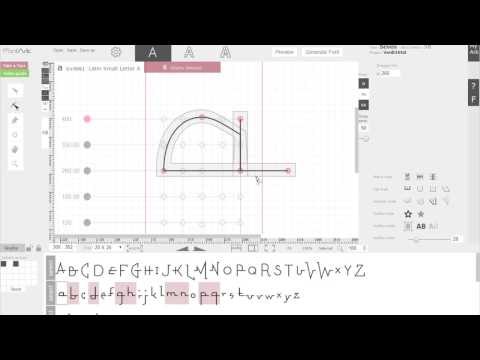 https://youtu.be/1v31ojOD5Nc
2 -
Should the Thorn be designed according to the Pp, or in case of an extreme design be defined as a self standing letter form?

0 -
Diverge.0
-
-
Yes.1
-
Thanks!0
-


Categories
- All Categories
- 47 Introductions
- 4K Typeface Design
- 495 Type Design Critiques
- 577 Type Design Software
- 1.1K Type Design Technique & Theory
- 670 Type Business
- 885 Font Technology
- 29 Punchcutting
- 539 Typography
- 125 Type Education
- 333 Type History
- 81 Type Resources
- 113 Lettering and Calligraphy
- 33 Lettering Critiques
- 80 Lettering Technique & Theory
- 569 Announcements
- 100 Events
- 116 Job Postings
- 170 Type Releases
- 182 Miscellaneous News
- 270 About TypeDrawers
- 54 TypeDrawers Announcements
- 114 Suggestions and Bug Reports