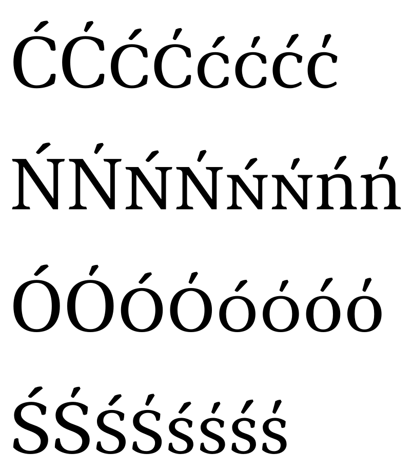
How do I use kreska accents?

Martin Silvertant
Posts: 166
I want to do some Polish typography, but I can't get the kreska accents to appear. I normally add a localized language feature to my own typefaces to replace acute with kreska when Polish is selected, but I have checked several typefaces from Google Fonts and can't find kreska characters in any of them.
How do I use kreska accents? And is it correct that typefaces like Open Sans, Lato and Noto feature no kreska characters? What are some typefaces that do?
How do I use kreska accents? And is it correct that typefaces like Open Sans, Lato and Noto feature no kreska characters? What are some typefaces that do?
0
Comments
-
Could you show the OT code you are using?
The procedure is:
1. To add precomposed alternative glyphs with kreska replacing acute.
2. To add substitutions in <locl> feature.
Support for kreska seems to be quite rare until now. With the OT features available for so many years, it is a shame not to see wider and correct support for Polish.
A sample:
1 -
Sorry, I think I wasn't clear. I'm not working on a typeface right now. Implementing a locl feature works fine for me.
I'm wondering how I use the kreska characters of other typefaces, or if perhaps it's just not supported by most typefaces. I saw an image of Georgia with kreska accents, but they were absent in my versions of Georgia.
And what about Noto? With such extensive language support, I would have thought it adequately supported Polish characters. Can people really claim to have Polish language support while not adding kreska characters?
0 -
I've never seen a typeface featuring the kreska. (Not to say that I've seen much of anything).
I think it's kind of not a big deal, especially with fonts that include acutes that are not too horizontal. And even if so, not only a random Polish person, but sadly, the majority of our designers, probably wouldn't tell the difference. Bluntly saying.
The real problem is companies like MS selling their products with incomplete fonts - 90% of the fonts included with the Office lacks even basic diacritics, I guess that MS just already was a licensee of the basic versions of the fonts but not the extended ones...1 -
If a designer expands the set of one of these 90% for commercial use, like design materials for a client (but does not sell the font), can that land them in trouble?
Also, 99% of books here are set in Times New (yeah, it's pretty dull). I never heard of a publishing house buying the font. Isn't that, technically, illegal?0 -
@Vasil Stanev: Times New Roman is bundled with Mac and Windows operating systems, so very few people need to license it.
@Martin Silvertant: Many otherwise very competent type designers do not routinely include different versions of their acute accents for Polish. Pretty much all Adobe fonts released or revised in the past 15+ years, which have CE support, also have this feature.
2 -
Adam Jagosz said:I've never seen a typeface featuring the kreska. (Not to say that I've seen much of anything).
Most of my typefaces have it. It's one of the features the Glyphs tutorials recommend for any typeface.
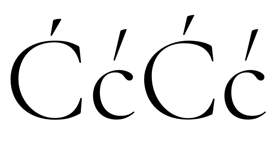
Cormorant:
 2
2 -
@Christian Thalmann
Wow, I like it how the (lowercase) kreska in Cormorant isn't meek and muffled as it is in the image in the first comment (I always prefer accents that are a part of the glyph and not just a minor addition), but isn't the height too radical, especially compared to the capital?
... Okay, seeing that in context (the high ascent) explains a lot.
I see you used one design for lowercase acute and kreska. Now I feel the cap kreska is a little bit intimidated. Couldn't it be a little more slanted? As I look at the lower and uppercase, I get the impression the cap is more upright.0 -
The capital kreska is mostly so timid because I wanted it to fit into the very limited vertical space that Garamonds typically reserve for capital accents. However, based on your feedback, I've now slanted it a bit more to match the slant of the lowercase kreska (which is identical to the lowercase acute).
Note that there is also the stylistic set SS13 that makes the flattened capital accents taller and therefore more harmonious with the lowercase. This is particularly useful for languages where accented letters appear often and across case boundaries: 1
1 -
I’ve seen the kreska overlap the base letter, in display settings.
Was this just a kludge, as per this example (which I’m assuming is Letraset), or does it belong to a more authentic tradition (even one of traditional kludging)? 2
2 -
Hey, Christian, each time I see one of those Cormorant samples popping out in the wild, I’m amazed just what a sleek and cheerful piece of design it is. That lowercase kreska of yours looks fantastic!4
-
Hi Grzegorz,
glad you like it! What do you mean with Cormorant samples in the wild? Do you know any live usages of the fonts? I'd love to see them one day...!
BTW, I did not design a lowercase kreska, it's really just the style of lowercase accents in general that happens to fit with the slant requirements for a kreska. 0
0 -
It’s funny because, as Adam said, most Poles probably wouldn’t tell the difference between an acute accent and the kreska no matter how steep the angle. Yet for those of us with an eye trained in one way or another, Cormorant’s steep and pronounced design somehow feels spot on. I wonder if this preference has its roots in handwriting. I mean, I’ve been taught to write kreska top to bottom, the standard practice in Poland. This seems most natural with a more upright stroke, and with no need to differentiate an acute from the grave one can even make it straight-down vertical. But of course, if you wanted it more horizontally inclined, the stroke would be hard to write this way and, at some point, it might become awkward to even look at. But it’s just my quick hypothesis, so don’t quote me on that.
Christian, I don’t remember seeing Cormorant being used on the Web so far, but it’s not the first time I see it here on the forum, and I’ve never had this opportunity for a proper shout-out. Until now, that is. From what I recall it has some decent ogoneks as well. Keep up the good work!2 -
I even dare say some Poles can't tell the difference between a regular kreska and one slanted the opposite direction, like the grave accent. Especially in handwriting. Okay, maybe that sounded too blaming. As a matter of fact, since Polish doesn't use any grave accents, the direction doesn't really matter. So in handwriting, any stroke, vertical, diagonal - left or right, horizontal, makes for a legible kreska. It's not uncommon to see right slanted kreskas in rapid writing.
It remains a fact that in print a more inclined kreska...
Grzegorz Rolek said:
@Nick Shinnsomehow feels spot on.
I don't feel qualified to answer that, but I recall seeing that kreska crossing the base letter many times. You might call it a traditional kludge, as it would often be used whenever the space is insufficient, possibly beside a strikethrough Ż (Z dot). I'm not quite sure however whether it's much of a cultivated tradition — such design brings to my mind old printing. Especially that ogoneks were also once (like in 1700s) straight strokes crossing the base letters.
2 -
I know I saw it in a font recently, as I checked the code to use in my own work. But now I can't find one example. I was sure it was Antykwa Poltawskiego, but I just opened it and find I was wrong.0
-
There are a number of non-standard kreska solutions in the Fancy Diacritics pool:
Attached to O, exterior (plaque)
Attached to O, interior (museum portal)
Crossing O, almost vertical (signwriting)
Crossing O, diagonal (signwriting)
Crossing O, diagonal (station sign)
Attached to right of S, like a vertical serif (signwriting)
Attached to Z, almost vertical (signwriting)
Integrated in N, left-leaning (plaque)
Integrated in N, left-leaning (plaque)
Integrated in N, left-leaning (street sign)
Note that all the examples are in all-caps.
3
Categories
- All Categories
- 46 Introductions
- 3.9K Typeface Design
- 489 Type Design Critiques
- 572 Type Design Software
- 1.1K Type Design Technique & Theory
- 663 Type Business
- 876 Font Technology
- 29 Punchcutting
- 530 Typography
- 121 Type Education
- 328 Type History
- 81 Type Resources
- 111 Lettering and Calligraphy
- 32 Lettering Critiques
- 79 Lettering Technique & Theory
- 561 Announcements
- 96 Events
- 116 Job Postings
- 169 Type Releases
- 179 Miscellaneous News
- 269 About TypeDrawers
- 53 TypeDrawers Announcements
- 114 Suggestions and Bug Reports


