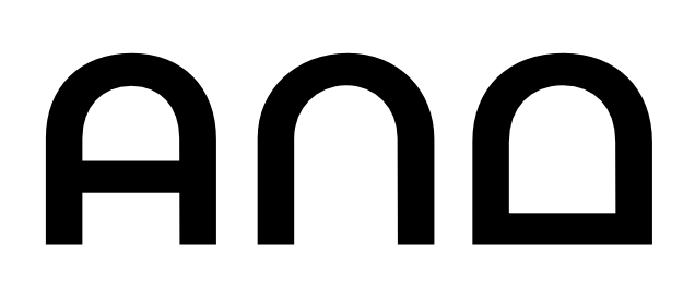
The Humpty A

Ray Larabie
Posts: 1,487
All right! Stop whatcha doin', cause I'm about to ruin the image and the style that ya used to. In a display typeface, if my A is of the humpty variety, what should I do with my Alpha, Lambda and Delta? Can they be humpty too? Extra points for rhyming.


Tagged:
1
Comments
-
I think they must stay somehow triangular to be understood as Lambda and Delta, maybe just round a bit the top corners, keep the bases angular with the slabs.
4 -
I would say no, based on Parachute’s Bague Round. Panos Vassiliou breaks a lot of the “proper” conventions in his designs, but not here.5
-
Ray it looks like you'll have to keep those in the... digital underground. :-Þ
 https://www.youtube.com/watch?v=y38Ec57yMG8
But I like Ofir's suggestion a lot.
2 -
I spent a month in Greece last summer, and I did see rounded Lambdas here and there (at first I mistook them for Pis). I don't recall seeing rounded Deltas, though.4
-
Rounded Lambdas look too much like Omegas.4
-
Lambda Lambda Lambda2
-
In mine own typeface, Quinoa Round,
I trod on this uncharted ground,
not knowing whether it would feed
a Greek typographer's fair need.
No actual use I have yet known,
though if some sample you should own,
I would be keen to be so told.
Your word shall be weighed up in gold.
7 -
I hope you don't feel your creativity is strangled
But my sense is those letters should be triangled.7 -
The t, as writ in lower case,
with quick an outstroke it doth chase
the letter that doth follow next.
I wonder who first drafted text
in which the t stands like a pole.
No doubt some nincompoopish troll
then called it travesty, or worse:
impossible to read in verse.
Yet nowadays with pride we count
Futura as a splendid fount
that child and sage alike can read
with comfort and unhampered speed.
If we applied this spirit bold,
a kindred story might be told
about our fetching domed designs
for these precise Hellenic signs.
6 -
Apparently the video linked above is no longer procurable. Obviously this desecration of the record cannot be allowed to stand, not least as it renders the double-entendre unintelligible. Hence:Ray it looks like you'll have to keep those in the... digital underground. :-Þ https://www.youtube.com/watch?v=msrq0HjwJUM
As you were.2
Categories
- All Categories
- 46 Introductions
- 3.9K Typeface Design
- 489 Type Design Critiques
- 572 Type Design Software
- 1.1K Type Design Technique & Theory
- 663 Type Business
- 875 Font Technology
- 29 Punchcutting
- 530 Typography
- 121 Type Education
- 328 Type History
- 81 Type Resources
- 111 Lettering and Calligraphy
- 32 Lettering Critiques
- 79 Lettering Technique & Theory
- 561 Announcements
- 96 Events
- 116 Job Postings
- 169 Type Releases
- 179 Miscellaneous News
- 269 About TypeDrawers
- 53 TypeDrawers Announcements
- 114 Suggestions and Bug Reports


