

Oldstyle currencies?

Jasper de Waard
Posts: 655
I know that a lot of typedesigners include down-sized currency symbols to work with the oldstyle numerals, but it always looks a bit odd to me. I feel like it makes sense from a typedesigner's perspective, but it's maybe too unusual for people to actually use it. Do you include them? Do you have examples where it does work?
FS Brabo is one of my favourites, but this £ isn't really working for me. It just seems awkwardly small:

FS Brabo is one of my favourites, but this £ isn't really working for me. It just seems awkwardly small:
0
Comments
-
Cap-sized currencies definitely look weird around x-high OSFs, though. I used to draw x-high currencies for OSFs, but that looked weird as well. These days, I make them at small-cap height.2
-
Interesting compromise, but it still looks weirdly small to me. Could you show an example at cap height? To me, these look fine:

0 -
It doesn't work so well with a lower x-height, especially when the number after the currency is really small:

I agree my current solution looks rather tiny. I might have to adopt something like (x-height + ascender)/2.
0 -
I think the tall version looks good, since the 6 and 8 have (I expect) roughly the same height. but others might disagree. In any case, there's little use for making a formula like that. Just do as your eyes tell you!0
-
I like how it is in Source Serif Pro, that works with both lining and oldstyle figures so you don't need to change currencies.0
-
I include them in <c2sc>.
The only characters I put in <smcp> are lower case letters.
I’m quite partial to the fully extended, “thorny” sterling, cf Baskerville—how British is that?!—; here in Oneleigh I designed separate Sterling and figures for each of <case>, default (incl. <smcp>), and <c2sc> (All Small Caps):
 4
4 -
-
@Nick Shinn Those are nice examples! But, can I deduce from this that you don't differ the currencies between oldstyle and lining?0
-
Hmmm, I'm beginning to warm up for that cap-sized £ among the OSF. I might ban my tiny version to C2SC, then, as Nick does.
BTW, that flamboyant supertall £ is quite a sight! I don't think I could pull it off in my current fonts, though.
Oh, and Nick, I've always wondered — how do you pronounce Oneleigh? I tend toward [ˈwʌnˌleɪ] in my head...
0 -
BTW, that flamboyant supertall £ is quite a sight!
I love the second one, big, also for all caps and small caps. Rotate your screen, it's a J from the italic font, as practiced in hot metal, it saves time and explains the below baseline position.
5 -
I have no idea how Oneleigh is supposed to be pronounced, I found the name (of an ancient house) in a short story written by the Irish author Lord Dunsany in the early 20th century.0
-
on-eh-ly I believe.0
-
Something like O’Nelly, then? Aha! Mystery solved!
0 -
-
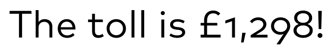
How does it look when it's followed by 8 or 6?0
-
-
If “gh” is pronounced as in “cough”, it could be One Life.0
-
@Christian -- More like "on a lee".
0 -
One Lay.0
-
So [ˌɔnəˈliː]?George Thomas said:@Christian -- More like "on a lee".
0


Categories
- All Categories
- 47 Introductions
- 4K Typeface Design
- 495 Type Design Critiques
- 577 Type Design Software
- 1.1K Type Design Technique & Theory
- 671 Type Business
- 885 Font Technology
- 29 Punchcutting
- 539 Typography
- 125 Type Education
- 333 Type History
- 81 Type Resources
- 113 Lettering and Calligraphy
- 33 Lettering Critiques
- 80 Lettering Technique & Theory
- 569 Announcements
- 100 Events
- 116 Job Postings
- 170 Type Releases
- 182 Miscellaneous News
- 270 About TypeDrawers
- 54 TypeDrawers Announcements
- 114 Suggestions and Bug Reports