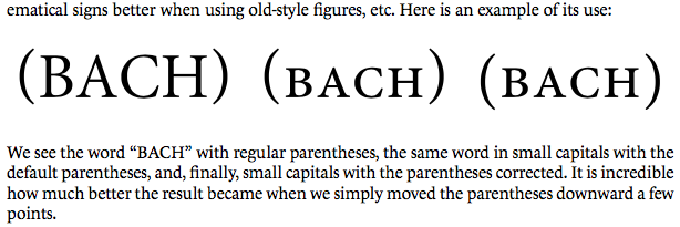
Dropped small-caps parens
Simon Cozens
Posts: 833
In Yannis Haralambous' Fonts and Encodings, he gives an example of an OpenType single adjustment positioning:

It's pedagogically a very neat example of how GPOS and OT features work: you put a simple positioning rule inside a feature (
But has this (or anything like it) been seen in fonts in the wild? Does it even make typographic sense?

It's pedagogically a very neat example of how GPOS and OT features work: you put a simple positioning rule inside a feature (
smcp); turn on the feature and the parentheses drop down vertically.But has this (or anything like it) been seen in fonts in the wild? Does it even make typographic sense?
0
Comments
-
I know a lot of people reposition* this stuff for the CASE feature, so why not here?
*some even sub in alternate designs fit for each alphabet0 -
The issue I’ve run into when using GPOS for things like this is that some extra-font rendering elements end up inheriting the re-positioning.
The classic example is the underlining in InDesign.
Granted, underlining in InDesign sounds so faux pas. But I do know some publications that use this feature to create a text highlight style in print, so it’s not as unusual as some might think.
In this demo, my font is testing the possible use of GPOS to reposition the Catalan middot (instead of having a separate periodcentered.CAT glyph and using substitution; see also this discussion.). You can see what happens:
The same would happen for {smcp} punctuation in the case you cite. Unfortunately.
The GPOS approach is technically sound. But the implementation in the wild may not be.
I don't believe I ever tested Web environments. Perhaps they are more accommodating.
5 -
What Alvaro said. The image in the OP is odd. Default parentheses usually centre vertically on the small caps, close to x-height centre, so the special case is <case>.3
-
I prefer to create separate smaller and lower parens as part of <case> instead of repositioning. To me the size also created a mismatch.3
-
I tend to put the resized parentheses into C2SC, since mixed-case small caps would look weird with short parentheses:

Pity this doesn't seem to work with Apple's typography panel. I can select «Lower Case > Small capitals» and «Upper Case > Small capitals», but the punctuation does not seem to be affected. But that's just one of many things that don't work as advertised with that typography panel (at least in Keynote).
3
Categories
- All Categories
- 46 Introductions
- 3.9K Typeface Design
- 489 Type Design Critiques
- 572 Type Design Software
- 1.1K Type Design Technique & Theory
- 663 Type Business
- 877 Font Technology
- 29 Punchcutting
- 530 Typography
- 121 Type Education
- 328 Type History
- 81 Type Resources
- 111 Lettering and Calligraphy
- 32 Lettering Critiques
- 79 Lettering Technique & Theory
- 561 Announcements
- 96 Events
- 116 Job Postings
- 169 Type Releases
- 179 Miscellaneous News
- 269 About TypeDrawers
- 53 TypeDrawers Announcements
- 114 Suggestions and Bug Reports


