Denser Segmented Alphanumeric Displays

Nihar Mazumdar
Posts: 2
I have always been interested in the complex alphanumeric displays that are commonly found on older electronic devices, and I have been wanting to take it a step further, and create an in-between ground from the 14/16 segment displays and the dot matrix display.


I have designed three alphanumeric displays that will slot between the 16 and the dot. Since the 14/16 are usually referred to as "starburst" displays, I have called mine "Nova, Supernova, and Hypernova respectively."
Nova: Has three diagonals in each corner. It has twenty-three segments in all.
Supernova: Has five diagonals in each corner. It has thirty-three segments in all.
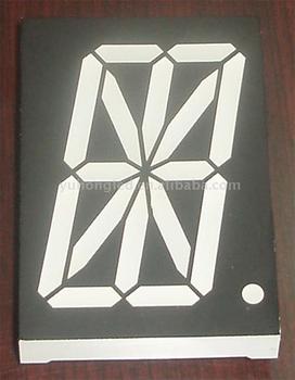
Hypernova: Has seven diagonals in each corner. It has forty-one segments in all. Forty-five with the side segments cut.
All three have a central dot.
More segments make more characters possible, and especially more characters utilizing the lower half of the display.
I have tried several times to submit these fonts to MyFonts but they won't take it even though they have several fonts of the same genre (7's and 14's). The font board has told me my font is illegible and has spacing issues. How do I fix my font to make it look professional and get accepted?
The fonts are available for download on Font Space and 1001 Fonts.

http://www.fontspace.com/nihar-mazumdar
http://1930.1001fonts.com
I have designed three alphanumeric displays that will slot between the 16 and the dot. Since the 14/16 are usually referred to as "starburst" displays, I have called mine "Nova, Supernova, and Hypernova respectively."
Nova: Has three diagonals in each corner. It has twenty-three segments in all.
Supernova: Has five diagonals in each corner. It has thirty-three segments in all.
Hypernova: Has seven diagonals in each corner. It has forty-one segments in all. Forty-five with the side segments cut.
All three have a central dot.
More segments make more characters possible, and especially more characters utilizing the lower half of the display.
I have tried several times to submit these fonts to MyFonts but they won't take it even though they have several fonts of the same genre (7's and 14's). The font board has told me my font is illegible and has spacing issues. How do I fix my font to make it look professional and get accepted?
The fonts are available for download on Font Space and 1001 Fonts.
http://www.fontspace.com/nihar-mazumdar
http://1930.1001fonts.com
Tagged:
0
Comments
-
Maybe the concept, interpreted literally, just entails too many weight and spacing issues to work.
But maybe you can fudge it, creating a design that suggests this type of display without being overly restricted by its rules.
Think of ITC American Typewriter, which evokes typewritten letters but doesn't bother being monospaced.0 -
...but they won't take it even though they have several fonts of the same genre...That's the point. MyFonts already has plenty of hard-to-read segmented LED fonts and you're asking them to host even-harder-to-read segmented LED fonts.
Also consider: MyFonts didn't always have much of a review system. That's pretty new. It's possible that some of those fonts wouldn't be accepted if they were submitted today.
It's a worthwhile experiment but you're asking MyFonts to host it in the hopes that it'll sell. I think this is an idea that would suit more experimental channels. If you focus on legibility and create something that wouldn't be technically feasible, maybe they'd consider it. But even so, they have a lot of those already. Think about the designer choosing an LCD font. What can you offer that's not already being offered.
3 -
Ok. Thank you for using my comment against me. I'll just give up. Thank you.0
-
The first thing you should do is try to make all stems even in weight.
The thin diagonals and vertical centre stem are the biggest impediment to legibility, and are an aesthetic issue too.
Why not try making all the stems thin, to create a Light or Extra Light typeface?
For the lower case, consider Hobo as a suitable descender-less model.
Or perhaps configure the matrix to allow very short descenders, as in e.g. Advertiser’s Gothic.
Bear in mind that the only really necessary diagonal for the Latin alphabet is for V and v.
Try and make your matrix conform to the alphabet, not vice versa.1


Categories
- All Categories
- 47 Introductions
- 4K Typeface Design
- 495 Type Design Critiques
- 577 Type Design Software
- 1.1K Type Design Technique & Theory
- 670 Type Business
- 885 Font Technology
- 29 Punchcutting
- 539 Typography
- 125 Type Education
- 333 Type History
- 81 Type Resources
- 113 Lettering and Calligraphy
- 33 Lettering Critiques
- 80 Lettering Technique & Theory
- 569 Announcements
- 100 Events
- 116 Job Postings
- 170 Type Releases
- 182 Miscellaneous News
- 270 About TypeDrawers
- 54 TypeDrawers Announcements
- 114 Suggestions and Bug Reports