Aprikos – Display sans-serif

I've dabbled in type design before but this year I decided to take it more seriously and started reading up alot on all aspects type design. So this is one of my first typefaces that I am proud of and happy to show.
Let's get to it: during the summer I started designing a friendly display typeface that currently go by the name Aprikos (Swedish for apricot). I've come pretty far as glyphs and features go but I haven't showed it to anyone yet so I would love to get some feedback on design, features and kerning. Kerning/spacing is something I've struggled with but I feel that it's currently at a good place.
I'm happy with any comment or critique I can get. I have attach a few png's and the pdf based on the Sample Proof template. If there's anything specific that you think I haven't shown properly I gladly provide more samples.
Thank you!


Comments
-
The flared + rounded thing is pretty cool — I could definitely imagine myself using this.
Good that you have an alternate /g. The Hobo-style one is fun, but probably a dealbreaker for some people.
Are you planning more weights?
0 -
Thanks Austin.
Yeah, I can understand that the some might think that the hobo-like /g stands out too much, hence the alternate.
I haven't thought about more weights yet but that is definitely a possibility if the first version is well received.0 -
I like this a lot! It's easier to judge with more running text, though in both mixed and allcaps setting. Some feedback:
I think the K could be widerL narrower
M is a little dark. Try narrowing (and making taller) the apex
The part of Q's tail that's n the inside could be a little lighter
R's leg could be slanted more
S is leaning backward a little
I really like the almost vertical endings in e and 'a', but they are rather isolated. Try to incorporate them in other glyphs as well.
The bowl of 'a' might be a little too wide, although I like the feel.
r is quite wide
Supercool g, although I think it would make more sense to make the funky one the alternative version.
bottom of t extends too far to the right
The oldstyle numerals seem a little wide.
The comma could be taller
0 -
Should the curve of the J be a little squarer, a la C?0
-
Nice and unusual sort of vertical wavy effects ! I like its smoothness.
0 -
Quite charming! Name fits well.
The top of /a feels a bit cramped, especially on a phone screen. Perhaps lighten the arm a bit?
0 -
@Jasper de Waard: Thanks a lot for the detailed commentary. I will go back and examine all the points that you brought up.
- M: I struggled with /M and it already has some visual compensation with the tapered stems and narrower diagonals, but I'll go back and have another look at it.
- Q: Yeah, you're right. It shows al ot more in smaller sizes.
- S & R: good points.
- a & e: Yeah I was thinking about it at one point and couldn't decide which way to go. I should give it another try. Probably try on /c /t and maybe /z to be consistent with some sort of angled broad pen reference.
- Bowl of /a: I like the sort of lazy look, fat belly, but maybe it doesn't full match the other glyphs.
- r: I give it a look.
- g/alternate: Yeah, I think I will have to consider that
")
- t: I try to make a narrower bottom and see how it feels
@ivan louette: Thanks!
@Christian Thalmann: Thanks! Yeah, I see what you mean. But I'll give a lighter arm a try on the /a.
0 -
The square upper right shoulder of the /a feels really unharmonious especially near an /e or /s since these have smoother, curved strokes. Ditto on the terminal endings of a & e, maybe they could match more with the more angular /s terminals.1
-
@Jasper de Waard @Michael Jarboe @Christian Thalmann
I worked some with the terminal ending making the more similar to each other (red is new). I agree that the hard stroke curve of /a was standing out so i softened it a little but tried not to take away to much of its character. Also pulled in the bowl some.


Also did changes to the some of the capital letters + /r. Some changes bigger than others.


And here's the basic set of characters:
 1
1 -
-
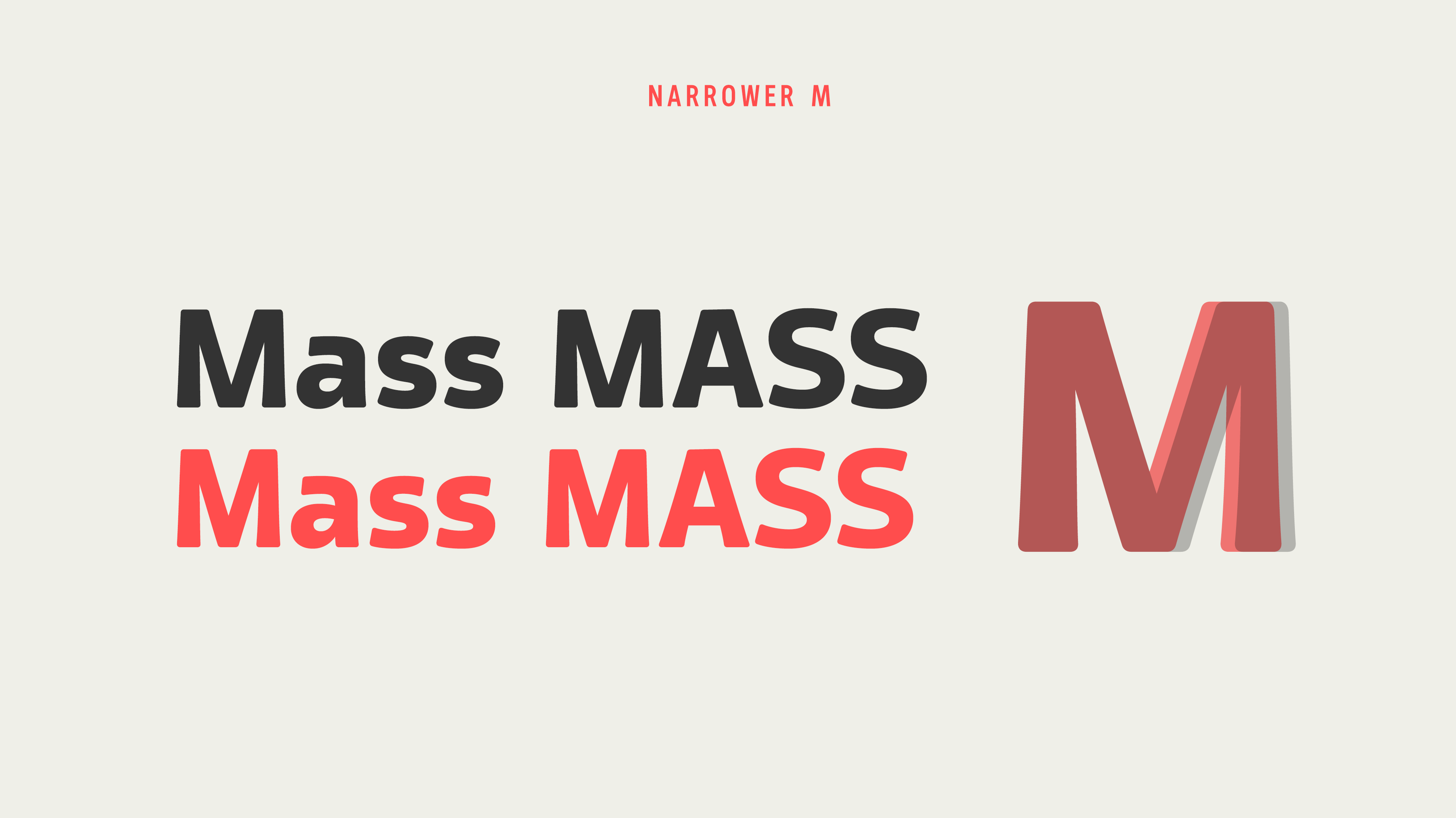
Looking better! I think the M could be wider, though, but keep the apex as it is. So the diagonals will be slanted a bit more. Also, I think it would make sense to apply the same sort of terminals to the caps as well. The s is slightly out of balance now. It looks like it is slanted vertically (if that makes any sense), which makes it fall backwards.
ebdpq could be a little wider.
Those images look nice, but I don't think they are necessary for the folks on typedrawers. A pdf with lots of text and maybe one image for a quick glance should suffice.
Lastly, I do believe this deserves to get some extra weights!0 -
@Jasper de Waard
Thanks again! I will take another look at all the glyphs you mentioned. The /M might have gone to narrow now like you say, leaving it more cramped than before.
And sure, I will cut down on the styled images in the future and post a pdf with more text.
More weights would be fun to do, indeed 0 -
I have now widened the /M while keeping the apex the same. /C got the same terminals as /c and /a to be more consistent. Widened /C a little too.
/e is now slightly wider, as well as /d/b/q/p. 0
0 -
Those curved terminal strokess of /C/G/S seem too light to me.0
-
Yeah I see what you mean about /C/G/S. Made them slightly heavier. Now /C/G/S/O all have the same horizontal thickness. /C could possibly need adjusted a tiny bit more, since it's so open it looks thinner then the others, or is it just me?

0 -
No, not just you, amount of surrounding white space will definitely impact perceived darkness, so ignore the math and trust your eye.0
-
@Jasper de Waard said:
Went back to the old style numerals and adjusted the size of some of the glyphs. After looking at some other typefaces I also shrunk the decenders and accenders.The oldstyle numerals seem a little wide.

Since people talked about more weights I started working on a thin weight with MM in mind, but a real proof on that when I have more glyphs i place.
2 -
That light looks promising! But mind your joints, they look a bit thick, though that may be intentional.1
-
@Jasper de Waard Thanks!
Not sure exactly what you are referring to. Do you mean in the thin version at the end of the strokes?0 -
I mean where strokes (like the bowl of d) join other strokes (like the stem of d), in the thin weight.0
-
@Jasper de Waard ah, of course. I thought the strokes were thin enough to warrant almost no visual compensations in the joints but I guess I should give it another look as well as some test prints.
0 -

It's been a while. I have now worked out the full thin weight with interpolation set up. Now I want to redo the whole spacing, removed all the kerning I had done on the bold weight. I've given HT LetterSpacer a go tweaking it's parameters to make things look right.So my main concerns right now are:- Spacing: I want the bold weight set pretty tight but loosening it as the strokes get thinner. Does it look good? Is the thin weight too spaced out compared to the bold weight?
- Thin weight: I feel pretty confident in how the letters transform from bild/thin. Are there anything that stands out?
@Jasper de Waard: You mentioned the joins last time. I've done very minor adjustments to the joins but looking at them now it might not have been enough to make a big difference, if even noticeable at all. I will probably go back to that again.
I appreciate any thoughts or feedback you care to share with me.
Thanks!0 -
Yes, I think the joints could still use some thinning. The spine of the light s looks a little too thick and too squarish. Spacing of s could be more generous in regular and light weight. The comma looks too short, especially in lighter weights. The black r looks wide compared to the lighter r.
The g could use more space on the left. Actually, I think all rounds could use some more space. Black 'a' needs more space on the left.
You're starting to get there! But it's too early for kerning. Perfecting the spacing takes time, but it will also save time when kerning.0 -
Btw, I really dig some of your typerobics exercises! Particularly the firelli one stands out to me!
On topic: The angle of the terminal in 'a' and 'e' works really nicely. Have you thought about reversing the angle of the terminal in other letters? f g j s and y all seem like they could make it work to me.0 -
@Jasper de Waard
Thanks alot for the comments!- Back to joins I will go.
- Spine of /s, do you mean mid-spine or the vertical ends of the spine?
- The comma is definitely indeed to short.
- Agree that /r does feel narrower in the light. I like the feel/width in the bold so will probably widen the light /r.
- Regarding spacing of /g,/a and the round shapes: I'll try to adjust the HT LetterSpacer parameters to fix that and see how it feels. If I can't I'll adjust some things manually. Did you mean in both light and bold?
- Angles of /a and /e: The idea/reason behind the reversed angles in those glyphs is supposed to be related to the effects of an angled broad-nib or brushstroke. That's why /f,/j,/g and /y terminals end more straight along the angle of the pen and stroke. Thats the rationale at least.
0 -
- The joints thing is subtle, it only occurs very closely to the joint itself, so I think you should change the curvature a bit.
- I mean the mid-spine, although of course they are related.
- Spacing: light seems okay. The problem is definitely biggest in the bold.
- I understand the rationale, but a rationale is only a rationale. I'm not saying you should abandon it, but I would suggest that you at least give non-calligraphic terminals a try. Then make up your mind. To me, a lot of the terminals right now look a little bit too bland, lacking in tension. Look at Mallory, for instance, which pulls off exactly what I mean very nicely:
You could even try a similar thing in the s, leaving the top as is, and adjusting the bottom.0 -
Jasper: Argh, no, the world doesn't need another Johnston.

1 -
@Jasper de Waard
Thanks for the clarifications. Regarding the rationale I ca admit that it might just be a disguised personal choice/taste. Will have to think about it.
I've focused my effort to the spacing of the bold weight and put the other things aside for now. Here's my latest effort in setting the spacing.
I increased the sidebearings for the rounder shapes by decreasing the depth parameter( 16 -> 8) and area parameter a little (310->300)
Check pdf for more examples.
0 -
That's better. In 'example', the p looks good, but the g in 'single' still looks too tight, which seems odd to me. Are the sidebearings in g and d the same?
And by the way, personal taste is a perfectly good reason for such a design decision.0 -
@Jasper de Waard
They are the same but LSB of /l is different from RSB of /n. So yes space is tighter between /n/g than /p/l. Maybe the depth parameter needs a very slight decrease.
Here's a quick preview of those pairs, unchanged from last proof:
0


Categories
- All Categories
- 47 Introductions
- 4K Typeface Design
- 495 Type Design Critiques
- 577 Type Design Software
- 1.1K Type Design Technique & Theory
- 670 Type Business
- 884 Font Technology
- 29 Punchcutting
- 538 Typography
- 125 Type Education
- 332 Type History
- 81 Type Resources
- 113 Lettering and Calligraphy
- 33 Lettering Critiques
- 80 Lettering Technique & Theory
- 569 Announcements
- 100 Events
- 116 Job Postings
- 170 Type Releases
- 182 Miscellaneous News
- 270 About TypeDrawers
- 54 TypeDrawers Announcements
- 114 Suggestions and Bug Reports