Type Trailer for Samsung One - what others?
Dave Crossland
Posts: 1,527
 https://www.youtube.com/watch?v=3XlB-n2qLzk
Just saw this... I've been seeing more and more type trailers... what other classics are there?
3
Comments
-
These next ones done for France Culture are a classic. Not trailers for new fonts ; only charming little presentation pieces with noticeable errors or approximations (like the one which considers the nice Matthew Carter's Auriol as a text font while it is designed after a titling optical size of the original).
4 -
This one goes on way too long.0
-
how about
How Morisawa Font Products are created.
3 -
5
-
A couple with Dalton Maag typefaces:
Intel Clear https://www.youtube.com/watch?v=gPdZxsL3Flw
Lush https://www.youtube.com/watch?v=fTR_DmUiJHI
Other’s typefaces:
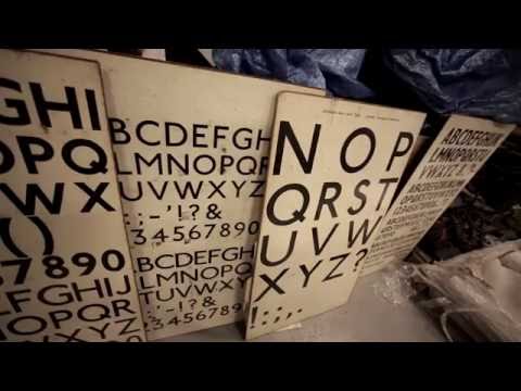
Johnston 100 https://www.youtube.com/watch?v=BKd-SZl5hl0
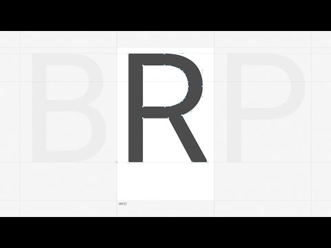
Roboto https://www.youtube.com/watch?v=6WxACOHm0_g
Slightly off topic:
Ubuntu https://www.youtube.com/watch?v=BG-Q7hTKCws
2
Categories
- All Categories
- 46 Introductions
- 3.9K Typeface Design
- 489 Type Design Critiques
- 572 Type Design Software
- 1.1K Type Design Technique & Theory
- 663 Type Business
- 875 Font Technology
- 29 Punchcutting
- 530 Typography
- 121 Type Education
- 328 Type History
- 81 Type Resources
- 111 Lettering and Calligraphy
- 32 Lettering Critiques
- 79 Lettering Technique & Theory
- 561 Announcements
- 96 Events
- 116 Job Postings
- 169 Type Releases
- 179 Miscellaneous News
- 269 About TypeDrawers
- 53 TypeDrawers Announcements
- 114 Suggestions and Bug Reports


