Anfíbia - new display font

Hello! It is the second time I come post my job here for analysis, this latter is also derived from the design shown here. In this new typeface left the art nouveau influences more explicit in Cap, approaching more of the ECCENTRIC, and re-moved the noise present in that earlier work. The result though this has not already fully-finished (lack basic ligatures ff, fi ... and special Latin characters), this pleases me greatly, however as I am new to publishing projects come here I asked you to say truthfully what They think of my typography.
It's called ANFÍBIA (amphibious) for now, to be a display font that in their low-cases shows be very efficient as text typeface, a source that integrate well in two different environments without losing their identity, in my view, of course.
Sorry my English is very limited.
Comments
-
This is definitely an improvement and I think the proportions overall work well. The big problem is those clunky curves. Study the way that node placement and curve tension work in well-drawn fonts, and maybe look into tools that can help optimize curves (I like RMX tools for Glyphs if you have it).0
-
Unfortunately I do not have access to this tool, which was mentioned by you, however I have some idea of how to improve the curves.
0 -
Back to work
I have changed a few things, which in my opinion have greatly modified the facetype. Now that I've finished my graduation I'm going to devote a lot of time to typography projects. For that reason I would be very grateful to know the opinion here of the community.


Thanks beforehand.
0 -
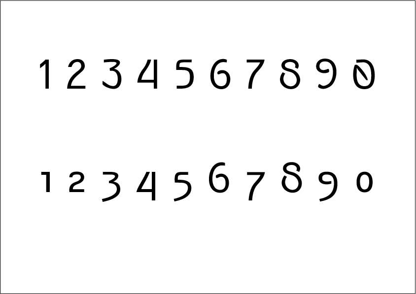
The numerals could use more attention. The ends of the strokes of the 8 are crisp and aligned, almost like a stencil unlike the gaps on 6,9. The gap on the zero has its own way of closing the gap that seems to be a completely different strategy than 6,8,9.
The bottom of the 5 is flush to the baseline while the 3 has a hook with a thickened, sharp end. In the old style numerals, the bottoms of 3,5,9 seem to be closely related.
The lowercase u feels odd next to the a. Capital U is squared off which looks interesting but lowercase u looks like a rotated n.
fi ligature is too narrow.
Most of the capitals and numerals have an Art Nouveau style while many of the lowercase letters look like twentieth-century, formal sans-serif. The c,s,g,m,n,r looks so serious. I like your K,k but I think you should choose one idea or have them relate somehow; they seem to belong to different typefaces. Same deal with the W,w.1 -
I don't think the spurless /a/ works. /a/ would usually relate to /d/ and /u/. /b/ and /q/ are okay in that form though.
I'd try a more circular oldstyle zero.
An inconsistent thickness in the turning of the shoulders in /m/n/h/u/ is the most glaring remaining clumsy drawing.
Pay attention to inequality of counterspace in the narrower /b/d/g/p/q/ compared to the rounder /c/o/.
But before you do too much more refining, think hard about what Ray said about the style of the uppercase vs. the lowercase.0 -
Thanks for the contributions Ray Larabie,
As incongruities in the figures I passed unnoticed. I have not spent any time in them.
When I started this project I found few references of lowcases in this style, so a little relationship between the two.
And as it is from a somewhat eclectic period in the arts I thought this mix would not do so badly.
I'll reconsider this obviously.
I just wonder how to leave the / m / n / r characters less serious.
0 -
Maybe your /v/w/ contain clues for what you could do with /n/m/.
0 -
Wow !!! big idea Craig Eliason.
0 -
I must have vision problems, Before he told me he could not see how strange the thicknesses were in the derivatives of / n /.
In fact, I only realized when I compared it with other typefaces.
And now, what do you think of the new forms?

1 -
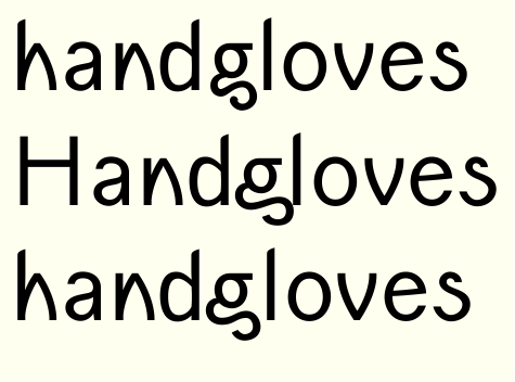
I redesigned the / g / I started with a very wide g, When I saw that I would have problems with the spacing I compress the bottom of it until you get the / g of the first line.
I'm not very confident,
Do you think it works?

0 -
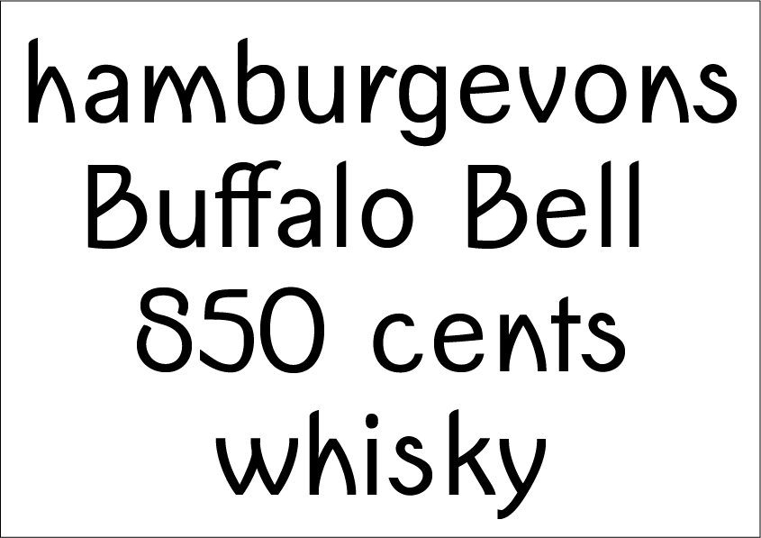
Your /a and your /e are now too conventional. Spacing is a bit varied too - look at "cents"; the "nts" is very tight compared to the "ce".0
-
I haven't read the entire thread, but I suspect others have mentioned this: first, develop a feeling for good curve quality. For example look at the –otherwise charming– "s" and see how the top-right of the bottom bowl is too thick (assuming you're going for a monoline look).0
-
Personally, I preferred the original designs for /n and related characters. If you want to keep these triangular arches, I would suggest moving the apices away from the stems. Less symmetry, more balance.
0 -
True, these new characters are with inconsistent metrics. Thank you for realizing this Simon Cozens.
About /a, I have an /a alternate,
Look!

Do you think it works best?
0 -
Looking at that "a" it strikes me how much better the bottom is than the top. Are you modifying an existing font?0
-
No, it's a typography I started from the beginning. This "a" was done through a cut in a "d".
0 -
Hi Christian Thalmann,
I do not know if it's because of the fatigue of looking at the same glyph, But I'm liking these new shapes. Although you are anticipating much more work with kerning.
I will test your suggestion based on more cursive forms that I made before the angular ones.
0 -
I'll take this 'overweight' out of the 's' and use the technique you're given to look for new ways with the same problem.Hrant H. Papazian said:I haven't read the entire thread, but I suspect others have mentioned this: first, develop a feeling for good curve quality. For example look at the –otherwise charming– "s" and see how the top-right of the bottom bowl is too thick (assuming you're going for a monoline look).
1 -
It's definitely getting more interesting. Make sure your g and y get along together; that's a particularly important relationship.0
-
The horizontally cut stroke ends in C, D and S really aren't working for you. Just make them open and cut perpendicular to their strokes and you'll be much better off.
You have a number of places where the round part of a letter is MUCH heavier than the vertical stroke. Lowercase a, lower bowl of B, etc.
The mnh arch shape is not working for me, although the w is just fine.
0 -
Follow the advice of Christian Thalmann and modify the / n and related characters, But I'm still not sure about this triangular design.
Phinneys Tomas – These much larger thicknesses are due to a wrong hitting configuration that made me exaggerate in the Shapes. I'm working on it, but some characters are still missing.


0 -
I can see many features mixed here... Perhaps it would be good to set up a clear brief, so you don't get lost with so many possibilities. At the very beggining you said it should have art nouveau influences, but now I can't see it anymore. It's okay to change your original idea, you're the boss after all. However, with a well defined brief you could look at similar typefaces, study them in detail and learn from it.As Craig and Hrant already said you would benefit from spending some quality time to refine your curves (as well as spacing).I'd hold the instopable (and valid) impetus for expansion and conquer, and I'd be very humbly content with a small piece of land in adhesiontown for an entire season. Narrow down your character set and spend as much time as possible to create a nice concept with a small set of lowercase letters, until you feel confident to carry on.3
-
Rafael Saraiva said:I can see many features mixed here... Perhaps it would be good to set up a clear brief, so you don't get lost with so many possibilities. At the very beggining you said it should have art nouveau influences, but now I can't see it anymore. It's okay to change your original idea, you're the boss after all. However, with a well defined brief you could look at similar typefaces, study them in detail and learn from it.As Craig and Hrant already said you would benefit from spending some quality time to refine your curves (as well as spacing).I'd hold the instopable (and valid) impetus for expansion and conquer, and I'd be very humbly content with a small piece of land in adhesiontown for an entire season. Narrow down your character set and spend as much time as possible to create a nice concept with a small set of lowercase letters, until you feel confident to carry on.
Is true, Rafael, It makes perfect sense...
As it is a very slow and time-consuming project I have forgotten and neglected the initial purposes of this typography in many decisions. I'll reevaluate that.
Thank you for the advice.
0 -
I adjusted the thicknesses and abandoned the derivatives of "n" angular, I will leave for an next project where you want to pass an indigenous, rustic and runic aspect.
I've tried other "g" designs but they did not work, nor is it worth showing. I also made a change in G because of the new endings.

 On a technical
issue, someone knows if laser printers tune the diagonals like this
"\" and thicken those "/". 2
 -
Much better. This is my own personal taste, but what if the Z and 7 were more like the N and K?1
-
Thanks for the helpful comments Ray Larabie.
I made a new design of seven, I do not know if it was this kind of modification I had mentioned, But comparing with the old I believe there has been an improvement. I tried to make the Z modification too, But the result did not pleasure me, Was either too narrow and aggressive or wide lazy (I do not know if it makes sense in English kkk).
Could you give me your opinions on my Standard Ligatures?


0 -
7 is better.
I think ligatures can be useful for solving problems that can't be solved with spacing and kerning. I'm pretty certain a lot of type designers include standard ligatures because they think they're supposed to be included. It seems like your lowercase f can get along with f,i,l,t just fine with kerning. Keep in mind that it's my personal distaste for standard ligatures; some people like them.2 -
Ray Larabie said:7 is better.
I think ligatures can be useful for solving problems that can't be solved with spacing and kerning. I'm pretty certain a lot of type designers include standard ligatures because they think they're supposed to be included. It seems like your lowercase f can get along with f,i,l,t just fine with kerning. Keep in mind that it's my personal distaste for standard ligatures; some people like them.
I'm the kind of person who has fetish for ligatures hahaha ...
but it's true, When I started the project the "f" had been designed as an "f" of the futura,Very compressed.
0 -
Hi, again,
Someone could help me with these diacritics and glyphs whom I am not familiar with.
I would be very grateful for any advice.

0
Categories
- All Categories
- 46 Introductions
- 3.9K Typeface Design
- 489 Type Design Critiques
- 572 Type Design Software
- 1.1K Type Design Technique & Theory
- 663 Type Business
- 876 Font Technology
- 29 Punchcutting
- 530 Typography
- 121 Type Education
- 328 Type History
- 81 Type Resources
- 111 Lettering and Calligraphy
- 32 Lettering Critiques
- 79 Lettering Technique & Theory
- 561 Announcements
- 96 Events
- 116 Job Postings
- 169 Type Releases
- 179 Miscellaneous News
- 269 About TypeDrawers
- 53 TypeDrawers Announcements
- 114 Suggestions and Bug Reports


