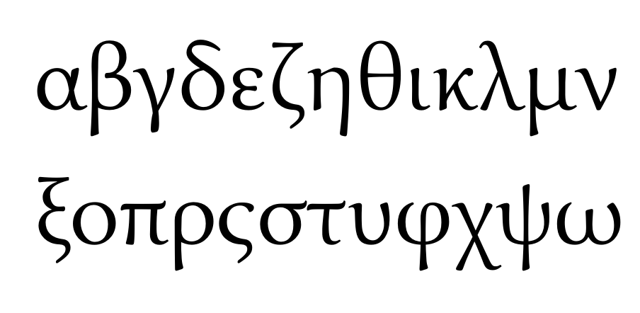
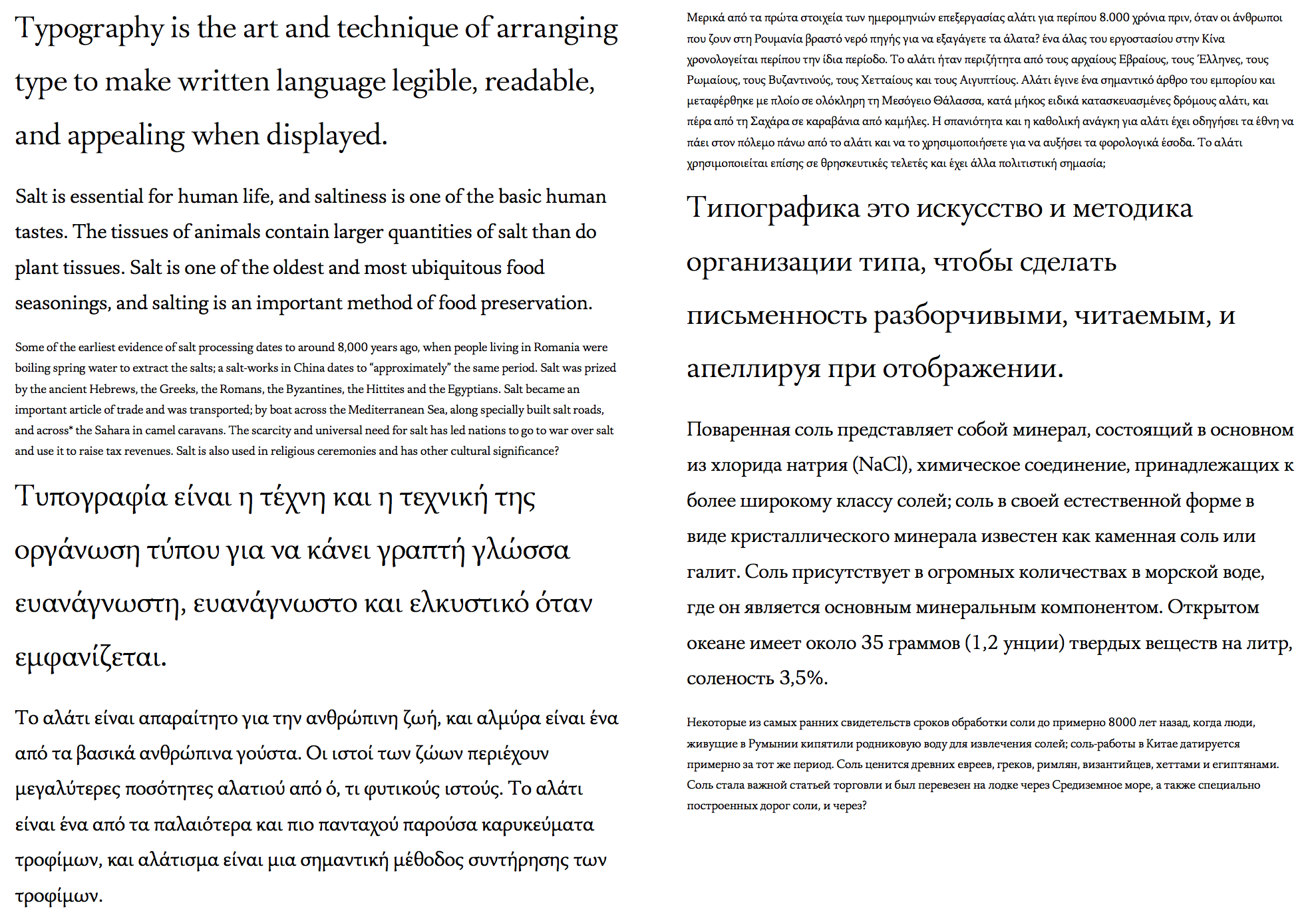
Alive Serif
Nathan Zimet
Posts: 76
Since last November I've been working on a serif typeface and it's gotten to the point that with my current ability i'm not sure how to progress further-so I thought I'd post what I have on here.
For now, only this single base master is in progress but once it's done I will be expanding the family considerably.
I'm looking for any feedback, doesn't matter how severe.
I'll post more symbols and stuff including the oldstyle figures and numerators/denominators if/when I figure out how to use OpenType features in pages, or borrow a computer with Photoshop on it.

0
Comments
-
Can you tell us some more about what you’re looking for with this project? From your PDF, all I can tell is ‘text-size’.
0 -
KkXY look too narrow to me, especially K. Overall it's really not bad, but what I think it lacks most, is some kind of unique character. It looks to me like Minion mixed with something else. Not quite 'alive', if you ask me.0
-
@Rob Mientjes For point sizes larger or smaller than 14-16 it appears to need optical correction, so i will be adding optical correction for different point sizes. Final plan of the font is 5 optical masters.
@Jasper de Waard Thanks! I'll be touching up those k's x's and y's. I think the reason it resembles Minion is the a b, and c, mostly. I'll see if i can make them more different. After looking some more it appears that my x height is also quite similar to Minion.
I'm not sure how to make it more "alive" myself. The things I've done are add calligraphic influence, made the shapes round and open. I'll try increasing the space between letters a touch but still If you have any Ideas for making it more alive, I'd love to hear them.0 -
In the Cyrillic, the lower-case ч seems to me to be too wide.0
-
I feel like vertical serifs in the caps are too tiny. I mean it's almost like z has bigger serifs than Z.
8 should have the top slightly smaller than the bottom to be able to stand on its feet. I'd do a bit of the same treatment to 2.
V, W look thinner than other caps, try to review each caps thickness around H and Os.
Terminals could be a bit more consistent throughout lc and numerals.
0 -

Hi Nathan,
As you may know, I do research into (the origin of) patterning in especially roman type. Looking at your Alive Serif I noticed that it shares some similarities with type that finds its origin in Italian Renaissance archetypal models, such as Adobe Minion Display. From the Type tester on the Adobe Typekit website I screendumped some images that I partly cut and pasted in combination with some overall horizontal stretching of the lowercase. Hopefully the outcome is a bit useful for you for further analysis of your design.
Best, Frank
3 -
@George Tulloch I've made it less wide.
@Adrien Tétar Thanks~ I've touched up a lot of the lower case and some of the numerals. I've also started tweaking vertical serifs but they not be tweaked enough yet.
@Frank I see you are using the Display version-using the text sizes of minion, however, there are more differences between Alive and Minion. When I do my Display sizes, I'll refer back to the image. I'm sure it will he useful.
Attached is a new proof for Alive, this time I've included more punctuation and the ß.
0 -
IMHO for text purposes your typeface is a bit too light, hence the comparison with the display version of Minion. But okay: below I compare your typeface with the text version of Minion, although this is a bit embolded because of a horizontal scaling of 106%.

0 -
Still have a while to go but here's a bit of progress on the greek


0 -
Shouldn't the Greek question mark look like a semicolon?
0 -
The alpha is a lot more believable now. The previous one seemed very Latinized, at least to me.0
-
@Christian Thalmann yes. You're right. I'll fix my sample texts.
So I'm still struggling with the Greek. Is this better? Is the angle of stress okay for this style of Latin?

0 -
-


3 optical sizes for caption, large text, and display, with small caps and latin superscripts.
I'm not sure about the cyrillic /б it's not much like other fonts in the genre.
I'm also toying with the name Azolla, it seems a bit better than the current name.
All the diacritics are temporary and old which is why they're out of place and ugly~ just don't notice them for now. Oldstyle number are yet to be spaced and kerned.
attached is a pdf of the text page in the last image.
0 -
Need some space between στ0
-
Something's going wrong with the accents in Cyrillic. Speaking of which, /Ka-cy strikes me as a bit narrow, /Che-cy as a bit wide, and /U-cy as a bit dainty (try a larger body and smaller tail?). Your /Softsign-cy/Hardsign-cy combination isn't kerned, which I guess will never come into play, but I'm wondering if /Softsign-cy/Te-cy might then be missing kerning (I tend to put /Hardsign-cy and /Te-cy into the same kerning class).
In Latin, the /Þ looks a bit too weak for a capital. I know it's hard to make it look important enough, but you can make the counter taller and wider than in /P.
The /ẞ doesn't work for me. Check out this advice page: https://typography.guru/journal/how-to-draw-a-capital-sharp-s-r18/
0 -
-
Your cyrillic capitals have a very cool encyclopaedic vibe, but the appearance of ball terminals should be unified across the range. A wavy tongue сould look good on Э as well, try it.
The beak of the hard sign is too big, the letter looks unstable.
Х and х look a bit top-heavy, probably because they aren't asymmetric enough.
б looks good.
К and Ж are a bit weird. Their legs are thick, their arms are thin. They need a bit more play in the stroke width.
0 -
Yes, that /ẞ is much better. The top right connection looks perhaps a bit awkward. I would also recommend trying out a steeper straight segment (i.e., moving the central vertex a bit to the right and opening up the interior).
0 -
um

@ Belleve Invis I'm seeing if i need a ligature but still working on it
@ Samuil Simonov well, i tried some of the /Э might have potential.
@ Christian Thalmann /ẞ retweeked. I may have overdone it though.0 -
@Nathan Zimet
Is this discontinued??
It would be GREAT for typesetting mathematics if you have italics...1 -
To be honest, I don't see the difference from the last iteration... Currently, it's bottom-heavy; I'd move the top right part more to the right, including the joint at mid-level.Nathan Zimet said:@ Christian Thalmann /ẞ retweeked. I may have overdone it though.
1
Categories
- All Categories
- 46 Introductions
- 3.9K Typeface Design
- 489 Type Design Critiques
- 572 Type Design Software
- 1.1K Type Design Technique & Theory
- 663 Type Business
- 875 Font Technology
- 29 Punchcutting
- 530 Typography
- 121 Type Education
- 328 Type History
- 81 Type Resources
- 111 Lettering and Calligraphy
- 32 Lettering Critiques
- 79 Lettering Technique & Theory
- 561 Announcements
- 96 Events
- 116 Job Postings
- 169 Type Releases
- 179 Miscellaneous News
- 269 About TypeDrawers
- 53 TypeDrawers Announcements
- 114 Suggestions and Bug Reports


