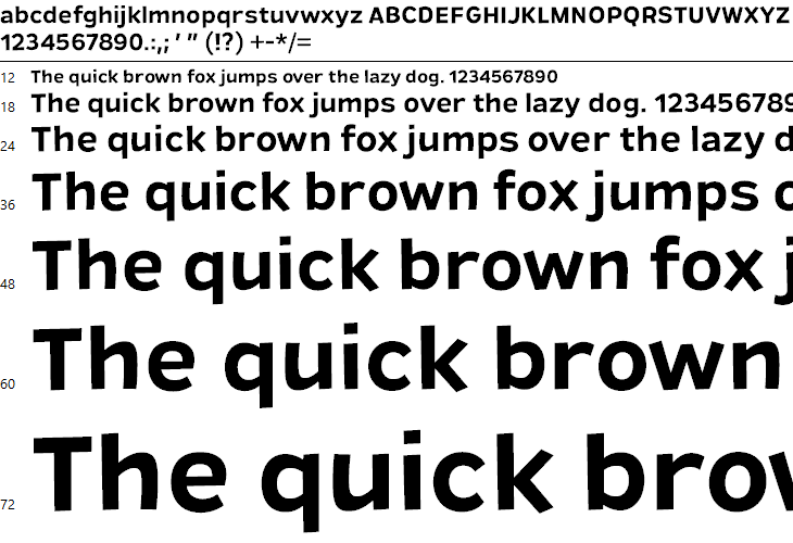
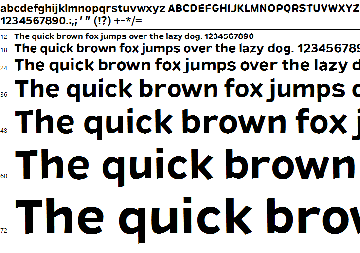
Unhinted TTF looks crunchy in Windows

Ray Larabie
Posts: 1,487
In ancient times, I could make an unhinted TTF look fuzzy in Windows 10 by setting the gasp table to smooth everything, no instructions. Now any unhinted TTF looks like a burning dumpster fire no matter what I do with the gasp. The horizontals are smooth but the verticals are hard pixels. I'm 100% sure there's no hinting. How do I turn on vertical fuzz so it looks more like an OTF?
Tagged:
0
Comments
-
What window version do you tested it with?0
-
In ancient times there was no Windows 10!

You can control DirectWrite smoothing in a GASP table version 1 (but not with FontLab). Feel free to contact me!
1 -
Win 10 Pro 64 Bit
Can I hack it? With a hex editor, I can see gasp near the start of my TTF in followed by FF FF 00 03 00 01 2A 80 00 00 00 08 followed by glyf.0 -
The header contains offsets to the location of the tables. For production better recalculate the table checksum and the checkSumAdjustment in the head table, which is next to impossible by hand.
But why go that route when you have font editors that can do it?
FontCreator allows you to make the changes:
0 -
@Erwin Denissen
I tried exporting with various setting using Font Creator but the results were the same. This typeface is a casual sans. It bounces up and down. The ends of the strokes have arbitrary slants on them. There should be no hinting at any size. Here's the OTF version with no hinting. That's exactly what I'm looking for. See the vertical smoothing? Check out the angles on the ends of the vertical strokes.
Next is an unhinted TTF exported from FontLab with GASP set to smoothing, no instructions for all sizes. I tried converting using TTFAutohint with the no kerning setting and the results are identical. Note the ugly tops of the strokes and the kink on the top of the T.
Here's a TTF exported from Font Creator with exactly the same settings you suggested.
Here's a TTF exported from Font Creator with gridfitting and smoothing for all sizes.
Here's a TTF exported from Font Creator with smoothing for all sizes.
Here's the TTF if you want to experiment.0 -
If this typeface is for display sizes only, why not generate the font as otf with PostScript outlines?
The PS rasterizer under GDI in Windows has its quirks but it will render big sizes better than this. And PS fonts under DirectDraw in Windows will certainly look better.1 -
I set the GASP in VTT to always use no hinting, and ysmoothing when rendered in DirectWrite. if you are looking at the font preview in Win 10, this uses ClearType GDI, which does not have support for ysmoothing, and will look jagged and unhinted. The font would need hinting to look good under GDI ClearType2
-
When you disable ClearType the font shows with standard antialiasing. I would expect a similar result with ClearType enabled when smoothing along multiple axes with ClearType is enabled in the gasp table.
0 -

this is how a GASP might look like, if you want the font to have no hinting in DirectWrite. Red, (not set) disables hinting, Green, (set) will enable y-smoothing to be always on, above 8ppem, in DirectWrite.
Again, if you are using the font preview, (which used ClearType GDI, to render a .ttf sample) in Windows, you will still see jagged broken looking fonts, as it is an un-hinted font, and this is how ClearType GDI, will render an un-hinted font, as there is no support in CT GDI for y-smoothing. The font will look smooth and un-hinted at all sizes in DirectWrite.
otf fonts are rendered on Windows, using the Adobe Rasterizer, (including in the Windows font preview Window,) which is why you see smooth greyscale rendering in the sample you show of the otf font)1 -
No, that is the expected result of an unhinted TTF shown in GDI CT.
(I am curious about why doesn’t MS use DW as the backend of GDI. cc. @Mike Duggan
)0 -
@Paul van der Laan I can release only OTF most places, but one of my distributors requires TTF.
@Mike Duggan...there is no support in CT GDI for y-smoothing.Huh? I didn't know that. That's a dead end. Thanks for your help, everyone.
0
Categories
- All Categories
- 46 Introductions
- 3.9K Typeface Design
- 489 Type Design Critiques
- 572 Type Design Software
- 1.1K Type Design Technique & Theory
- 663 Type Business
- 875 Font Technology
- 29 Punchcutting
- 530 Typography
- 121 Type Education
- 328 Type History
- 81 Type Resources
- 111 Lettering and Calligraphy
- 32 Lettering Critiques
- 79 Lettering Technique & Theory
- 561 Announcements
- 96 Events
- 116 Job Postings
- 169 Type Releases
- 179 Miscellaneous News
- 269 About TypeDrawers
- 53 TypeDrawers Announcements
- 114 Suggestions and Bug Reports


