Width & weight relationships

Winston Scully
Posts: 16
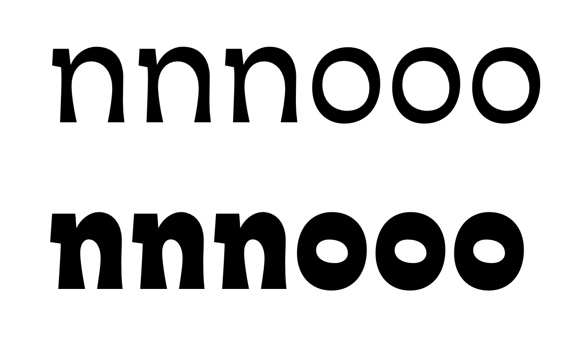
It seems that the general rule is to widen a typeface as it gets bolder, is this standard practice? Or can you think of specific typefaces that keep the same width from light to bold without shifting widths?
Asking for a friend.
Asking for a friend.
0
Comments
-
Retaining the same width between weights is not standard practice (the heavier you get, the more room you need), but it’s not too rare. Identifont and David Sudweeks have lists of such “uniwidth” families.2
-
Generally darker is indeed wider (although only about half as wider as it is darker) but there are uniwidth fonts –including some admirable designs– that nicely maintain set width.
To me when uniwidth is applied to too broad a weight spectrum the very light/dark weights become uncharacteristically wide/narrow. Which is why I use a trick I call "fixed offset": weights that are not unwidth with the central weight spectrum nonetheless have glyph widths that are all a fixed offset away from the uniwidth ones. For example in my Patria the Regular and Demi are unwidth, and while the Light and Bold are not, they can be made to match the widths by applying tracking -5 and +10 respectively.
0 -
I always work from heavy to light. If I don't narrow the light, it feels like it's too wide. Lighter weights have wider sidebearings which makes it feel even wider.
2 -
I am either a big fan of the very heavy weights or a glutton for punishment. There is a place somewhere bolder than extrabold which requires much farting and tap dancing to overcome the problems caused by excessive weight [indeed obesity has its problems]. The less contrast in the font, the worse the problems so a sans grot is a devil to deal with. With sans fonts in the Black range, making advance width the same accross all weights is asking for trouble--only masochists need attempt this ;-)1
-
Some historical types have the same width from regular to bold because those two weights were duplexed on the same Linotype matrices. Sabon is an example.
I have found that when working with unconventionally horizontal contrast, you might end up with bolder weights that are narrower. The weight those letters gain is all along the y axis, and to keep the counters small some letters have to be narrowed.
7 -
2
-
Harnt, how do insert the tweets? I tried that and just got plain text links
0 -
I just paste the link. It might be how you/I copy it from Twitter; try copy-pasting Twitter's native link into a browser, making it navigate to it, and then copy-pasting the resultant URL.
1 -
I have found that when working with unconventionally horizontal contrast, you might end up with bolder weights that are narrower. The weight those letters gain is all along the y axis, and to keep the counters small some letters have to be narrowed.
I found the same thing with a monoline family I'm working on. Regular is wider than Thin, but then things start to narrow again all the way up to Ultra. When I try to make the blackest weights as wide as the regular weights, I hate the result: either too extended or gappy.
Anyone else have an opinion on this? Do you see a problem with a family whose bolder cuts are a bit narrower than the lighter weights?
0
Categories
- All Categories
- 46 Introductions
- 3.9K Typeface Design
- 489 Type Design Critiques
- 572 Type Design Software
- 1.1K Type Design Technique & Theory
- 663 Type Business
- 875 Font Technology
- 29 Punchcutting
- 530 Typography
- 121 Type Education
- 328 Type History
- 81 Type Resources
- 111 Lettering and Calligraphy
- 32 Lettering Critiques
- 79 Lettering Technique & Theory
- 561 Announcements
- 96 Events
- 116 Job Postings
- 169 Type Releases
- 179 Miscellaneous News
- 269 About TypeDrawers
- 53 TypeDrawers Announcements
- 114 Suggestions and Bug Reports


