Modify Vertical Spacing

peggo (Pedro González)
Posts: 60
Hello Typodrawers,
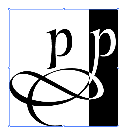
Few days ago I launched my most recent font "LeBrush" everything is right on the type design process until the moment when I start to do the graphics on Photoshop, Illustrator and Indesign, where the editor bounding box (in the image below) which appear too large to modify the text group comfortly.

I know box appear big because of extension of the vectors on stylistic alternates. I'm already try to modify via "Custom parameters" on the GlyphsApp info window.

But nothing works, I really can't find how to make this as smaller as the standard 1000pt height.
Do somebody know how effectively modify this vertical box?
Few days ago I launched my most recent font "LeBrush" everything is right on the type design process until the moment when I start to do the graphics on Photoshop, Illustrator and Indesign, where the editor bounding box (in the image below) which appear too large to modify the text group comfortly.

I know box appear big because of extension of the vectors on stylistic alternates. I'm already try to modify via "Custom parameters" on the GlyphsApp info window.

But nothing works, I really can't find how to make this as smaller as the standard 1000pt height.
Do somebody know how effectively modify this vertical box?
Tagged:
0
Comments
-
Apparently this is "another special" Adobe issue feature, because even in Microsoft Word it looks as normal as always do.

0 -
Check your leading in InD and make sure it is in the range you want. If it is OK, check your vertical metrics to be sure your ascender plus descender equals your UPM [1000]. Otherwise, you may have a stray bit of drawing accidentally way down on one of your glyphs.2
-
@peggo (Pedro González)
What values do you have for typoAscender, typoDescender, typoLineGap?
How are they different to hheaAscender, hheaDescender, hheaLineGap and winAscent, winDescent?
Your typoAscender and typoDescender should add up to your unitsPerEm (typoAscender - typoDescender = unitsPerEm).
It’s often recommended to have hheaLineGap set to zero and hheaAscender and hheaDescender add up to the same as winAscent and winDescent (hheaAscender - hheaDescender = winAscent + winDescent). The typoLineGap can be the difference with unitsPerEm. If your winAscent and winDescent are too tall, then choose an adequate hheaAscender and hheaDescender, and recalculate typoLineGap from that. In that case you should enable the useTypoMetrics flag so modern applications use your typo metrics instead of the Windows metrics.
Alternatively you can also set all the line gaps to zero and all the other metrics to the same values (absolute value for winDescent).
Maybe try what is shown on https://grahamwideman.wikispaces.com/Font+Vertical+Metrics
Why do you have vhea values?1 -
Thank you guys!
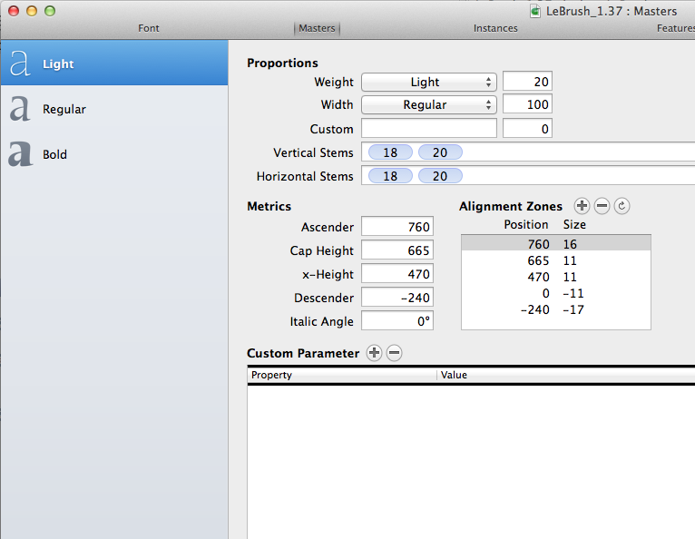
@Chris Lozos I use to set my vertical metrics (descender line value + ascender line value) at 1000 UPM.
I really almost never have to do this kinda "trial-error" exercises, after see nothing changes I delete that parameters and leave the font with metrics shown above, as always do. I tried your values on hheaLineGap plus other ones (as shown below)Denis Moyogo Jacquerye said:@peggo (Pedro González)
What values do you have for typoAscender, typoDescender, typoLineGap?
How are they different to hheaAscender, hheaDescender, hheaLineGap and winAscent, winDescent?
Your typoAscender and typoDescender should add up to your unitsPerEm (typoAscender - typoDescender = unitsPerEm).
It’s often recommended to have hheaLineGap set to zero and hheaAscender and hheaDescender add up to the same as winAscent and winDescent (hheaAscender - hheaDescender = winAscent + winDescent). The typoLineGap can be the difference with unitsPerEm. If your winAscent and winDescent are too tall, then choose an adequate hheaAscender and hheaDescender, and recalculate typoLineGap from that. In that case you should enable the useTypoMetrics flag so modern applications use your typo metrics instead of the Windows metrics.
Alternatively you can also set all the line gaps to zero and all the other metrics to the same values (absolute value for winDescent).
Maybe try what is shown on https://grahamwideman.wikispaces.com/Font+Vertical+Metrics
Why do you have vhea values?
Then go to Adobe Apps to check if something changes but still nothing change, I really can't figure it out what could I do to fix modify the size of this box.0 -
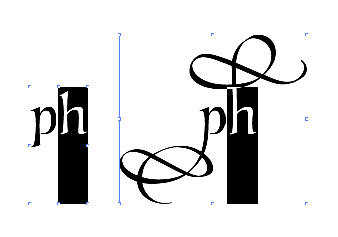
By the way.. the size of this box is apparently automatically showing so (into Adobe Apps only) because of the extension of the vectorial shapes existing on my fonts

I can understand the bounding box becoming bigger when the shape in use is big too, but it's not makes sense to me, when this box remains big even when the shape is in use is small, is just a little annoying. In fact, as you can see below this box works fine into ascenders behavior.
0 -
Have a look at Zapfino metrics

3 -
Thank you Pablo... after looking that I can conclude that bounding box behavior is a normal feature on Adobe Apps.PabloImpallari said:Have a look at Zapfino metrics 0
0
Categories
- All Categories
- 46 Introductions
- 3.9K Typeface Design
- 489 Type Design Critiques
- 572 Type Design Software
- 1.1K Type Design Technique & Theory
- 663 Type Business
- 875 Font Technology
- 29 Punchcutting
- 530 Typography
- 121 Type Education
- 328 Type History
- 81 Type Resources
- 111 Lettering and Calligraphy
- 32 Lettering Critiques
- 79 Lettering Technique & Theory
- 561 Announcements
- 96 Events
- 116 Job Postings
- 169 Type Releases
- 179 Miscellaneous News
- 269 About TypeDrawers
- 53 TypeDrawers Announcements
- 114 Suggestions and Bug Reports

