Untitled Grotesk
Comments
-
In case it still matters, here's something I just posted elsewhere that elaborates on my stance on vertical proportions: http://typedrawers.com/discussion/comment/20717/#Comment_20717
0 -
Apologies for the huge delay since the last update, but I had zero time to work on this until picking it up again in the last week or so.

I've since made a concerted push to complete the Regular weight in terms of character set and metrics (the first full stab at sidebearings, kerning and ligatures are now in effect).
Still missing are all diacritical variations, sub/superscript numerals and even a subset of Greek. Just about everything else I intended to cover is included at this point, however.
(Yikes, I just realized I've got some dumb quotes in that body text, and at the moment I don't have time to edit/reupload. Gross. Apologies.)
The black weight is also waiting in the wings to be updated in accordance with all the edits I've made to Regular. My mid-term goal is Regular and Black, followed by Regular Condensed and Black Condensed. Ideally I'll follow that up with true Italic and Italic Condensed, but that's a lower priority for now.0 -
Here's some feedback:
- bottom joint of 'a' has a different structure than, say, d, which seems odd to me. The bowl of 'a' looks a bit too 'pointy' (the curves could be more squarish).
- the c is leaning to the right. The top and bottom terminals aren't really in sync
- The bar in e seems too high to me.
- The ear of g could be little wider. And there's not a lot of space between the bottom and top bowl.
- k looks to wide and the inktrap looks out of place.
- I like the s and S!
- t looks very narrow
- the joints of v w y are perhaps a bit excessively wide.
- A M N V W have the same issue. It brings character but maybe tone it down a little.
- I think you're beter off getting rid of all ink-traps. They seem unnecessary.
- the bar in G could go a little lower
- L and J are very wide
- I don't really like the fl ligature style
- maybe widen the top in 'fi' and 'fj'
In general, curves on the inside seem more 'squarish' than on the outside. I would advise not to move too quickly. There's plenty of room for improvement in doing just the regular and the black.
0 -
Thanks very much, a lot of your feedback confirmed suspicions of mine.
I'm definitely conflicted on the ink traps (especially since that term doesn't reflect their intent). Their true purpose is to help imbue some of the curvaceousness I've established with /a, /s, etc. in the perfectly straight characters like /A, /V and /Z that have no real opportunity to play along.
It's not that I think it looks wrong without the inktraps in the top row:
Nor can I honestly say the /Z in the bottom row is the ideal solution, but I'm drawn to any feature that softens up an otherwise linear character without totally abandoning its design. I'll continue to mull it over.
BTW, I agree with you on the width of the /k (or /K, or both, possibly). But I still really, really like the curves where the two diagonals meet in the center. That feels the least like an inktrap to me, since the curves are seen on both sides of the stroke, not just the inside corner.0 -
Most of Japser's feedback touched on details I was debating internally to begin with, so I've revised the uppercase, lowercase and lining figures accordingly.
Here's the new summary, with a more text-heavy PDF attached,
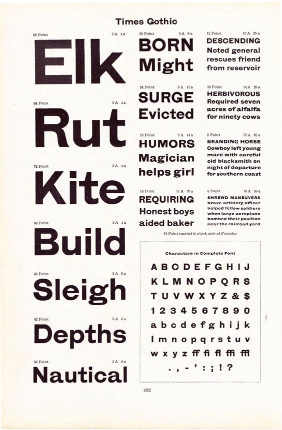
If there's a single influence I've drawn on, it's the old Times Gothic from ATF:
https://s-media-cache-ak0.pinimg.com/564x/c0/45/35/c0453570ed8383a9518d57e0e240f246.jpg
I'm not specifically going for a revival/remake, but I wanted to adopt a few of its quirkier features:
- The goofy, extended tail on the /a
- The tight apertures, namely in the case of /C, /c and /G
- Longer terminals at the ends of /f and /j
By revisiting the Times Gothic specimens that originally inspired this project, I convinced myself I could live without some of the dodgier features that Jasper (and many others) have critiqued:
- The wedge terminals on /b, /d, /p, etc., which deviate from the monoline style
- The faux inktraps found in linear glyphs like /Z, /w, etc. I'm sticking to my guns for now on /K and /k, (and just realized as I posted this that I forgot to remove it from /R, but I will)
The /C and /c were also worth finally fixing. I'd been trying to put a slight "snarl" in the upper half of both glyphs to match the curling, flared ends of the curves in the /a and /s, but as Jasper pointed out, on /c in particular it just threw off the balance. I've made them a bit more symmetrical now.
0 -
Middle vertex of /w/ looks too wide to me.
Given your /a/ tail, I think a more substantial /g/ ear is in order.
Is /L/ too narrow?0 -
Does this typeface really need f ligatures?0
-
Ray: It really does, for /fi and /fj at the least. The downside of the full curl at the top of the /f is that it doesn't sit nicely with dots and ascenders at all. The original Times Gothic comes with a comparatively large set of it ligatures itself for the same reason (although it takes a different stylistic route).
Craig: You raise a good point about /g. I'll play around with that. Thanks!1


Categories
- All Categories
- 47 Introductions
- 4K Typeface Design
- 493 Type Design Critiques
- 575 Type Design Software
- 1.1K Type Design Technique & Theory
- 669 Type Business
- 884 Font Technology
- 29 Punchcutting
- 537 Typography
- 124 Type Education
- 332 Type History
- 81 Type Resources
- 113 Lettering and Calligraphy
- 33 Lettering Critiques
- 80 Lettering Technique & Theory
- 569 Announcements
- 100 Events
- 116 Job Postings
- 170 Type Releases
- 182 Miscellaneous News
- 270 About TypeDrawers
- 54 TypeDrawers Announcements
- 114 Suggestions and Bug Reports