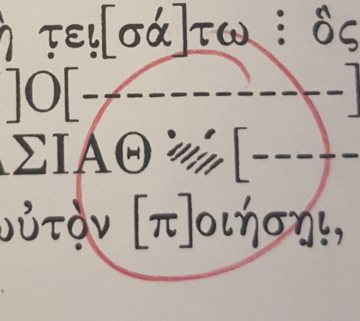
Fifth Century Athenian letter forms

KP Mawhood
Posts: 300
edited: For an academic title "Greek Historical Inscriptions", a few questions on best practice / font recommendations:
Example form:

1) Encoding / image: Is it better to encode as unicode or insert SVGs? e.g. Gamma with a glyph " Λ " as U+0393…
2) Recommended fonts: To cater to very specific variation details of Greek inscriptions…
3) Private Use Area: Is there a best practice here for characters that are not currently on unicode charts?
Finally, would I do better just to reach out to Michael Everson or someone similar?
Thanks all.
Example form:

1) Encoding / image: Is it better to encode as unicode or insert SVGs? e.g. Gamma with a glyph " Λ " as U+0393…
2) Recommended fonts: To cater to very specific variation details of Greek inscriptions…
3) Private Use Area: Is there a best practice here for characters that are not currently on unicode charts?
Finally, would I do better just to reach out to Michael Everson or someone similar?
Thanks all.
1
Comments
-
Oh my goodness – let me do it for you, Katy.
In such a case some familiarity with Greek is called for.
First of all, you haven’t given much so far about the actual briefing of the commission; context: what for and how? a book title? a restaurant signage …? Is it to design a brand or to provide text for repeated use, based on encoding? Which media involved? Target audience??
And “5th c.y Athenian” has damn nothing to do with esoteric, where did you get that from? If that task seems “esoteric” to you, you’d better hand it over to someone else.
If you still want to do it on your own (?!) start with the 1st step first and look into Greek script history. Then study relevant encodings and search for fonts …
0 -
In general:
1) Usually, fonts are preferred to SVG graphics. Now, if presentation is critical, and mobile is critical, I do note that something like 4–5% of mobile browsers are not web-font-savvy (mostly Opera Mobile).
2) No idea.
3) If it is a presentation variant of an existing glyph usually best practice is to use an OpenType feature (such as ss01) to access these alternates. Or just use a custom font with these glyphs in the default positions. PUA is a really last resort because you lose the backing text.1 -
@Andreas Stötzner I solve font-related problems at Oxford University Press. On a good day, it's a 48-hour turnaround. The book is a scholarly work titled "Greek Historical Inscriptions", see above, at a modest 1,000 pages. Media involved likely print, online, PDF, XML-archive.
No font example I've found so far covers the glyphs we require. Even finding visual references is tricky for some. Perhaps archaic is better suited? I wish there were someone else to hand it over to, sounds like an excellent idea!
@Thomas Phinney
1) Presentation is definitely critical, it's an academic book about Greek inscriptions.
3) If they were alternates of an existing glyph, yes I agree with you. I've glossed through the unicode charts with a beady eye, to no joy. In essence, there's some photocopies from the authors with forms circled for "new sorts". Some of the forms of the original look hand-drawn…
0 -
Katy, always best to use true font glyphs as opposed to images in text, it will help with sorting, finding, indexing etc.
Recommending fonts is difficult without seeing anything. Tyro Typeworks Brill may have what you need or else Michael Everson, Jerry Leonardis or John Hudson (Brill) may be able to point you in the right direction.
It's good practice to try and avoid the PUA wherever possible. Non-encoded Glyph + diacritic combinations would probably be covered by mark (+ccmp) lookups in the kind of font you require. Other historical glyphs may fall into ligature or contextual alternate lookups.
Good luck.
2 -
To me, this looks like an illustration of what is on the inscription.
The author was probably able to restore the top of some letter (maybe Υ or Κ, Χ, or some other letter) but not the whole letter. Instead of using [----] like for the other letters on the inscription that couldn’t be restored, the top of that one letter (or maybe two letters, it’s not clear) and erase marks (i.e. scratch marks) are reproduced with an illustration, leaving to the reading the liberty of guessing what that might be.
2 -
@Denis Moyogo Jacquerye I spoke to a DPhil, Classical Languages and Literature. She said precisely that, it's an illustration of the inscription marks. But, that no specific character form can be identified.
In terms of text encoding, the verdict seems to be that it should remain an illustration – as there is no unicode value for "ambiguous inscription". Although, I'm open to ideas.0 -
So that your "ambiguous inscription" can be a glyph wtih a Unicode address, perhaps something from Unicodes "Private Use Area". https://en.wikipedia.org/wiki/Private_Use_Areas0
Categories
- All Categories
- 46 Introductions
- 3.9K Typeface Design
- 489 Type Design Critiques
- 572 Type Design Software
- 1.1K Type Design Technique & Theory
- 664 Type Business
- 877 Font Technology
- 29 Punchcutting
- 530 Typography
- 121 Type Education
- 328 Type History
- 81 Type Resources
- 111 Lettering and Calligraphy
- 32 Lettering Critiques
- 79 Lettering Technique & Theory
- 562 Announcements
- 97 Events
- 116 Job Postings
- 169 Type Releases
- 179 Miscellaneous News
- 269 About TypeDrawers
- 53 TypeDrawers Announcements
- 114 Suggestions and Bug Reports


