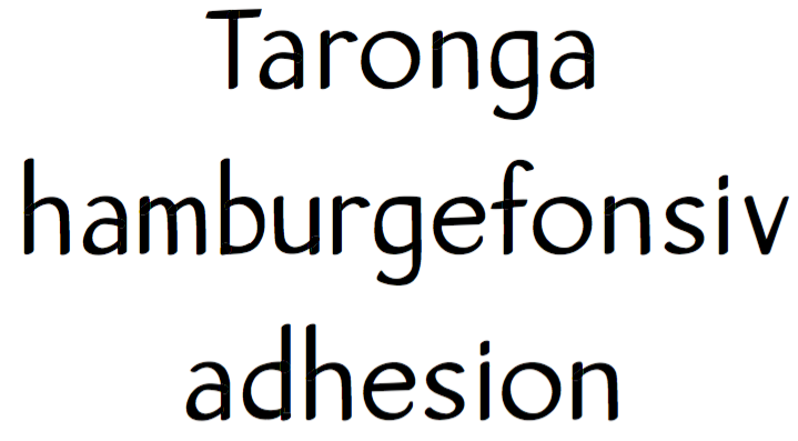
Taronga: a humanist sans
Simon Cozens
Posts: 831
One day I'll be good enough to actually finish a project, but until then I am trying to learn by making as many mistakes as I can, as quickly as possible. (If there are better ways to improve, please let me know!)
In previous projects I've just been pushing points around on the screen, but for this one I started by drawing on paper and scanning, and then tried to make widths and curves regular across the glyphs. I haven't found many fonts like this - I've looked at other humanist sans, but there don't seem to be many as contrasty. (David Bergsland's Brinar is the most similar I've found, or, dare I say it, Papyrus.) Maybe there is a good reason for that, though...

In previous projects I've just been pushing points around on the screen, but for this one I started by drawing on paper and scanning, and then tried to make widths and curves regular across the glyphs. I haven't found many fonts like this - I've looked at other humanist sans, but there don't seem to be many as contrasty. (David Bergsland's Brinar is the most similar I've found, or, dare I say it, Papyrus.) Maybe there is a good reason for that, though...
0
Comments
-
I think you are definitely progressing
 I recommend reading Frank Blokland's www.lettermodel.org for insight into the 'typical' proportions; eg your 'T' bar is a little narrow.
Also pay attention to the terminals; the exit stroke of the e and g are flicking up a bit in a playful manner while many other exit stroke are straight-laced and there isn't so much playfulness in other places where it could be found. The exit of the s also flares in an usual way.
The stroke flow of the tail of the g is awkward, your Callipers plugin could help 0
0 -
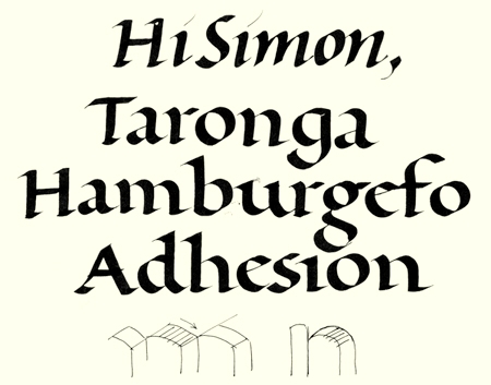
Hi Simon,
With ‘Humanist’ you refer to the broad-nibbed origin of the model, I presume. In that case it would make sense to explore a bit more the related contrast flow IMHO. I quickly wrote down an example for reference.
Perhaps playing with the LetterModeller application will help you also a bit, as Dave suggested. For the rest, sans serifs are difficult stuff and serifs are more than elements that just can be removed. Please read my brief comments on this subject here.
Best, Frank
0 -
Is this for text or display? Test several words at the size you intended it to be used.2
-
I really like the idea of a handwriting font that looks like it was written very neatly (which is how I see this). It's so much more common to see that energetic, quickly-written feel, so there's something nice about the combination of "neat and clean but still obviously handwritten." Maybe it would be helpful to think of it that way, rather than as "a sans," if that makes sense?
0 -
Simon, I am not a typeface designer. But let me offer my thoughts. I like this font. I agree with Austin Stahl's comment about being very neatly printed. To my eyes, the e does not look like it fits in with the other letters. I looks more drawn rather than printed neatly, but I am not sure why. Maybe it is too round, although the o looks fine. Maybe the lower right part of the e doesn't end write. Maybe it should be skinnier. I just can't put my finger on it. Comparing the vertical part of the T and the h, the h looks darker. Particularly because your upper case letters are short, they have to be dark enough. I say keep going with this.0
Categories
- All Categories
- 46 Introductions
- 3.9K Typeface Design
- 489 Type Design Critiques
- 572 Type Design Software
- 1.1K Type Design Technique & Theory
- 663 Type Business
- 875 Font Technology
- 29 Punchcutting
- 530 Typography
- 121 Type Education
- 328 Type History
- 81 Type Resources
- 111 Lettering and Calligraphy
- 32 Lettering Critiques
- 79 Lettering Technique & Theory
- 561 Announcements
- 96 Events
- 116 Job Postings
- 169 Type Releases
- 179 Miscellaneous News
- 269 About TypeDrawers
- 53 TypeDrawers Announcements
- 114 Suggestions and Bug Reports


