Height of straight and curly quotes marks
Wei Huang
Posts: 99
What height do you design these at? I've seen a few schemes and am curious about the different rationales. I understand straight quotes (typewriter quotes) aren't 'supposed' to be used, and are a result of conserving keys on the typewriter keyboard. But since people do use them and software doesn't always automatically correct them they are here to stay. Shouldn't they reflect the curly quotes?

I don't understand what's going on here.

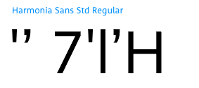
This I can understand, these are all aligned to the cap or ascender height.
3. Straight quotes lower than curly quotes:
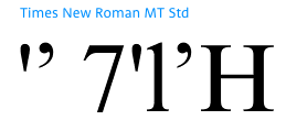

I understand that the straight quotes are aligned to the cap height and the curly quotes are aligned to the ascender height (or thereabouts).

Looks smooth at the start of sentences, for dialogue? Less disruptive?


Slightly more emphasis, anchors the height of the ascender?
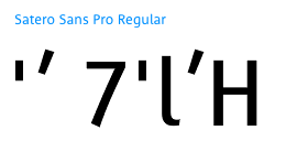
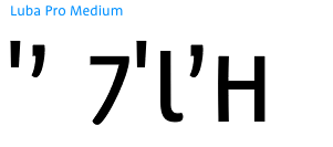
Why?
Height of quotes in relation to each other
1. Straight quotes taller than curly quotes:

I don't understand what's going on here.
2. Straight quotes same height as curly quotes


This I can understand, these are all aligned to the cap or ascender height.
3. Straight quotes lower than curly quotes:


I understand that the straight quotes are aligned to the cap height and the curly quotes are aligned to the ascender height (or thereabouts).
Height of quotes in relation to cap height and ascender height
I'm just guessing here as to the rationale:1. Quotes aligned to the cap height

Looks smooth at the start of sentences, for dialogue? Less disruptive?
2. Quotes aligned to the ascender height


Slightly more emphasis, anchors the height of the ascender?
3. Quotes heigher than anything


Why?
Tagged:
3
Comments
-
This choice is firstly design and designer specific. The height of both the straight and curly quote can differ between fonts simply because the design has a different style or different constraints. A reason the straight quote is sometimes lower is because it is meant to be used as an abbreviation for time (22" being 22 seconds/minutes.), which means it is designed to work well with numerals.
On the other hand, you are right in saying that a lot users don't know this and mis-use the straight quotes. How to deal with that is up to you.0 -
I’ve put angled “straight” quote glyphs in several typefaces, and made them identical to “curly” quotes.
I figure that the only reason they are vertical (or “neutral”, according to Unicode) is because they originated in serifed styles, which have a left or right bias. But this is not necessary in sans fonts:
But perhaps there is some grammatical reason for verticality that I am unaware of?
2 -
The verticality is just an old convention from typewriters.1
-
FWIW, fonts in which the ascii quote marks don't in some way relate to the typographical quote marks... I don't understand it. Maybe the type designer is trying to make the ascii quote marks look bad on purpose to steer users toward the typographic quote marks? Not that that would work...3
-
Particularly those in which an apostrophe-backspace-period served as an exclamation point, I'd guess.Mark Simonson said:The verticality is just an old convention from typewriters.1 -
@Jasper de Waard That would be the prime marks which are supposed to work with numerals https://en.wikipedia.org/wiki/Prime_(symbol) The straight apostrophe/quotes/marks is a multi-purpose leftover from the typewriter.
Interesting approach, Nick, surrendering to usage. What could possibly be a case where the straight quotes look weird when angled?0 -
Like what Nick has done, I've made the ascii quote the same as the right quote in a couple of my fonts, but that's a good point about situations where you need to be able to tell the difference visually. If the face is not appropriate for coding or other similar use anyway, it's probably okay.1
-
@Indra Kupferschmid @Frode Bo Helland
Ahh, my apologies. I didn't know there was a separate mark for that. Do you include it in your typefaces, though?0 -
There is, unfortunately, no convenient way to type a prime or double prime from common keyboard layouts. Font Bureau regularly includes a standard stylistic set in their fonts (ss19) for substituting true primes in place of straight quotes. It’s a hack, but there you go, for better or for worse.
0 -
Jasper is not wrong, of course, that more often than not the straight quotes are used as primes. And I think, as type designers, we do what we can to come to terms with that reality.
I’ve taken to making them not quite straight, trying to strike a balance between making them look a little more acceptable when used “naively” for quotation marks or primes, while still preserving their core identity.
4 -
Craig Eliason said:Particularly those in which an apostrophe-backspace-period served as an exclamation point, I'd guess.
Depending on the language and the keyboard the straight quotation mark in typewriters was used for different purposes. Some examples taken from Mackay, The typewriting dictionary, 49–50 (from top to bottom, diaeresis, ditto mark, exclamation, feet, inches, minutes and seconds).
However the exclamation mark and the diaeresis were often included in the keyboard.
I guess is a matter of style to use straight of curly quotes today. Actually, in Hebrew straight quotations marks are more common.5
Categories
- All Categories
- 46 Introductions
- 3.9K Typeface Design
- 489 Type Design Critiques
- 572 Type Design Software
- 1.1K Type Design Technique & Theory
- 663 Type Business
- 877 Font Technology
- 29 Punchcutting
- 530 Typography
- 121 Type Education
- 328 Type History
- 81 Type Resources
- 111 Lettering and Calligraphy
- 32 Lettering Critiques
- 79 Lettering Technique & Theory
- 561 Announcements
- 96 Events
- 116 Job Postings
- 169 Type Releases
- 179 Miscellaneous News
- 269 About TypeDrawers
- 53 TypeDrawers Announcements
- 114 Suggestions and Bug Reports


