It's not a perfect ellipse, why?

AbiRasheed
Posts: 249
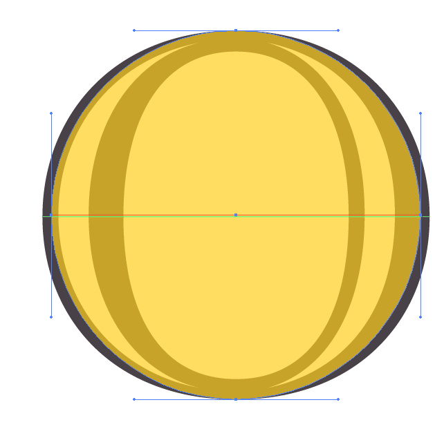
I'm pretty sure this has been done before but never understood why. I was just studying Hoefler engraved text and noticed the O wasn't a perfect ellipse as marked in the image below. The overlay on top in yellow is the ellipse and the bottom in brown is from hoefler text. Is there a reason why they do this? If you look at the gif as seen here, assuming its to make up for width optically and even if I pulled the side anchors it looks off in the corners. Not to mention the anchors on the side are not center aligned for the O in hoefler's version, its like it's been pushed up a little. The green stroke aligns with the anchors from the brown text and the orange stroke aligns with the anchors on the yellow ellipse. Maybe I've over analyzing this but I'm kinda curious why its off centered and it's not an ellipse.
Thanks.
Edited image cause the first one was the wrong image.

Thanks
Thanks.
Edited image cause the first one was the wrong image.
Thanks
Tagged:
0
Comments
-
[Still wrong image, I think. The one you linked to in the text seems to meet your description.]
You ask why the letterform isn't a perfect ellipse. I might respond by asking why you would expect it to be? The letter O is seldom a perfect ellipse. Even in a geometric style of low contrast type such as Futura, the O is adjusted for optical reasons. In most styles of type the shape varies not only for optical purposes but also to give some liveliness to the form: pure geometry tends to look dull and static.
With regard to why the optical centre of the letter might sit slightly higher than the geometric centre — by raising the extrema of the sides slightly — this is for the same reason that the crossbar of the H sits slightly higher than the mid-height of the letter. Whether as a result of optics or experience, we tend to perceive geometrically centred vertical features as lower, so they are raised slightly to compensate. The same adjustment is observed in much art, and also in how we frame pictures or arrange text on a page: the bottom margin is larger than the top margin.5 -
Even aside from optical correction to overcome some idiosyncrasies of human perception, who is to say that a compass drawn circle is the best curve for a glyph to live in harmony with all of the others? We attempt to draw the best curve for the visual situation without regard for strict geometry. While geometry may have its usefulness, it is rarely optimal for the drawing of letterforms.1
-
I have just come across this article. It seems to hint at a "greater meaning" regarding time and space and how we perceive it. https://app.secure.griffith.edu.au/news/2016/01/28/bringing-time-space-together-for-universal-symmetry/1
-
@Chris Lozos @John Hudson Cheers thanks. I was aware of the optical corrections people make for crossbars, etc, didn't realise it applied to rounded letters. So, if I had to redraw this, would you start with an ellipse and only after everything is drawn out does one make optical corrections like off centering the anchors and stretching the handles like on the top etc to make it visually pleasing? Essentially it's eyeballed when you make these corrections?
0 -
I don't know what the method was for creating that particular letter, but it isn't unusual to start with a basic ellipse (not necessarily a circle) and then edit the nodes and handles to get it to look how one wants, looking at it alongside other letters, gradually refining.2
-
Following what John said, when you look at it next to other glyphs again and again as you work, don't fear making a change in the curve no matter how long you have worked on it.2
-
Temporarily mirroring is used to prove the curves and angles but does it work for any letter shape? For symmetrical — sure, but some asymmetrical characters that good adjusted become looks not so good when mirrored horizontally.... edit the nodes and handles to get it to look how one wants, looking at it alongside other letters, gradually refining.1 -
Designing type is not a geometry perfect task. Practice your drawing skills more and learn to "see". The eye is the final arbiter.
4


Categories
- All Categories
- 47 Introductions
- 4K Typeface Design
- 495 Type Design Critiques
- 577 Type Design Software
- 1.1K Type Design Technique & Theory
- 670 Type Business
- 885 Font Technology
- 29 Punchcutting
- 539 Typography
- 125 Type Education
- 333 Type History
- 81 Type Resources
- 113 Lettering and Calligraphy
- 33 Lettering Critiques
- 80 Lettering Technique & Theory
- 569 Announcements
- 100 Events
- 116 Job Postings
- 170 Type Releases
- 182 Miscellaneous News
- 270 About TypeDrawers
- 54 TypeDrawers Announcements
- 114 Suggestions and Bug Reports