The default line height in OSX fontbook

Belleve Invis
Posts: 269
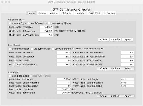
Recently someone reported that Iosevka's line height is inconsitent among weights, however the metrics in `hhea` and `OS/2` table are exactly same within all the subfamilies I provided.

It it means that there are still some undiscovered parameters which decides the line height?
TTF files : http://7xpe0v.com1.z0.glb.clouddn.com/iosevka-lineheight-test-osx-20151224b.7z
It it means that there are still some undiscovered parameters which decides the line height?
TTF files : http://7xpe0v.com1.z0.glb.clouddn.com/iosevka-lineheight-test-osx-20151224b.7z
0
Comments
-
 2
2 -
The vertical metrics info in both the regular and bold font files is indeed identical.

I have seen this before and TBH I have no clue what is causing the different display in Font Book. It looks like a cosmetic issue to me and one can at least circumvent it by adding NameID 19 to the naming table.

Although actually the same effect shows up in the example above, it is less obvious than in the standard font overview.
0 -
I’m guessing it’s your bounding boxes.
Some layout apps use the top of the bounding box to position type.
Often, characters like Aring will be taller in the Bold.
0 -
@LeMo aka Frank E Blokland
After changing the hhea.descent to the "real" descender (-205) the problem is solved. But... Why OS X increases line height?0 -
Definitely having this problem... Checked in OTMaster, all table values are the same. Custom text string in the name table.
Can't for the life of me figure out why weights have different line heights?!0


Categories
- All Categories
- 47 Introductions
- 4K Typeface Design
- 495 Type Design Critiques
- 577 Type Design Software
- 1.1K Type Design Technique & Theory
- 670 Type Business
- 884 Font Technology
- 29 Punchcutting
- 538 Typography
- 125 Type Education
- 332 Type History
- 81 Type Resources
- 113 Lettering and Calligraphy
- 33 Lettering Critiques
- 80 Lettering Technique & Theory
- 569 Announcements
- 100 Events
- 116 Job Postings
- 170 Type Releases
- 182 Miscellaneous News
- 270 About TypeDrawers
- 54 TypeDrawers Announcements
- 114 Suggestions and Bug Reports