CA Capoli by Cape Arcona Type Foundry

Thomas Schostok
Posts: 16
Hey TypeDrawers,
happy to announce our newest baby:
CA Capoli
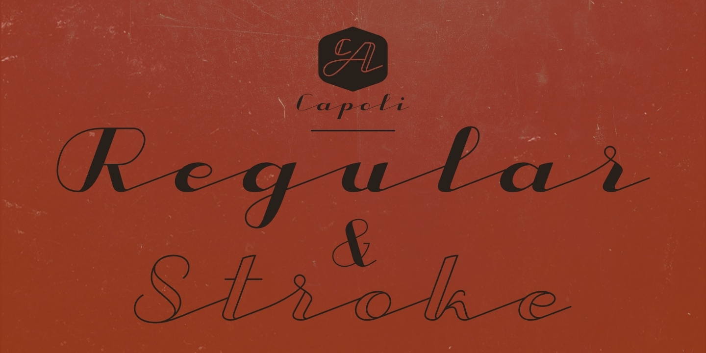
CA Capoli was designed by Thomas Schostok and is a fine script typeface with a vintage touch. Perfect for illustrative titles or logotypes. It comes in two styles, Regular and Stroke.
happy to announce our newest baby:
CA Capoli
CA Capoli was designed by Thomas Schostok and is a fine script typeface with a vintage touch. Perfect for illustrative titles or logotypes. It comes in two styles, Regular and Stroke.
A mystery – in search of the origin
The inspiration came during our trip to Italy, where we took a short rest in a bar during a hot day. We discovered a simple ceramic ashtray on the table. The word “Nido” was inscribed in a typeface that looked like it dated back to the 1950s. We made some investigations about the word, its meaning and origin but it still remains a big mystery. Was it the name of a hotel or a restaurant or some vintage Italian cigarettes? We don’t know. We were so amazed about the design of the logo that we decided to create a typeface out of it. A sophisticated endeavour because we just had four letters. How could the rest of the letters — if it ever existed — have looked like? Our hypothesis is CA Capoli a typeface with a full Central European character set and some nice alternative letters to chose from.
Since we never find out what “Nido” really ment, we invite everyone to find out or give us a hint. Please get in contact with us.
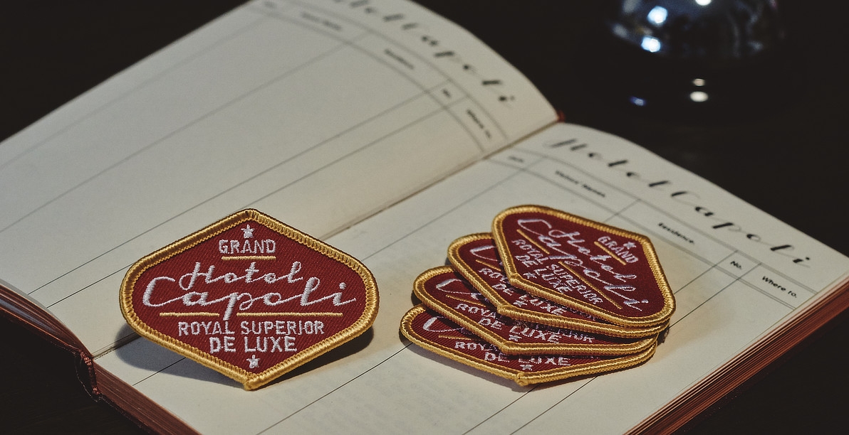
When we thought about “Nido” and its possible derivation of hotel business, we felt like creating a small side project for our new typeface, a corporate design for a fictional hotel called Hotel Capoli with business cards, letterheads, a reception book, key fobs and embroidered patches for the service dress of the hotel service stuff. The Hotel Capoli is located at the wonderful beach of Cape Arcona on the fictional country of Arcona Islands where our type foundry is located.
Here are some screens of CA Capoli, we hope you enjoy:


0
Categories
- All Categories
- 46 Introductions
- 3.9K Typeface Design
- 489 Type Design Critiques
- 572 Type Design Software
- 1.1K Type Design Technique & Theory
- 663 Type Business
- 877 Font Technology
- 29 Punchcutting
- 530 Typography
- 121 Type Education
- 328 Type History
- 81 Type Resources
- 111 Lettering and Calligraphy
- 32 Lettering Critiques
- 79 Lettering Technique & Theory
- 561 Announcements
- 96 Events
- 116 Job Postings
- 169 Type Releases
- 179 Miscellaneous News
- 269 About TypeDrawers
- 53 TypeDrawers Announcements
- 114 Suggestions and Bug Reports