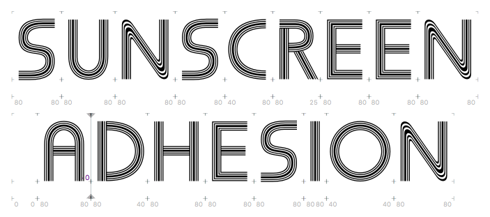
Carry on or stop?
Obviously there are some differences, but... well, it's the same concept. So do I chalk this one up to experience and work on something else, or is it interesting enough to do more on?
Incidentally, it does provide an interesting way of solving the font piracy problem - just embed client-specific barcodes in each font you sell:

Comments
-
Well, I doubt is will ever be a bestseller. But if it isn't about making money, do it if you enjoy it and are excited about it! And don't do it if you are not excited. If the discovery of Pentaprism has made you lose enthusiasm, take a break, at least temporarily.
In terms of advancing your craft and learning, I suspect the ratio of complications/time to payoff will be poorer than average on a wacky design like this. But I could be mistaken. 1
1 -
You should definitely check out Grow Typeface System by Dinamo http://www.typetoken.net/typeface/grow-typeface-system-dinamo/, I can't find their hotsite for it, which was really fun, but these pictures give you an idea of what the typeface is like. You can see Grow in use over here http://fontsinuse.com/typefaces/38253/grow0
-
Maybe you should see where your design is most different from Pentaprism and develop it in that direction? I think there's something very interesting and unusual happening in the vertices of your N.
2 -
I echo @Thomas Phinney's advice: If you enjoy it and are excited by it, keep going. Until you're not excited anymore.
Making it from scratch is enough to make it yours. There is enough room in the world for several different styles of fonts with this lined effect. I would actually counter @Max Phillips's advice—not that it is wrong or bad, we simply have different approaches, choose what works best for you—but I would never look at Pentaprism again, until you are done or stuck, and see what solutions you come up with on your own. They will probably be unique—just like your /E, /N, /R and /S.6 -
FWIW, I think Dyana's recommendation is at least as good as mine. As she says, there's more than one path to take.
2 -
Who knows where the “technical” challenge will lead?
Ed Benguiat, a phenomenal draftsman, drew/cut/painted stuff like this for PLINC, if I’m not mistaken; now the tools are quite different, but the challenges remain, and working with today’s tools opens up new design avenues to explore, which differentiate the outcome from what’s been done before.
1 -
Discoveries, either by a person or a society, come in the process of problem solving, not by reproducing someone else existing solution. Find your own path to find something new to you. Dyana is right, "never look at Pentaprism again".
0 -
Keep with it. It's an interesting design, and I think you're doing well with it. You could make changes to further differentiate your design, but I don't think you need to.
0 -
The user and all related content has been deleted.2
-
Indeed Pentaprism is a medley of the many phototype variations on Koch’s Prisma infused with Bauhaus-like round forms e.g. for AEMNY, incl. PLINC’s Prisma series and Headliners’ Prismania.
Pentaprism comes in five styles. The basic one has 5 lines, like Prismania. The uppercase is angular (as in Futura Prisma & Prisma Graphic — but with a non-splayed ‘M’), the lowercase holds round caps (as in Bauhaus Prisma & Prisma Bauhaus). See also Michel, Aki Lines, Filmsense, Blackline.
2 -
I was mistaken, James, you remembered Ed’s story better than I did.1
-
The user and all related content has been deleted.3
-
Thanks all for the inspiration. I did some more work on this because it continued to be both fun and a learning exercise. I didn't look at Pentaprism again. It doesn't work at anything less than really big sizes - I presume that's just a limitation of this design, and I shouldn't be trying to mess about too much with hinting.
I'm going to let it cook for six months to see if I want to polish it up at all, (I'm very happy indeed for it just to be an interesting learning exercise) but to share the fun here it is.0 -
'When to stop' is probably the most important decision a designer or artist has to make.0
-
Thanks to all for the help and advice on this and other projects. I've decided to stop, and release Sunscreen as my first font!
 and I bet you that "R" is going to haunt me for the rest of my life.
0
Categories
- All Categories
- 46 Introductions
- 3.9K Typeface Design
- 489 Type Design Critiques
- 572 Type Design Software
- 1.1K Type Design Technique & Theory
- 664 Type Business
- 877 Font Technology
- 29 Punchcutting
- 530 Typography
- 121 Type Education
- 328 Type History
- 81 Type Resources
- 111 Lettering and Calligraphy
- 32 Lettering Critiques
- 79 Lettering Technique & Theory
- 562 Announcements
- 97 Events
- 116 Job Postings
- 169 Type Releases
- 179 Miscellaneous News
- 269 About TypeDrawers
- 53 TypeDrawers Announcements
- 114 Suggestions and Bug Reports


