A straight version of Abraham: Bram

Jan Willem Wennekes
Posts: 148
Around two years ago I released Abraham, a hand-drawn typeface with varying lettershapes (3 alternates for all uppercase and lowercase letters, 'randomly' used so the words look like they are hand-drawn, a lot of calt and salt).
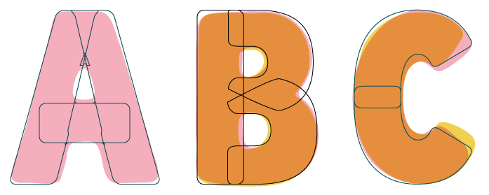
I decided to try and 'retro-engeneer' the solid/straight typeface that Abraham is supposedly drawn from, as if the shapes used in Abraham were the sketches for a more straight lined typeface. Working title: Bram.
Here's what I have so far (see attached sample): if you flip the pages in that PDF, you'll first see two pages where uppercase letters of Abraham are featured, the 3rd page are the letters I arrived at.

Here and there I had to smuggle a little bit, but this is getting pretty close. The squared /period and /comma didn't feel right for some reason, so I treated those as circles of similar shape as the insides of /six /eight /nine.
Since Abraham was thick and solid, but also smooth and rounded at the edges, I treated all corners in the same manner. This probably wouldn't help much when you'd use this in print in small sizes, but I feel it would work nice when used in (very) large sizes. As Abraham was intended too. See some samples below:


What do you think so far. Any oddities that catch your attention, that need fixing? I don't want to depart too much from the 'original' Abraham, but some improvement here and there might be nice.
Thanks for watching!
I decided to try and 'retro-engeneer' the solid/straight typeface that Abraham is supposedly drawn from, as if the shapes used in Abraham were the sketches for a more straight lined typeface. Working title: Bram.
Here's what I have so far (see attached sample): if you flip the pages in that PDF, you'll first see two pages where uppercase letters of Abraham are featured, the 3rd page are the letters I arrived at.

Here and there I had to smuggle a little bit, but this is getting pretty close. The squared /period and /comma didn't feel right for some reason, so I treated those as circles of similar shape as the insides of /six /eight /nine.
Since Abraham was thick and solid, but also smooth and rounded at the edges, I treated all corners in the same manner. This probably wouldn't help much when you'd use this in print in small sizes, but I feel it would work nice when used in (very) large sizes. As Abraham was intended too. See some samples below:


What do you think so far. Any oddities that catch your attention, that need fixing? I don't want to depart too much from the 'original' Abraham, but some improvement here and there might be nice.
Thanks for watching!
Tagged:
1
Comments
-
Opened up the counters of /A, /B, /P, /R and /4 a bit more. Made /W a bit lighter, lowered its inner crotch. If you open up the attached pdf sample you can flip through the pages to see the difference before (1st page) and after (2nd page).

0 -
I don't dislike it, but it does feel a little bit in between choices to me. How would you envision this being used?0
-
I think sometimes it's a mistake to use geometric construction for a design which would be better delivered if it were hand drawn or at least appeared more hand drawn. It's a contradiction to have such innocent letterforms with perfect alignment and rigid, horizontals and verticals. You'd be better off tracing it on paper and autotracing it.
I've made the same mistake several times.2 -
Thanks @Jasper de Waard and @Ray Larabie for your comments. These are helpful. It might indeed become too simple / geometric, and hence loose it's interestingness. I did feel like I was stripping away some of its personality.
My idea was that this could be used in similar cases where a playful display type could be used, when you'd need something friendly yet solid, but didn't want that hand-drawn feel to it. Maybe that's too limited an approach, so maybe this typeface wouldn't add that much to what is out there already.
How do you feel about examples like this?


0 -
Hi Jan, have you considered making the /B's central incision a bit more pronounced? I have trouble parsing it as a /B at first sight. The /R is less problematic for me, but might also profit from some similar adjustments.
1 -
Yeah, I think it makes sense on screens: web, apps, games etc.0
-
Thanks for the comment @Ray Larabie large sizes and screens sound like good purpose.
And good catch @Christian Thalmann - I had sharper incisions in Abraham, you can even see it in the overlapping alternates of the /B above in the sketch. This new version is actually more true to Abraham than what I had before (right is new):
2 -
-
Much better /B/R!
Is the /G perhaps a bit too timid? I feel the crossbar could be a bit heavier and its stem a bit lighter. Maybe make the whole glyph a hair wider?
The bottom of the /W strikes me as somewhat compressed, maybe try moving the two vertices apart a bit.
0 -
Thanks again @Christian Thalmann! The /G might be too narrow, not sure. It is really based on the /C as it was in Abraham as well. I did try to widen it a bit (you can see it starts diverging from the /C). Bigger crossbar helps I think? This wider /G does seem a little better, even though it doesn't play by the rules...

I also tried a slightly wider bottom for the /W, better? Maybe now those inside angles are looking weird too?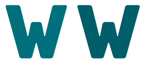
1 -
-
I know a display font like this isn't necessarily about even color, but it seems to me the structures of /C/J/W/ invite too much white space into the letters.0
-
This wider /G does seem a little better, even though it doesn't play by the rules...
Rules? What rules? There is only one ruler, and its name is Eye.
1 -
Screw the rules, the new /G looks righter.0
-
Thanks all for these comments.
@Christian Thalmann and @Michael Jarboe - ok then, screw it let's do it!
@Craig Eliason I do see what you mean, but it would mean making substantial changes to what this typeface is (or used to be). It could definitely go more in the direction of something like Berthold Block, where the /J /C and also /S are more condensed in shape:
If I were to divert from the 'original' Abraham style, then this might be an interesting direction though.0 -
It could also mean a completely different /G (sketch version here, needs work)
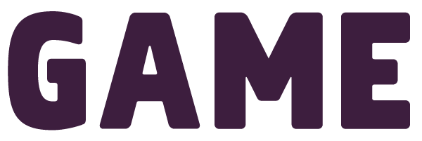
not sure if I like that as much as the old one - what do you think?0 -
Can you show those new CGSJ in context?
Makes me think of Panno, which is not necessarily a bad thing. https://www.boldmonday.com/typeface/panno-sign/0 -
Good point @Jasper de Waard. Here's a few quick words with "Jasper de Waard"
That new /J seems to work much better in between other forms, it doesn't leave so much white space around it.
Panno looks really nice, thanks for the reference.


^ here I do like the new /G better than the old one. It looks better next to a straight sided letter like the /L than next to the /A to me right now.0 -
Top /W/ and /J/, bottom /S/ and /G/ would be my votes. And trying to narrow the /W/.2
-
I would actually go with the new direction all the way. Although the G could be wider, and the S more 'round' (move up the bottom-right, and move down the top-left). Also the diagonal part in S could be thicker.0
-
And I think it would works nicely with 'old' W!0
-
Thanks @Craig Eliason and @Jasper de Waard
These were sketches, so yes, they do need some work. Thanks for the pointers.
Shouldn't the bottom terminal of /J be of similar structure as /S and /C though? Somehow that would feel like the most consistent solution to me.
Here's a few new images. I'm testing whether the inside soft corners can be deleted. Looks ok to me, a bit stronger/sharper now, but the friendliness isn't lost since the outside corners are still soft. New /O /D /M and refinements on the /S /C /W
Craig's suggestion here at the top - I have a bit of difficulty with the different terminals of /J versus /S and /G. The second seems more natural to me.

Bottom word features the refined /C /O and the new /M0 -
You could have the /J/ curve back up just a little, without necessitating the huge width that the old version had.
Consistency's good but there's plenty of precedent for flexibility here (Futura, Franklin Gothic...)
There's a kind of round, childlike quality to the design (meant as a compliment!) that I think gets lost in the angular /S/G/C/ on those bottom two rows of that last image. But of course maybe you're intending a different direction than I'm seeing here.0 -
I prefer the first line here. Some letters of the second line strike me as too sleek for the flavor of the font.
0 -
Thanks @Craig Eliason and @Christian Thalmann - this helps. I started out with Abraham in mind, which indeed has a more naive, playful approach. That's what I wanted to convey in this straighter typeface. These last attempts are starting to go beyond that, which isn't a problem in itself.
It feels like a 'fork' in the design process: either direction could become a full typeface, but it's a design choice. I could have this typeface grow up even more, introduce more angles and straightness, but at this point that doesn't feel right. I'll keep those letters though, and I might come back to them some other time and develop those. The more angular /S/C/G/J could be combined with straight legs on the /R and /M, and sharper corners here and there.
So back to the friendliness of Abraham. In the meantime, this path did lead me to open up the /C /S and /J a bit more and have their terminals cut off a bit sooner. What do you guys think about these? (see attached pdf for more detail). Might be hard to tell but I redid all the letters.

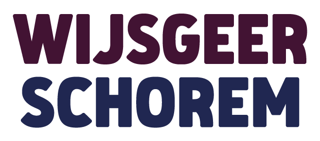
1 -
The new /S is pretty! Big improvement.
I preferred the narrower /J, though, especially in the /IJ digraph. This one generates a lot of white space.
Perhaps the /R is still a bit too massive in the way that /B used to be?
I feel the /Q is too timid.
0 -
Looking good. I think the left half of C and G could be rounder.1
-
Thanks @Christian Thalmann and @Craig Eliason!
The /S is always a difficult letter to fit into the system imho, so that means a lot.
Good call on the R, I decided to redo /R /B /P once again. The /R was definitely bugging me already, it looked too fat in relation to the other letters.
New /O and /C /G too, to test Craigs idea of a bit more roundness. They look better to me, but are they perhaps becoming too wide? They do seem less cramped inside.
Not sure about the /J - other letters such as /T /L and /Y will invite a lot of whitespace as well. Below is a somewhat smaller /J though, it diverges a bit from the terminal of /C and /G but still has the same 'logic' so it could work.
Updated letters, plus a few new /Q combinations.
The new uppercase alphabet (still the old /J)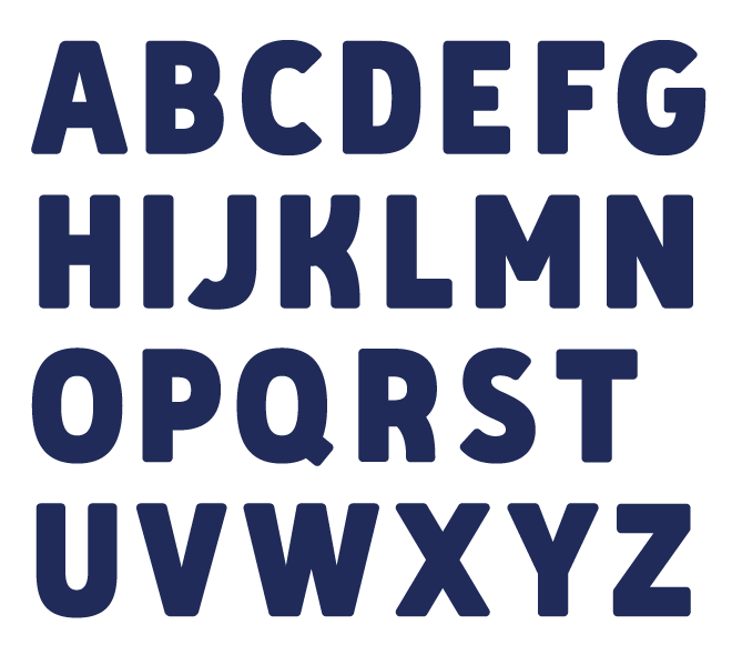
1 -
D could be wider. And the whitespace in V, W, and M could be taller.2
-
Ah, good catch that /D, thanks @Jasper de Waard - I should have remade that one together with the /O /C etc. /V and /W are a little lighter now. Not sure if it helps already, it seems as if the diagonals aren't wide enough? Or is that a trick of the eye?


Also tested a bunch of words with a narrower /J but they seem off, the slightly wider /J seems best to me. Especially in relation to letters such as /L /P /T /Y.
0
Categories
- All Categories
- 46 Introductions
- 3.9K Typeface Design
- 489 Type Design Critiques
- 572 Type Design Software
- 1.1K Type Design Technique & Theory
- 663 Type Business
- 875 Font Technology
- 29 Punchcutting
- 530 Typography
- 121 Type Education
- 328 Type History
- 81 Type Resources
- 111 Lettering and Calligraphy
- 32 Lettering Critiques
- 79 Lettering Technique & Theory
- 561 Announcements
- 96 Events
- 116 Job Postings
- 169 Type Releases
- 179 Miscellaneous News
- 269 About TypeDrawers
- 53 TypeDrawers Announcements
- 114 Suggestions and Bug Reports


