New brush typeface: Inky (?)
Comments
-
/period /comma /space, make them narrower
0 -
Thanks Pablo for the tip. I do kinda like the oversized period and comma, but I'll try some variants. Making space smaller too.
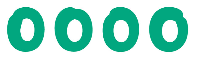
In the meantime I've tried a different /O with the connection topleft instead of topright. I've also worked on the contrast of similar letters such as /C /G /Q - and in follow up some others as well. (click images to enlarge)
Here's a few sample words with these letters:
0 -
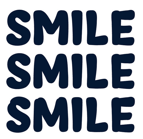
Also, how is this for a new /M? It started to seem odd to me, but maybe I've just been looking at it too long. Top row is the old version, middle is the new, bottom is the new also, but with slight bumps (overlapping brush strokes). I also added the /S with bump there:
 0
0 -
The new /M is great!
As for the /O, wouldn't you expect the start rather than the end of the stroke to be heavier?
0 -
Thanks @Christian Thalmann! You're probably right about that /O and the start & thickness of the stroke. Can't seem to get that one right though:
 0
0 -
Hmmm, maybe curl the ends of the stroke more so they point slightly inward rather than outward? Or move the intersection up?
(Disclaimer: I have no experience in signpainting.)0 -
tried that too, doesn't seem to work that well.
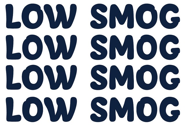
So far I still think the last two here (top two in the image above LOW SMOG) are my best options. If I look at other brush / signpainted inspired typefaces I see a lot of variants.
See for example streetscript, bonbon, sanelma (by @Mika Melvas) or holly...0 -
Still wondering, but the issue might be the difference in drawing / painting for upright or cursive versions? Some of the more upright brush typefaces employ the second way of drawing the /O - most of the others are italic/cursive to some extend...

0 -
That should actually be:

Since this is more an upright than a cursive variant, if one would connect the bottom right you'd arrive more or less at:
1 -
The contrast inside each letter still wasn't the same for most letters. Tried to fix that. Redid all the letters with more similar contrast. See attached PDF for sample work - no kerning or anything just yet so some words will look odd.
Sticking with the above /O for now. And using that new /M too.
Comments / suggestions welcome!0


Categories
- All Categories
- 47 Introductions
- 4K Typeface Design
- 495 Type Design Critiques
- 577 Type Design Software
- 1.1K Type Design Technique & Theory
- 670 Type Business
- 885 Font Technology
- 29 Punchcutting
- 539 Typography
- 125 Type Education
- 333 Type History
- 81 Type Resources
- 113 Lettering and Calligraphy
- 33 Lettering Critiques
- 80 Lettering Technique & Theory
- 569 Announcements
- 100 Events
- 116 Job Postings
- 170 Type Releases
- 182 Miscellaneous News
- 270 About TypeDrawers
- 54 TypeDrawers Announcements
- 114 Suggestions and Bug Reports