ReType font release: ‘Dulcinea’

Ramiro Espinoza
Posts: 839
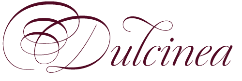
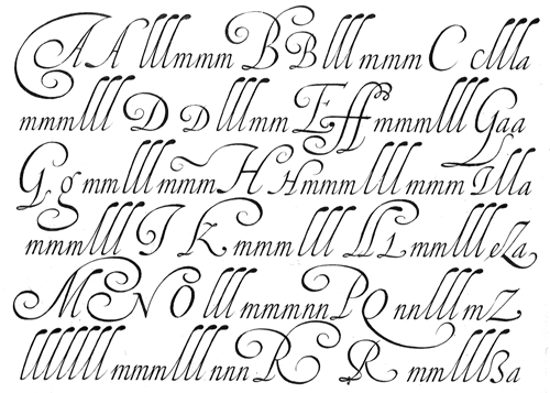
Dulcinea is the title of Ramiro Espinoza’s in-depth look at Spanish Baroque calligraphy’s most extreme tendencies, and especially at some of those produced by the writing masters Pedro Díaz Morante and Juan Claudio Aznar de Polanco. These 17th and 18th centuries alphabets with their plentiful calligraphic flourishes represented a marked break with the harmonic and angular Renaissance Cancellaresca style.
It was Morante who first introduced and popularized the use of the pointed quill in Spain, and although his famous text entitled “Arte Nueva de escribir” – first volume published in 1616 – contains alphabets that have much in common with traditional broad nib Cancellaresca calligraphy, most of the examples therein are outgrowths of the new models put forward by the Italian master Gianfrancesco Cresci.
The writing’s swashes are complex and intricate, but at the same time they feature a profusion of defects. Many of them sometimes come close to ugliness. However, these pages contain an artistic essence that bears a relationship to the ironic and sometimes somber character of Spanish Baroque.
That’s why the name of the font pays homage to “Dulcinea del Toboso”, the fictional beauty from Miguel de Cervantes’s Don Quixote, a work that reveals many of the period’s conflicts, such as the contrast between utopian ideals and reality, uncertainty and madness.
But Dulcinea is far from being just a revival. Its forms are not careful tracings of the outlines of Morante and Polanco’s letters, nor are they attempts to reproduce them digitally. In fact, the author of the letters says that had the font been created that way it would have been too archaic to serve as acceptable contemporary typography. However, he believes that there are myriad interesting details that can be rescued and preserved, along with the playful spirit of the original.

The work of designing Dulcinea consisted of combining original historical elements with the creativity and calligraphy of the font’s author in order to produce a modern typography that isn’t based on the same traditional sources as many recently created scripts fonts.
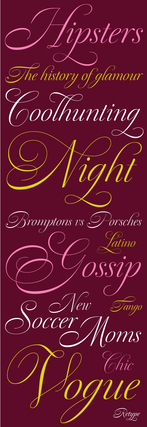
Dulcinea offers attractive options for the setting of texts and headlines: abundant ligatures and swashes along with intricate alternate characters. It sophisticated forms make it an ideal option for women’s magazines, recipe books, lingerie products or perfume packaging.
1
Comments
-
I’ve been waiting a long time to see somebody turn one of those great old manuals into a complex OpenType font. Ramiro did a great job with Dulcinea!0
-
Thanks James
") 0
0 -
Magnificent!0
-
Nicely done, but what happened to the blobby bits?0
-
Hi Nick,
Please be more specific. Do you mean features in the original books that are missing in the 'pseudo revival'? If so, I took a lot of liberties when making the font since I liked many details but I disliked equally a lot of others. If you mean, for example, the drop-shapped terminals in the ascenders, I think this things make a font too archaic. Since I wanted something commercially viable I gave the font a more XVIII Century feeling.0 -
Yes, those are what I was referring to.
0 -
1) This is lovely.
2) I, too, miss the blobby bits.
3) I agree this will do a lot better without the blobby bits.
Nice that it has the feel of a joining type without actually joining.1 -
This is beautiful. One thing I find difficult about scripts like this is that for my uses, they are often too light/thin. But that's just me being fussy :-)0
-
Great work! The alternates are impressive.0
-
I can't begin to imagine the work that goes into designing a script. Very nice work.0


Categories
- All Categories
- 46 Introductions
- 3.9K Typeface Design
- 493 Type Design Critiques
- 572 Type Design Software
- 1.1K Type Design Technique & Theory
- 668 Type Business
- 879 Font Technology
- 29 Punchcutting
- 534 Typography
- 122 Type Education
- 331 Type History
- 81 Type Resources
- 112 Lettering and Calligraphy
- 32 Lettering Critiques
- 80 Lettering Technique & Theory
- 563 Announcements
- 97 Events
- 116 Job Postings
- 169 Type Releases
- 180 Miscellaneous News
- 270 About TypeDrawers
- 54 TypeDrawers Announcements
- 114 Suggestions and Bug Reports