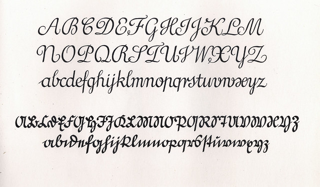
Is this a 'w' ?

I know that I have seen serif italic faces with a lc 'w' that looks like across between an 'n' and a 'v'.
But what faces have this w? Other than a few blackletters, I don't know of a single one. Where does this style come from?


what I remember it looking like

Anyone know?
Thanks!
w.JPG 34.2K

Comments

  • Yes, this is very close to how we learned to write cursive /w in primary school (Switzerland). We even had a hard corner in the top middle.

    (Of course, no-one uses cursive anymore in their daily life, and where it does appear, it's usually to the detriment of legibility.)
  • Stephen Coles
    Stephen Coles Posts: 1,008
    edited September 2015
    Here’s an example from a 1950s German writing manual via @Nina%20Stössinger:

    Lateinisch  Kurrent

    Also in Rudolf Koch’s Offenbacher Schrift (1928):
    Offenbacher Schrift das lateinische Alphabetjpg

    As for typefaces, Kleuken’s Ratio had this form. Kursivschrift’s ‘w’ does as well, even in its roman, but it’s an odd duck:


    I’m sure @Florian%20Hardwig – who has tagged various examples of this form on Flickr – could add more insight.
  • Karsten Rohrbeck wrote something about this asymmetrical ‘w’ in 2009. Unfortunately his site is not available anymore, but the post (without images) can be found in the Internet Archive.
  • You already mentioned it in your original post – the origin for this construction can be traced to Blackletter, more precisely FrakturIt also appears in older examples of English Roundhand.
    Especially in the German-speaking world, the asymmetrical ‘w’ survived for a while. Until the 1950s or 1960s, it can be found in non-Blackletter context, too, mainly script (also with extra crossbar) and related informal signpainting styles, occasionally in sans-serif. The uppercase ‘W’ can have this form as well (here again with crossbar). Here is a beautiful specimen by Willi Baus.
    Canada Type’s digital version of Kleukens’ Ratio Kursiv has that w as stylistic alternate.
  • Zapf's Comenius used this form for its itals.

  • Thanks for the reminder, Max. From a related thread on Flickr: [Zapf] pulled off this ‘w’ in his URW Antiqua, too, but only in one of the 63 styles – the Alt SuperBold Italic. Here’s a list of digital fonts in which ‘w’ looks more or less like an ‘nv’ ligature, including Zapf’s Noris Script and Zapfino 3. You need to activate Stylistic Alternates for a few of them to see the asymmetrical w.
  • The italic w in TypeTogether's Marco is also asymmetrical, though the first part is not so n-like as in some of the above examples.

  • Jens Kutilek
    Jens Kutilek Posts: 364
    edited September 2015
    In my FF Hertz I have included this form of w in the Italics in Stylistic Set 7:

    https://www.fontfont.com/fonts/hertz/book-italic#tab-features

    I included it as a nod to Zapf's hot metal version of Melior Italic, which had this form of w, but apparently changed it later to the internationally more common form.

    Unfortunately FF Hertz is not yet available on Myfonts, so it couldn't make @Florian Hardwig's list.
  • Very cool. Does anyone know if this form is still being taught in any writing courses in Germany or anywhere?
  • Doubtful David, but possible, but it is still used, in a "varietal" form, by calligraphers.
  • Jens, that’s a nice nod, thanks. That list was made a while ago and is not comprehensive. I will try to remember to add Hertz.

    David, as Christian has mentioned, this form is present in several of the traditional “Schnüerlischrift” handwriting models taught in Swiss primary schools, see schulschriften.ch. It was also present in Austria’s school script as defined in 1969. This model has been replaced in 1991.
  • Somehow this reminds me of the startling difference in construction pattern between the roman and the italic lower-case yat (U+0463).

  • Michael Clark
    Michael Clark Posts: 138
    edited September 2015
    But was that not the æ Maxim? Now I am curious. I was (likely mis-informed) that it was an acceptable Germanic form. I have used it countless times in calligraphic work.

  • Michael Clark
    Michael Clark Posts: 138
    edited September 2015
    http://www.typerror.com/current6/lettering_28.html
    "Wer wenn nicht wir?" Who else if not us?

    The last word uses this "W." The first 2 have their roots in the style that we are speaking of.

  • But was that not the æ Maxim? Now I am curious. I was (likely mis-informed) that it was an acceptable Germanic form.
    No, this is indeed a variety of the Cyrillic yat. In late 19th – early 20th century this form, which looks like a П + Ь ligature, existed even in u.c.


    And yes, it is remindful of the capital N in ‘French Script’ style. More examples:


  • Here are some nice large examples of this alternate form of w in Fraktur. We used it in a letterpress workshop in Weimar yesterday. Unfortunately, no one could tell which typeface this is. The cases in question have not been catalogued yet.
    https://www.flickr.com/photos/albert-jan_pool/albums/72157658505681406
    Concerning the origin of this form of w: In Ein nutzlich und wolgegrundt Formular Manncherley schöner Schriefften by Wolfgang Fugger, Nürnberg 1553, this form is the standard form in his Current, Kanzlei, Fraktur and Textur. Note that his Rotund shows a rather conventional w, but that in his Latin alphabet the minuscule form of w is absent. In Neudörffers Eine gute Ordnung und kurzer Unterricht, Nürnberg 1538 this form of w is also standard. It is also shown in a Textura in Unterweysung der Messung mit den Zirkel und Richtscheit, Nürnberg 1525.
  • Albert_Jan_Pool
    Albert_Jan_Pool Posts: 79
    edited September 2015
    Florian, how about establishing a tag for this w? w=nv
  • Albert_Jan_Pool
    Albert_Jan_Pool Posts: 79
    edited September 2015
    Note that the alphabets shown by Fugger, Neudörffer are reproductions of handwriting and that Dürers Textura is a reproduction of a drawing showing his construction of a Textura. Here is a typeface which is somewhat older: Koberger Type Nr. 10, a so called Druckbastarda (Bastarda for printing) It also has the nv-like form of w.
    http://luc.devroye.org/reske/reske3.jpg
    It was used for the Schedelschen Weltchronik from 1493
    http://luc.devroye.org/fonts-41607.html
    The Weltchronik itself can be viewed here:
    http://daten.digitale-sammlungen.de/~db/0003/bsb00034024/images/

    I wonder how old this form of w really is and wether it is really connected with the German Current, Kanzlei, Fraktur or Textura. Any suggestions?
  • Albert, thank you for these pointers.
    The display Fraktur looks like Koch’s Schmale Deutsche Anzeigenschrift (1923).
    Sure, let’s use w=nv as a tag on Flickr. I’ve tagged all kinds of interesting or unusual forms of w – including but not limited to this form – with the Unicode, U+0077.


  • Albert and Florian, don’t you think that this construction pattern of the y seems to follow the same logic as the w = nv? And the ѣ = пь, for that matter?
  • I think of the /y/ from Georg Trump's Delphin. 

    (Its /w/ has some of that, though its middle apex is angular.)
  • Florian Hardwig
    Florian Hardwig Posts: 273
    edited September 2015
    Albert – sorry, equal signs (=) don’t work in Flickr tags. Please suggest something else.

    Maxim and Craig, yes, I’d say they follow the same logic. Besides Walbaum-Fraktur, Maxim’s example shows the Italic from Kapr’s Leipziger Antiqua. Both Kapr and Trump went through the Schneidler school of writing in Stuttgart. Schneidler’s own Legende features this ‘w’ and ‘y’ as well.


  • I like the l.c. y in Kartsten Luecke’s Litteratra:

  • How about calling it a "stemmed /w"?

    (If anything, I'd consider it r+v rather than n+v; the first arch is often significantly narrower than an /n.)
  • Albert_Jan_Pool
    Albert_Jan_Pool Posts: 79
    edited September 2015
    Dear Christian, thanks for your your suggestion. I do not think that it are the stems by which this kind of w can be best distinguished. Please take a look at these w’s here: https://www.flickr.com/photos/ninastoessinger/4712988808/ Or have a look at ITC Bauhaus. In these designs, the stems of w are upright instead of diagonal, still they do not resemble the style discussed here. I think that we have to look at the way this kind of w is usually written. What I think is characteristic is that the first upstroke is written with a clockwise turn instead of the traditional counter-clockwise turn (or a straight diagonal stroke in upper-right direction). When the first upstroke is almost completely covered by the first downstroke the stroke following the first downstroke connects at the top part of the first stem instead of the lower part. This also applies to an interrupted writing construction, as is typical for the Textura: https://www.flickr.com/photos/ralf_herrmann/11387216606/. Karsten Lücke’s w, which rather resembles Rotunda in its own peculiar way, is similar because it is a hybrid to our eyes. It mixes the traditional diagonal downstrokes of the roman w with a cursive-like anti-clockwise upstroke. The result is another cup of tea though.
    Florian, I just searched in Flickr with w=nv. https://www.flickr.com/search/?text=w=nv  works (almost) perfect. We also have the machine tag type:face=xxxx which includes =. Am I missing something here?
  • David, as Christian has mentioned, this form is present in several of the traditional “Schnüerlischrift” handwriting models taught in Swiss primary schools, see schulschriften.ch. It was also present in Austria’s school script as defined in 1969. This model has been replaced in 1991.
    If I don’t remember incorrectly—it’s been a while—, I indeed learned this type of w in school. I started elementary school in Switzerland around 1991. Schulschriften.ch’s CH3 seems the most familiar model to me, with the x with two loops, the monocameral uppercase A, and the closed 4.

    I also still write the 7 with a horizontal stroke going through the stem, nearly 25 years later. I haven’t seen the weird w in a long, long time though.
  • Christian Thalmann
    Christian Thalmann Posts: 1,988
    edited September 2015
    I do not think that it are the stems by which this kind of w can be best distinguished. Please take a look at these w’s here: https://www.flickr.com/photos/ninastoessinger/4712988808/ Or have a look at ITC Bauhaus. In these designs, the stems of w are upright instead of diagonal, still they do not resemble the style discussed here.
    When I hear "stem", I'm thinking of something rooted on the baseline with a solid serif foot. That might be too narrow a usage, though, given that I've heard the term "round stems" for what happens in /o in contrasted faces. Is there an official term for my narrow definition?

    Ooh, how about "shouldered /w", then? Since it has a shoulder at the top of a vertical stem like /n and /r.

    Thierry: I'd say I'm a CH4; we certainly had those lowercase-style /M/N. I abandoned script writing as soon as I could, though. Semiconnected scrawling for the win! ;)
  • Reminds me of the hwair:


    Wow, it's been a very long time since I was a grad student in the '90s and last saw that primer.