Dagger Symbol Design

Michael Jarboe
Posts: 265
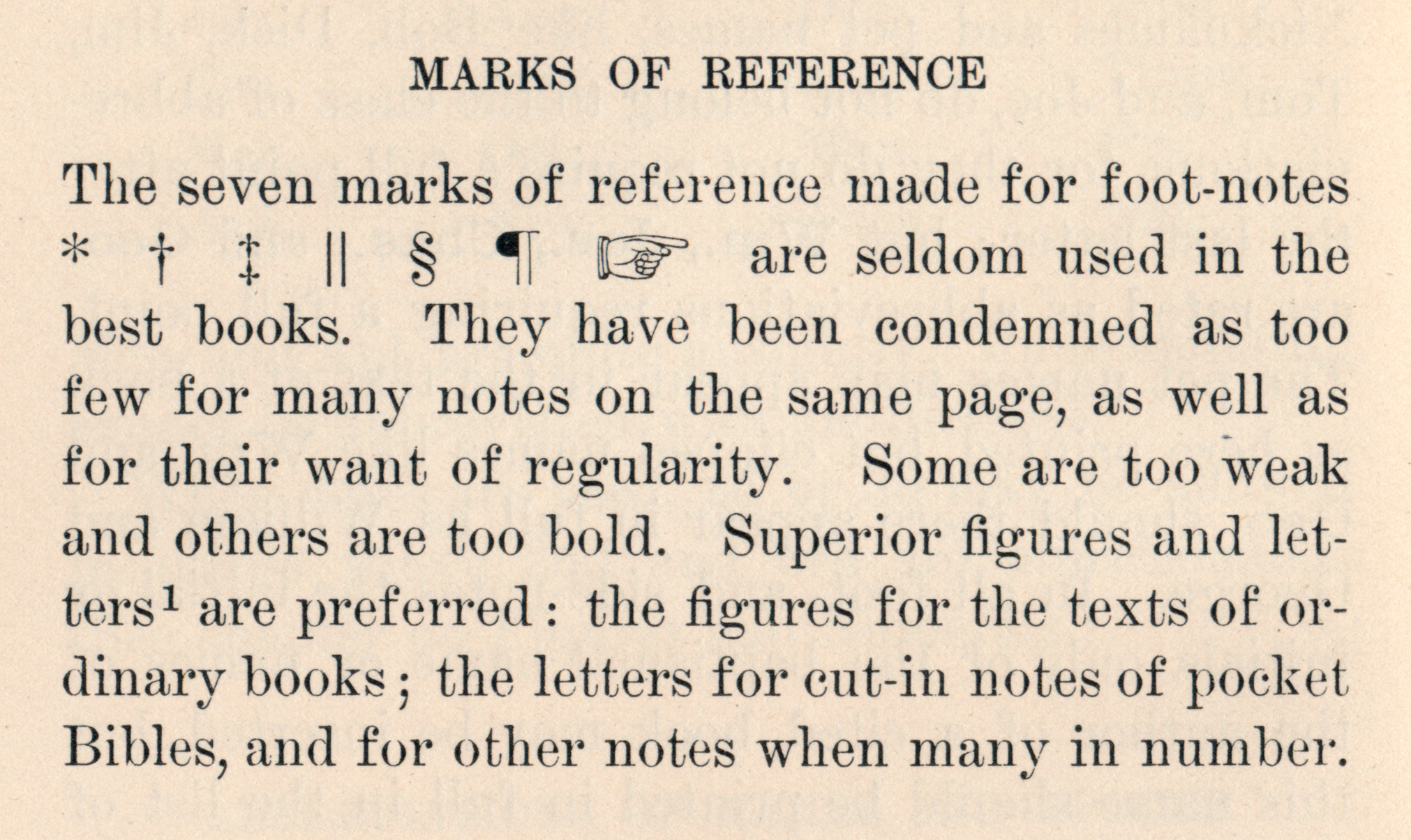
I'm curious about the design of the dagger symbol. After looking up its history, it seems to originate from a more abstract form (relatively similar to the division symbol?) than the more cross-like modern versions. Its origins look more so like full-size symbols (reaches from a descending point all the way to cap height), as opposed to superscript-like.
Does anyone know when the smaller, more superscript style dagger symbols came into prominence? Is that more so a contemporary thing where designers liken it to the size, and scale of the asterisk? Is there a preference among typographers for which they prefer when setting text or display?
Whether or not it could be said that either version is more or less correct, I recall over years of seeing the symbol in print that it is, and should be more superscipt-like, yet I seem to see more typefaces where the design is full size.
Tagged:
0
Comments
-
Probably depends on whether you're using it as a footnote marker or not, but it's an interesting question. Wikipedia just mentions its use in textual annotation (basically, a line to mark things off). Bringhurst shows full-sized daggers with a raised asterix*, but spends much more time talking one out of using footnotes than in advising one how best to use them.†
*I've seen a low asterix a couple of times, but it's really rare -- generally when used as a multiplication sign. This is probably related.
†This of course deserves a footnote.
3 -
Probably depends on whether you're using it as a footnote marker or not, but it's an interesting question.
Yes, I'm trying to decide on what rationale to adopt moving forward, and this thought makes me think that I should lean towards the more superscript-like dagger amongst text face designs, and the full-size amongst display.
0 -
I think you already have a great idea.
Another possibility is to set the superscript as a stylistic alternative, since anybody who would appreciate it already knows something about typography, and hence probably knows something about using OpenType. That way, you can get both the novices and the experts to appreciate your efforts.
1 -
Since it is more common these days for a font to have a full-size dagger, and because it has valid uses at this size and alignment, I typically draw the default dagger as such. And then for a book text face I may draw an alternative superior dagger and deploy it with the {sups} feature along with superior figures.
If you do decide to make a superscripted form the default, you may still wish to offer a full-size alternate.
3 -
Sounds like a great idea. Will take this in account for future updates. Recently I did a similar solution for FF DIN. The characters © and ® were available at cap-height only ever since 1995. Althoug the superior version of ® is rather popular (if not even the standard in many cases) no single customer ever complained or asked for a superior version. Nevertheless, in the most recent update of FF DIN, we included both © and ® as superiors also and made them accessible through the sups feature.Michael Vokits said:
Another possibility is to set the superscript as a stylistic alternative2 -
Perhaps practices in other countries are different, but in the United States the copyright symbol always precedes the relevant information (usually date and author) and sits on the baseline — e.g.: © 2105 Kent Lew. I cannot imagine any real need for a superscripted version.
(However, slightly different versions, either in size or position or both, to harmonize with oldstyle vs lining figures are not uncommon.)
The registered symbol, on the other hand, always follows the name that it marks as registered. It is comparable to the trademark symbol (™), and legal standards dictate which of the two is to be used in a given situation. It is common for both of these marks to be treated as a superscript so that the mark is less obtrusive and does not interfere with the reading of the product name itself.
Customers probably never complain about a full-size ® in a font either because they just scale-and-shift it (who cares?) or they just run it full size, since it often appears in legalistic mouse type (again, who cares?)
Although the copyright and registered appear to be alike and both pertain to marking intellectual property, the fact is that their current usage is distinctly different in practice and, in my opinion, they demand different design approaches.
4 -
I always thought the dagger was basically a grave marker and mainly used to mean "died", with the asterisk used as a sun symbol to mean "born". As such, it makes sense to me that they should both be superscript.
In any case, I made some full-sized stylistic alternates for the dagger and double dagger in Cormorant.

2 -
(However, slightly different versions, either in size or position or both, to harmonize with oldstyle vs lining figures are not uncommon.)
I've never thought about different versions of the copyright symbol for oldstyle vs lining. I thought including currency, degree, math symbols etc. was enough.
I guess anything that aligns at lining/cap height could use a modified (size, scale, positioning) version for oldstyle figures, and vice versa.
0 -
Love the dagger (sword? lol) on the far right, Christian.2
-
-
I was going for a rapier and main-gauche, though I guess the former is woefully short — there was no space to do it justice. ;o)Michael Jarboe said:Love the dagger (sword? lol) on the far right, Christian.
0 -
I like your rapier-style swept hilt dagger, Christian. I decided to take the dagger appellation literally in Nyala, too, and based the hilt on mediaeval Ethiopian sword design.

5 -
@John Hudson Did your model have a curved blade?0
-
Yes. I did try a curved dagger design, but it simply didn't read as the character.Craig Eliason said:@John Hudson Did your model have a curved blade?
When I made the Nyala Latin design, I wasn't really expecting it to be used, and it was mostly included in the font for technical compatibility reasons (to provide support for at least one Windows 8-bit codepage, the lack of which could cause problems at the time). So I felt a certain liberty with regard to the design of some punctuation and symbol characters. As it turns out, I see Nyala Latin used with some frequency, presumably by people who don't realise that it's primarily an Ethiopic font.
4 -
Daggers (and double daggers) are indeed interesting to play around with (and can include quite some hidden character) The possibilities are endless! (oh and
@Christian Thalmann that's a nice alternate rapier!)
7 -
I don't think need to mark a lot of footnotes with an all caps, military themed stencil but you never know.

7 -
Excellent showings from all, here. Fantastic! I gotta up my dagger game.0
-
The superscript alif diacritic sometimes used in Arabic is called a 'dagger alif' (ألف خنجرية alif khanjariyya). Ray's bayonet daggers reminded me that there is also the 'AK47 alif', as featured in the Hezbollah logo:

[With acknowledgements to Tom Milo, who first pointed this out to me.]2 -
Categories
- All Categories
- 46 Introductions
- 3.9K Typeface Design
- 489 Type Design Critiques
- 572 Type Design Software
- 1.1K Type Design Technique & Theory
- 663 Type Business
- 877 Font Technology
- 29 Punchcutting
- 530 Typography
- 121 Type Education
- 328 Type History
- 81 Type Resources
- 111 Lettering and Calligraphy
- 32 Lettering Critiques
- 79 Lettering Technique & Theory
- 561 Announcements
- 96 Events
- 116 Job Postings
- 169 Type Releases
- 179 Miscellaneous News
- 269 About TypeDrawers
- 53 TypeDrawers Announcements
- 114 Suggestions and Bug Reports


