TypeDrawers & typography on a handheld device

Tiffany Wardle
Posts: 245
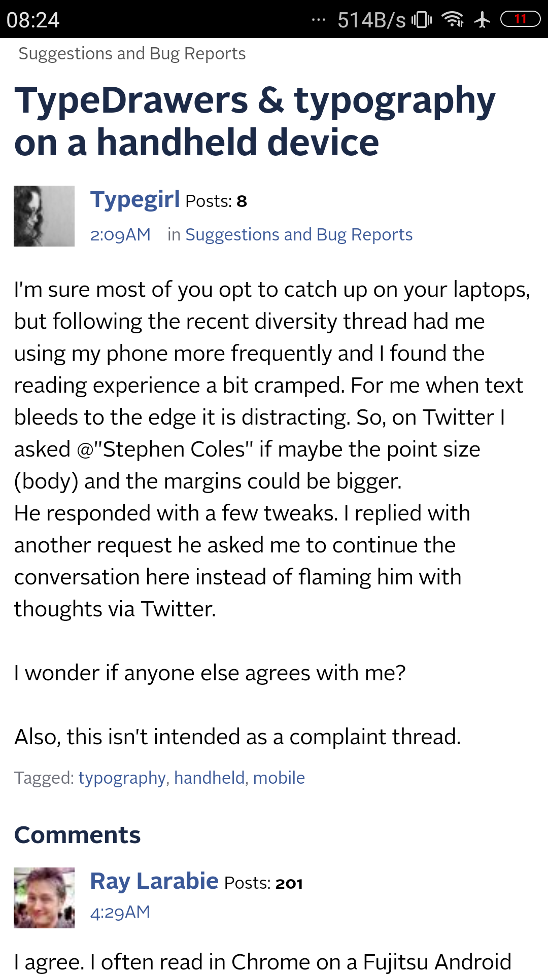
I'm sure most of you opt to catch up on your laptops, but following the recent diversity thread had me using my phone more frequently and I found the reading experience a bit cramped. For me when text bleeds to the edge it is distracting. So, on Twitter I asked @Stephen Coles if maybe the point size (body) and the margins could be bigger. He responded with a few tweaks. I replied with another request he asked me to continue the conversation here instead of flaming him with thoughts via Twitter.
I wonder if anyone else agrees with me?
I wonder if anyone else agrees with me?
Tagged:
2
Comments
-
I agree. I often read in Chrome on a Fujitsu Android phone and the formatting looks pretty good but yeah, a little more margin wouldn't hurt.
The like buttons don't fit on one line so maybe make them a bit bigger to fill out two lines?
Also I can't peek at who liked/agreed/hated etc. I don't know if there's an elegant solution for that. You could detect a touch/hold but I don't think it's easy. Maybe require two touches? Touch once to expand and reveal, touch again to register.
1 -
Chrome 43 looks good to me. The only issue for me is that moderation icons and profile pics are too low-res for the phone display density.
 0
0 -
Just tossing in my own take on side margins and font sizes: I find that many mobile apps/websites are too generous with both, especially given the narrow width of the display and the short viewing distance. After chatting with Tiffany, I bumped these up to something that still felt comfortable to me, but I acknowledge I have my own preference and device (iPhone 6) that may differ from other readers. If the majority disagrees with the current settings I’ll adjust willingly.
Will also look at fixes for the reactions. Image quality may be more difficult to adjust given the platform upon which this forum is built.
0 -
I have grown to appreciate FireFox more for text display. They seem to have found a clean way to render type.
0 -
The recent changes disturbed the topics list a bit. The gray background for already read topics is to small now. The margin was added to the container element but might be better added to the content element to make it bigger?0
-
Everyone has what they like and don't like and how they'd like it. For me I just find too close to the edge of the phone to be uncomfortable. But I need to go look again to see what these new tweaks are about.
0 -
(Note: it seems the screenshot I posted was after Stephen’s tweak. So my previous post does not necessarily disagree with you.)0
-
thanks, Frode!
 0
0
Categories
- All Categories
- 46 Introductions
- 3.9K Typeface Design
- 489 Type Design Critiques
- 572 Type Design Software
- 1.1K Type Design Technique & Theory
- 663 Type Business
- 875 Font Technology
- 29 Punchcutting
- 530 Typography
- 121 Type Education
- 328 Type History
- 81 Type Resources
- 111 Lettering and Calligraphy
- 32 Lettering Critiques
- 79 Lettering Technique & Theory
- 561 Announcements
- 96 Events
- 116 Job Postings
- 169 Type Releases
- 179 Miscellaneous News
- 269 About TypeDrawers
- 53 TypeDrawers Announcements
- 114 Suggestions and Bug Reports


