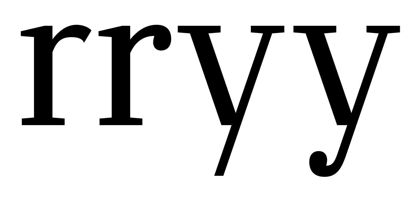
Itis - Serif Typeface (sorry for the name)

Evie S.
Posts: 84
I am a young font designer. I need some help designing my first publishable font, Itis. (I have experimented far more.) It is mainly boring and economical, but it has some quirks. Please be as constructive and critical as you can, as this is a learning experiment. I'm not working out the spacing yet, as I will likely change glyphs. I mainly need help making the /a lighter and the /c darker. Which /r and /y do you like? And I'm going to change the /w, too. (Sorry for the painful sample and WIP letters — I have yet to have a good one.)
 (Sorry for the painful sample and WIP letters — I have yet to have a good one.)
Tagged:
0
Comments
-
Welcome to the forums, Evan!
I don't think you can neglect spacing at this point. The sidebearings are part of the glyph, and you can't polish the latter if you don't yet know the former. Start with /nnnnn and /ooooo and then make the others look right when placed between them (/nnxnn, /ooxoo). It's hard to judge your sample without proper spacing.
Otherwise, I think you'll have to do some more work on consistency. Your round stems look lighter than the vertical ones, and the thins in /b are lighter than the ones in /u, for instance. In particular, the lower right joint of /u comes out very dark.
There's also stylistic consistency to consider. The detailing of several letters don't seem to agree much with each other. Most serifs are very mechanical and angular, but /a is all curves, including the outstroke, and /r's lack of a terminal feels strange amongst all the serifs and ball terminals.
The ball terminals strike me as a bit too light for their job. The /f and /t look like they should fall over. Overshoots seem on the small side in general.
Many curves look crude up close and could use some refining, in particular where curved strokes taper down (e.g., top of /a/c/f, bottom of /e). SpeedPunk and/or RMX Tools can help you with that, but they can't do the whole job for you (one can certainly build ungainly glyphs with perfectly smooth curves!). Maybe look at other fonts you like to see how they did it?
Cheers
0 -
I do use RMX, it can only do so much. Have you considered the alternative /r? I'll also add some more overshoot soon. I'll see about making /a more angular, because I am lazy.
EDIT: /a looked very bad as well as a part of me died inside, so I'll change the serifs... one serif at a time.
0 -
The alternative /r is promising, but as with the others, the ball terminal strikes me as too light. The first /y is pretty original, but its ending seems at odds with the otherwise rather serif-rich rest of the typeface.
0 -
I can't even change the /a without it either look bad or look like Lucida.
Also, in one of my inspirations is Farnham which has a curvy /a but a square-ish /i. So should I change the serif?
0 -
I'm having problems with Kernagic. I really want to cadence it, though.
EDIT: Reading other discussions, I'm trying a bold master.0 -
Honestly, I'm done for now. Apathy, ADD, perfectionism, procrastination and type design make a nasty combo.0
Categories
- All Categories
- 46 Introductions
- 3.9K Typeface Design
- 489 Type Design Critiques
- 572 Type Design Software
- 1.1K Type Design Technique & Theory
- 664 Type Business
- 877 Font Technology
- 29 Punchcutting
- 530 Typography
- 121 Type Education
- 328 Type History
- 81 Type Resources
- 111 Lettering and Calligraphy
- 32 Lettering Critiques
- 79 Lettering Technique & Theory
- 562 Announcements
- 97 Events
- 116 Job Postings
- 169 Type Releases
- 179 Miscellaneous News
- 269 About TypeDrawers
- 53 TypeDrawers Announcements
- 114 Suggestions and Bug Reports
