M75: going nowhere
Comments
-
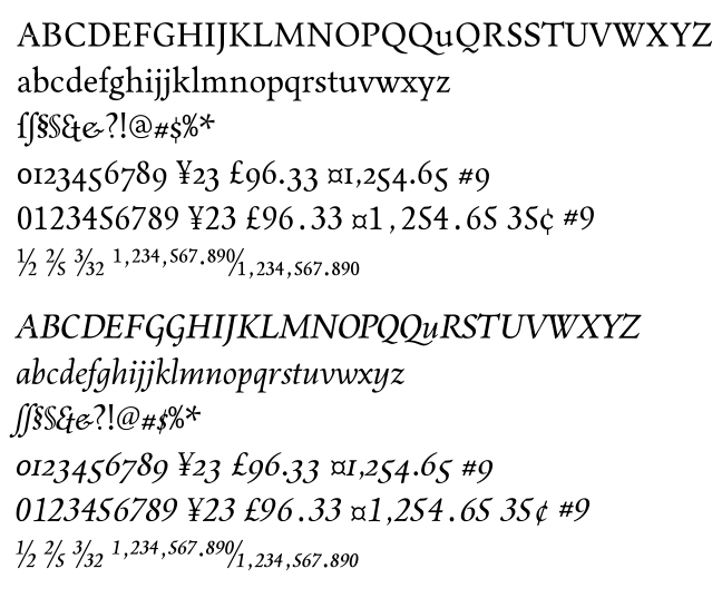
/T and /Z seem to tower above neighboring letters a bit.
Does the thin stroke of /X appear broken? Are /O and /Q bruised on their top right?
I believe I mentioned that before, but the tail of /Q really doesn't work for me at all. It looks like it's crinkling its nose.
The /a might be leaning to the left a bit much?
The appears to be some rendering problem with /g, maybe some path orientation issues?
Spacing strikes me as a bit wide in a few select places, for example in «ut» and «at».
0 -
/T and /Z seem to tower above neighboring letters a bit.
Definitely. Fixed.
Does the thin stroke of /X appear broken?
/V and /W, perhaps, but I'm not sure about /X. Lemme think about it for a while.Are /O and /Q bruised on their top right?
Double-checked; they're radially symmetrical with their bottom lefts. But mathematical perfection < optical balance, so I'll play with them a bit.I believe I mentioned that before, but the tail of /Q really doesn't work for me at all. It looks like it's crinkling its nose.
Yeah, that's one of my design flaws... it keeps popping up everywhere. Much like spurs on /T and /Z, it's just in my DNA at this point. I blame the local PBS station, which used a Palatino /Q as its logo, and the old Arkham Press Lovecraft printings, which used a Garamond with prominent /T and /Z. At least I wasn't exposed to Comic Sans at that young age! Anyway, your point is valid; I'll play with /Q.
The /a might be leaning to the left a bit much?
Agreed. Moved the top over a bit; amazing how little it takes to completely change the balance. Art is cool like that.The appears to be some rendering problem with /g, maybe some path orientation issues?
I should probably use Adobe's pdf reader (whatever they're calling it these days), 'cause SimplePDF and TeXworks gloss over that sort of thing. Then again, /g has a lot of pieces I haven't bothered to fully join -- maybe that's it?
Spacing strikes me as a bit wide in a few select places, for example in «ut» and «at».
Very much so, but there's no kerning at all -- I cleared it out, given the new spacing. Kerning is not my favorite activity, so I've been putting it off. (Much more fun to work on another face!)
0 -
Trying some new ideas in the roman. Removed the horns from /T and /Z and all forms of 7, /T is basically a mirrored /E, lc serifs are more substantial, /Q finally has a normal tail, /U is more square, crossbars of /f and /t and their various forms (ligatures are formed with glyph substitution) match up to flags of /i and /j, and a few other things. Much more normal, much more reserved and handsome, much more, well, Dutch. Still using a claw terminal on a few things, and still unkerned...

0 -
I think /U should be like the previous version. The /5 is a little out of place. The /W is a little clogged.0
-
Hi, Evan. Agreed on all counts, but I'll probably keep the /5 an alternate. ty
0 -
-
Can't decide which I like better, the curved serifs and Garamond horns, or flat and normal (FELT), so here's both. Maybe ready for one point uh-oh?
0 -
Maybe ready for one point uh-oh?
Not sure what you mean by that, but the spacing and kerning could still use some work. Look at «Curabitur», for instance.
/G is rather clumpy. The lining /2 and both /5's look very weird to me.
I like the /g.
0 -
Hi, Christian. It's a cute way of referring to "Version 1.0," the buggiest of all releases.

/G and /5 are my new nemeses. Still trying to balance either form of /5, whether it be with the long or short bowl. I keep wanting to model them on either /3 or /6 (or /S, my previous nemesis), but they do need their own thing. As always, your eye and advice are flawless and appreciated!
0 -

Ignore the open overlaps; as usual, I’ve forgotten to remove them. I have bigger issues, like lumpy curves and grotesque proportions and no clue about why they’re wrong — just that they’re wrong. Is it just me, or are the UC proportions just off? Does the italic seem stiff? Too much Times influence (completely surprising to me) in the roman?
To the extent these look good, they look like everything else; to the extent they look interesting, they look wrong. Most discouraging. (Although I do like my /section and /ampersand shapes; call it paternal blindness?)
My solution to UC/lc hashtag is simply to adjust its height. (There — I’ve finally added something potentially slightly useful to this site. Yay!)
0
Categories
- All Categories
- 46 Introductions
- 3.9K Typeface Design
- 489 Type Design Critiques
- 572 Type Design Software
- 1.1K Type Design Technique & Theory
- 663 Type Business
- 875 Font Technology
- 29 Punchcutting
- 529 Typography
- 121 Type Education
- 328 Type History
- 80 Type Resources
- 111 Lettering and Calligraphy
- 32 Lettering Critiques
- 79 Lettering Technique & Theory
- 561 Announcements
- 96 Events
- 116 Job Postings
- 169 Type Releases
- 179 Miscellaneous News
- 269 About TypeDrawers
- 53 TypeDrawers Announcements
- 114 Suggestions and Bug Reports


