Metrics and pixel fonts

Jordan Winick
Posts: 5
Hi, TypeDrawers. First post here.
I'm creating a pixel typeface. After looking at the many available open license fonts (a requirement for the project I'm working on) and not finding what I wanted, I decided to make something myself. I wasn't sure how to convert the pixel dimensions, but after reading this tutorial from Glyphs, it seemed relatively simple. Party.
I made my grid spacing 100 and my UPM 1000. All of my sidebearings and character widths are multiples of 100. That should make it display on pixel at 10pt, right? This is how the exported font renders at 10pt @ 72 dpi in Photoshop.

But when I make it 20 pt (or 10pt @ 144 dpi), using 4 pixels per pixel:

I'm creating a pixel typeface. After looking at the many available open license fonts (a requirement for the project I'm working on) and not finding what I wanted, I decided to make something myself. I wasn't sure how to convert the pixel dimensions, but after reading this tutorial from Glyphs, it seemed relatively simple. Party.
I made my grid spacing 100 and my UPM 1000. All of my sidebearings and character widths are multiples of 100. That should make it display on pixel at 10pt, right? This is how the exported font renders at 10pt @ 72 dpi in Photoshop.

But when I make it 20 pt (or 10pt @ 144 dpi), using 4 pixels per pixel:

Am I making some silly mistake?
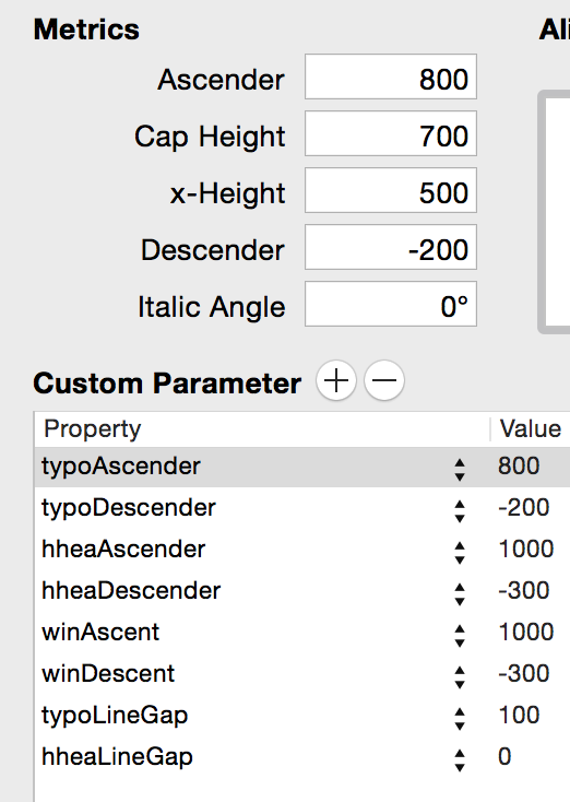
In case it's helpful, I set my vertical metrics like this:

0
Comments
-
Are you using little squares or strokes for stroke segments?
(Screenshots of your outlines might help.)0 -
I think I actually solved the issue. Originally, when I exported the font, I left autohinting on. For some reason I assumed that hinting wouldn't affect a pixel font since everything is perfectly on the grid, but that seems to be why it reproduced perfectly at 20pt and not at 10pt. I turned off autohinting and got this result:

So, let this be a good lesson for anyone searching for a solution: don't autohint your pixel font?0 -
There is no point to hint your font if you only use it at sizes where the outlines already fit the pixel grid.
Also, what could be a problem is where the corners of your outlines meet, e.g., in your c or s. They can confuse some renderers because technically, they constitute an overlap. This was a known problem with Flash, for instance, and counters (e.g., in the e or o) would be displayed filled. Inserting small outline bridges on such corners can fix this. There is a script called Flashify Pixels in my scripts repository on GitHub that does exactly that.0 -
Thanks! The font is going to be used at various sizes for creative purposes, but I'd also like it to appear on pixel at its intended size. I'll give the script a try and see if it works at 10pt but also improves display at intermediate sizes when hinted.0
-
I'm not sure autohinting is going to help you here, although there could be a manual hinting method that would force it to grid fit and be legible0
Categories
- All Categories
- 46 Introductions
- 3.9K Typeface Design
- 489 Type Design Critiques
- 572 Type Design Software
- 1.1K Type Design Technique & Theory
- 663 Type Business
- 875 Font Technology
- 29 Punchcutting
- 530 Typography
- 121 Type Education
- 328 Type History
- 81 Type Resources
- 111 Lettering and Calligraphy
- 32 Lettering Critiques
- 79 Lettering Technique & Theory
- 561 Announcements
- 96 Events
- 116 Job Postings
- 169 Type Releases
- 179 Miscellaneous News
- 269 About TypeDrawers
- 53 TypeDrawers Announcements
- 114 Suggestions and Bug Reports


