Mission Impossible

Choz Cunningham
Posts: 18
Not sure if this should be under critique since it is such a specific thing, but here goes....
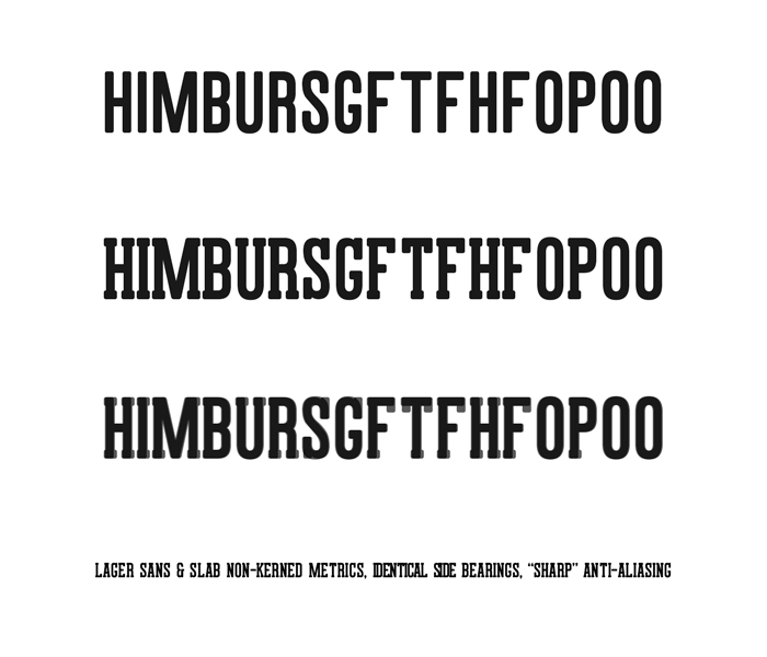
When I was sketching this face, I really wanted the metrics to be identical between the sans and serifed versions. I felt that would be a distinguishing feature, and handy for when a designer wanted to mix them together on a page. So far, I've developed them side by side to that end. However, I feel like I am at the point where I am playing tug-of-war trying to get them both to feel even, and not very well. The difficulty seems to be in the few letters that either don't have a serif on one or more sides (O, G, P, 2, 3, etc.) or vertical serifs (G, S, E, F, etc.)
Is keeping matching metrics worthwhile? Does it sound like a useful feature for end users? Is it even possible to pull off elegantly? If so, how might I get it to work: finer spacing, kerning pairs to the max, or another way?
Also, does the face feel too loose or too tight? Thank you all for taking a look at this.

Tagged:
0
Comments
-
Without commenting on the challenge being worthwhile or not: you've made a couple of other design decisions that are making this harder.
You might reconsider how condensed the face is, since that is restricting some of the leeway that you have to "hide" the serifs in. In a less condensed setting, your tracking would also be a bit looser, and the injection of serifs would not as noticeably upset the balance of counter spaces.
You could also consider a different design for the serifs. Latin-style triangular serifs would be much easier to cheat into tricky places. Right now the crossbar of the T has to be large enough for the serifs, but ends up far too large in the sans. Non-square serifs could be squished into (e.g.) a smaller crossbar with less trouble than the design you're currently working with.
Lastly, you could embrace the inconsistencies and make them into a design feature, but realize that puts you into a nice of "naive" type that may not be what you're after.
2 -
Back in the day, copyfitting to a layout was a big deal. I don't think it is so much anymore in our digital world where type-size and leading can be fractional. I would expect that you might make better type and sell more of it if it seemed to be evenly spaced than if you had to convince somebody of the importance of exactly equal font metrics.1
-
I can't even imagine a plausible application where you'd need a sans and a serif headliner to match spacing except in monospaced fonts.1
-
Tonight, I've played around with non-matching metrics and, plain and simple, it looks much better. Both seem to do best very tightly set. I'm glad that none of you think the original idea is of major value.
Jack, I am going more for "rustic" than "naive". The design was inspired largely by a variety of letterpress poster type popular here with some this and that smooshed in. I'll take another look at the T.
0 -
Also keep working on improving proportions.
/H /B /U /O looks narrow compared to /F /M
2 -
Commercial Type recently presented a super family with a few genres that share metrics, so users can swap Sans to Serif and see zero reflow. For the newspaper client this was important.
I agree the narrow design makes it harder0 -
@Pablo: The /M i narrowed (a second time) and it really looks nicer. Thanks.
@Pablo, @Jack: I think the T looks huge and kind of.... hmm, in both styles. I came up with a solution I'm pretty happy with, however! I created a pile of ligatures for /T and /F pairings. As I did, the /T narrowed on whichever side mated its partner. It narrows the /T maybe 12%, and doesn't look bad to me.
I think I put an example /T lig on twit/face/tumb/insta ("exclamachine" on all of them).
@Dave, I think matching metrics on sans and serif is an idea I will return to, but on a project with much smaller, less slabby serifs. Maybe when I'm working with a Multiple Master.0
Categories
- All Categories
- 46 Introductions
- 3.9K Typeface Design
- 489 Type Design Critiques
- 572 Type Design Software
- 1.1K Type Design Technique & Theory
- 663 Type Business
- 875 Font Technology
- 29 Punchcutting
- 529 Typography
- 121 Type Education
- 328 Type History
- 80 Type Resources
- 111 Lettering and Calligraphy
- 32 Lettering Critiques
- 79 Lettering Technique & Theory
- 561 Announcements
- 96 Events
- 116 Job Postings
- 169 Type Releases
- 179 Miscellaneous News
- 269 About TypeDrawers
- 53 TypeDrawers Announcements
- 114 Suggestions and Bug Reports


