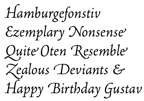
O with swash below the baseline
In Robert Slimbach's italic Adobe Jenson Pro fonts, the swash glyph for the uppercase character 'O' extends below the baseline (see left word in the picture below). At least to my untrained eye, this looks a bit odd, and I'm not sure if I can get used to it (the non-swash glyph is shown on the right for comparison). I've noticed that the swash glyph for 'O' also slightly extends below the baseline in Slimbach's Brioso font (where it looks much more appropriate), but not in fonts like Arno and Minion.
I haven't found any information about how the swash glyph for 'O' is traditionally drawn or what the various traditions or variants are. Could someone here enlighten me? Do people agree that the 'O' in the word on the left below looks 'wrong'?

I haven't found any information about how the swash glyph for 'O' is traditionally drawn or what the various traditions or variants are. Could someone here enlighten me? Do people agree that the 'O' in the word on the left below looks 'wrong'?

1
Comments
-
Do all of the swash glyphs drop in the Jenson or only the 'O'? It seems to me that if all swash caps have the same baseline that this would be just fine. I have designed a face [dez Petranian] that has a few different sets of swash caps. One of the sets has all the caps dropped and a bit larger than normal.
 1
1 -
I would say no, the only swash capital whose body appears to descend below the baseline is the 'O'. Is this traditional or a glitch?
 0
0 -
It looks to me as if they are balancing the size of the O to better fit with the more robust swash capitals. I actually wish the E was also larger and dropped.1
-
It is common for both C and O to be taller in Renaissance style swash letters. This derives, of course, from the Italian chancery cursive hand.0
-
...and S. Though I wish someone would encode a "long uppercase S", so we'd have something to make our uppercase German S outta.;)1
-
I think S zet! ;-P0
-
-
Smiley face.0
Categories
- All Categories
- 46 Introductions
- 3.9K Typeface Design
- 489 Type Design Critiques
- 572 Type Design Software
- 1.1K Type Design Technique & Theory
- 663 Type Business
- 875 Font Technology
- 29 Punchcutting
- 529 Typography
- 121 Type Education
- 328 Type History
- 80 Type Resources
- 111 Lettering and Calligraphy
- 32 Lettering Critiques
- 79 Lettering Technique & Theory
- 561 Announcements
- 96 Events
- 116 Job Postings
- 169 Type Releases
- 179 Miscellaneous News
- 269 About TypeDrawers
- 53 TypeDrawers Announcements
- 114 Suggestions and Bug Reports


