Size-Specific Spacing of Fonts

There’s a running joke on the Type & Media course that I teach, that no matter which student’s typeface we are looking at, the feedback will always be: ‘you should work more on your spacing’. As per most jokes, this one is based on a repeated observation. Because even the most unconventional letter shapes can be improved dramatically by ensuring consistent white space distribution. And the reverse is also true: even the most beautifully drawn typeface can look unconvincing when the spacing isn’t quite right. But what is spacing, also called letter fitting? A type designer will usually draw the black mass of letters – and the spacing is what surrounds those letters – the white space on the left and right of them. In font editing software, this is also called glyph sidebearings, a term borrowed from the days of metal type. Spacing is essentially the glue that turns letters into words. The job of a type designer is not to draw individual characters but to design text. When someone comments that a certain typeface works well in text, it is a comment about the spacing of the typeface rather than the shape of the letters. So what’re really saying with that comment to the Type & Media students is that they should stop focusing solely on shapes of letters and instead look at how they work in text.

Consistent white space around the letters is the essence of comfortable reading.
When the text is used in small sizes, plenty of space is required between the letters to make sure that the shapes do not blend into each other, that they retain their unique silhouettes. Conversely, when the text is used in larger sizes, the space between the letters can be reduced, thus helping readers by improving the flow of the text. In the old days, when type was still made from a physical material, letters were always designed in a specific size, which ensured the appropriate amount of white space was left between letters.
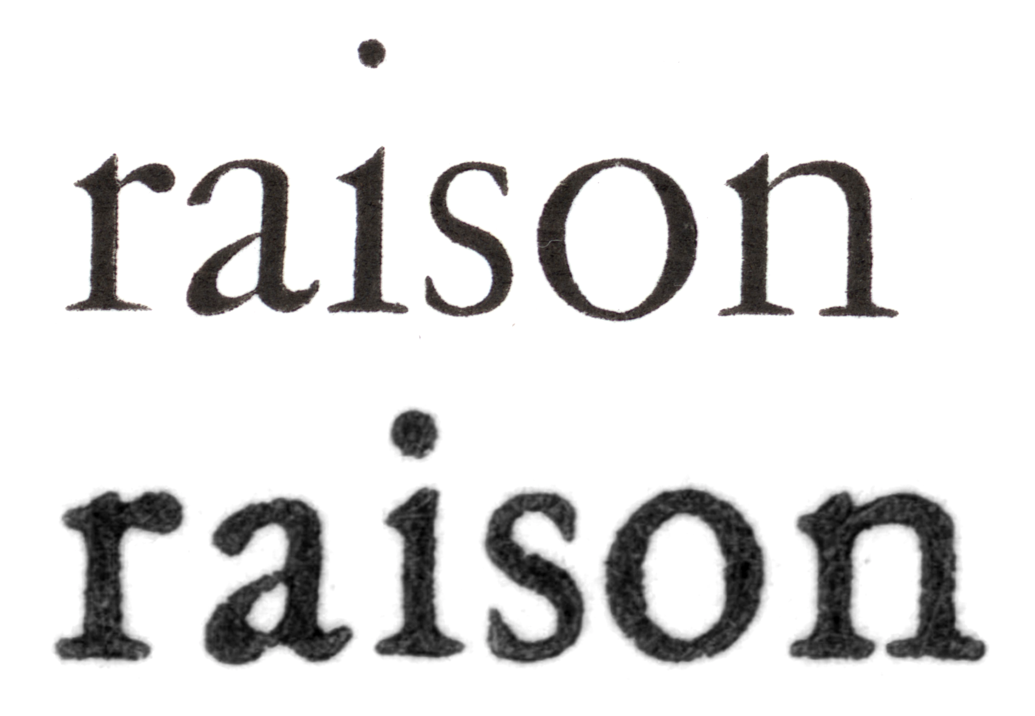
Garamont, also known as ‘caractères de l’Université’ from 1530s in 6 and 36 points scaled to the same size. From Les caractères de l’Imprimerie Nationale.
Photocomposition is a method of setting type by projecting light through a master film negative, which contains every character in a font, onto light-sensitive paper. A single master negative could result in text of multiple sizes, depending on the magnification level of the chosen lens, and this made the production of type significantly cheaper than making type separately for each point size. The first photocomposing machine appeared in the late 19th century, but the technique only became commercially available in the 1950s. Then, the personal computer and desktop publishing software further reduced the need for size-specific typefaces, as digital outlines could be scaled to any size. Production of digital fonts became much simpler, as we only needed to draw and space the typeface once.
Today, digital fonts are scalable to any size, but the characters’ sidebearings were still spaced for just one particular size. A font meant for small sizes should be spaced differently from one for large sizes. The late Dutch type designer Gerard Unger wrote in his book Theory of Type Design: ‘In general, the rule is: the smaller the type size, the wider both the signs and the spaces between them should be, and the reverse goes for the larger sizes’. The user, however, is free to choose a display font in a small size, resulting in a less than ideal word setting, or they can scale the text typeface to the largest sizes, where the spacing is too loose. In such a case, it would be expected that the user would adjust the font tracking. Tracking is the user-controlled process of loosening or tightening a block of text, not to be confused with spacing/fitting, which controls the metrics of letters and is defined by the type designer. And then we have kerning, which refers to the adjustment of the individual spaces between specific letter combinations; you can think of kerning as fixing irregular pair combinations in the font. There are some fonts which require very minimal kerning, or none at all, but all fonts need to be spaced properly to work well.
When text is properly spaced and tracked, with balanced internal and external white space between the characters, the text is easier to read. British type designer, Walter Tracy, defined adjustment of space between letters as a ‘process fundamental to the success of a type design’. Czech typographer Oldřich Menhart in his educational book Tvorba typografického písma states: ‘It could even be said that the right balance and alternation of dark and light parts of the type drawing creates the distinctive character of the type, and is ultimately more important than any emphasis on originality.’
We at Typotheque space the text fonts at 10 points, which is reportedly the optimal size for reading, according to the old but respected Paterson & Tinker study from 1929. This means that in a small range of sizes from 9 to 11 points, the fonts work perfectly well with default tracking, but when used in much smaller or larger points, they require an input from the user. While experienced typographers always adjust the text tracking according to the font size, others rarely consider making such changes, and thus do not always achieve the best text setting. Might there be a way to automatically change the tracking of the fonts, and therefore make a font user’s life easier?
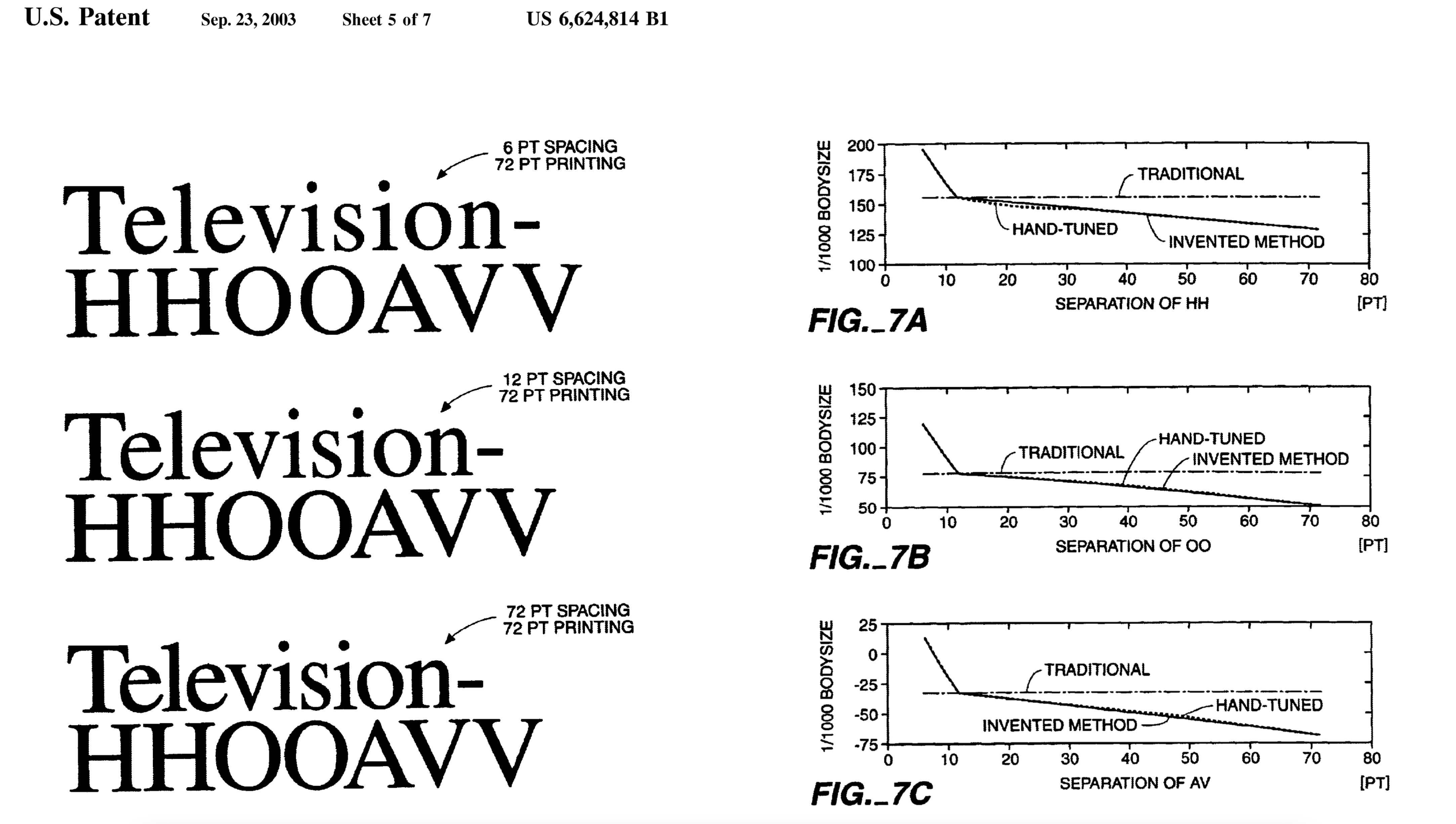
United States patent for the optical justification of text, invented by Peter Karow, assigned by Adobe Systems in 1998.
Back in the early 1990s, the German type foundry URW supplied all of its digital fonts in three optical sizes, Text (6–24 pt), Display (16–64 pt) and Poster (36–1000 pt), with adjusted details and tracking of the fonts. These subtle font optimisations were based on research by Peter Karow and his team at URW Type Studio, using the work of Herman Zapf and Donald E. Knuth from the 1970s. Besides URW’s on-the-fly solution for optical scaling of type, sold in a software package called URW Kernus, a larger project was instigated to develop algorithmic optimisation of paragraph composition (also called the hz-engine, after Herman Zapf). In 1995, after Adobe purchased the patent from URW, the hz-engine was implemented in InDesign 1.0, and in fact it is still used today, under the name ‘optical kerning’. This particular function has received its fair share of criticism, and I admit to having publicly criticised it, for its substitution of the kerning created by the type designer for algorithmic metrics. Without a doubt, the optical kerning algorithm is very powerful, and most of the time the kerning and tracking do create acceptable results, but it has its limits – because it has no awareness of the context around or the choice behind the typeface. Adobe’s optical kerning will attempt to manipulate the kerning and space of monospaced fonts, because it doesn't understand that the letters were designed to have fixed widths. And for the same reason, it also adds spaces between connected calligraphic scripts, thus breaking words. Spacing of type should be contextual, and to do a proper job, a spacing algorithm needs to consider the purpose and intention of the text, and therefore it should be part of the design of the typeface, defined by the type designer, rather than functioning as part of the typesetting application.
In 1991, Apple began working on a project, GX layout algorithm, and later introduced its TrueType GX fonts. These supported advanced typographic features, and internationalisation, similar to the OpenType font format developed by Adobe and Microsoft. The GX fonts provided an explicit tracking table that allowed contextual and uniform tracking of text based on the selected point size. Currently, Apple’s San Francisco fonts are taking advantage of this tracking table in terms of automatic adjustment to letter spacing, but since it does not use existing OpenType standard specifications, this feature fails to work outside of Apple’s own applications, and no such option exists in OpenType specifications.
We decided to introduce optical spacing in the OpenType standard fonts, so users can take advantage of the automatic optical spacing of specific fonts, in any application. This is not just a technical solution, but an extension of the typeface design, included only in typefaces that may require such a solution. The first Typotheque typeface to come with the optical spacing is Lava. Essentially, we spaced and kerned every font in the family three times, for a small size of about 6 points, a default size of 10 points, and a large size of 48 points, at the intended viewing distance of 40 cm. It is important that both spacing and kerning are size specific. Kerning pairs can minimise glyph collisions; in tight text settings glyphs can become too close and need more adjustments, while in a loose text there are naturally fewer glyph collisions. The kerning table for the largest size contains nearly 40% more kerning pairs than the one for the smallest size, and the kerning for black text contains additional 18% more exceptions, as the text setting is even tighter.
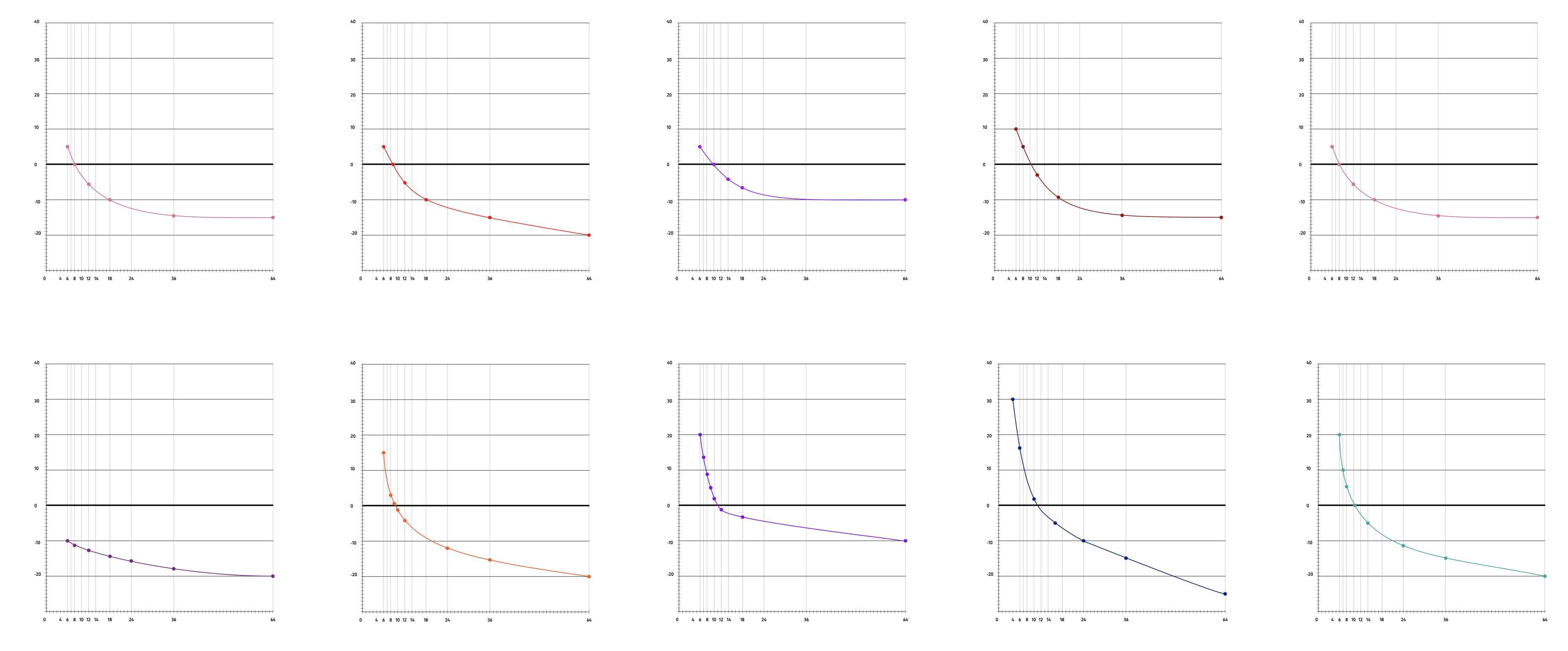
The current tracking values in the Lava font family have been tested by nine experienced typographers who are used to setting and evaluating legibility of text. (Thank you Matt Avery, Kai Bernau, Françoise Berserik, Friedrich Forssman, Bernd Kuchenbeiser, Caroline de Lint, Sander Pinkse, Tânia Raposo and Huug Schipper!). Each was asked to consider a block of text in a specific point size, and choose which tracking value appeared to make the text most comfortable to read. Reported values were organised in a spreadsheet, and visualised in a two-dimensional chart. While there were clear differences between the typographers’ tracking preferences, a very similar curve emerged from all samples, appearing in a slightly different position on the graph, but following the same path. One person would mark 9 pt text as not needing any tracking and would track the 18pt sample by −10; another would choose 5pt tracking at 9 pt, and −5% at 18 pt, basically the same curve, but repositioned.
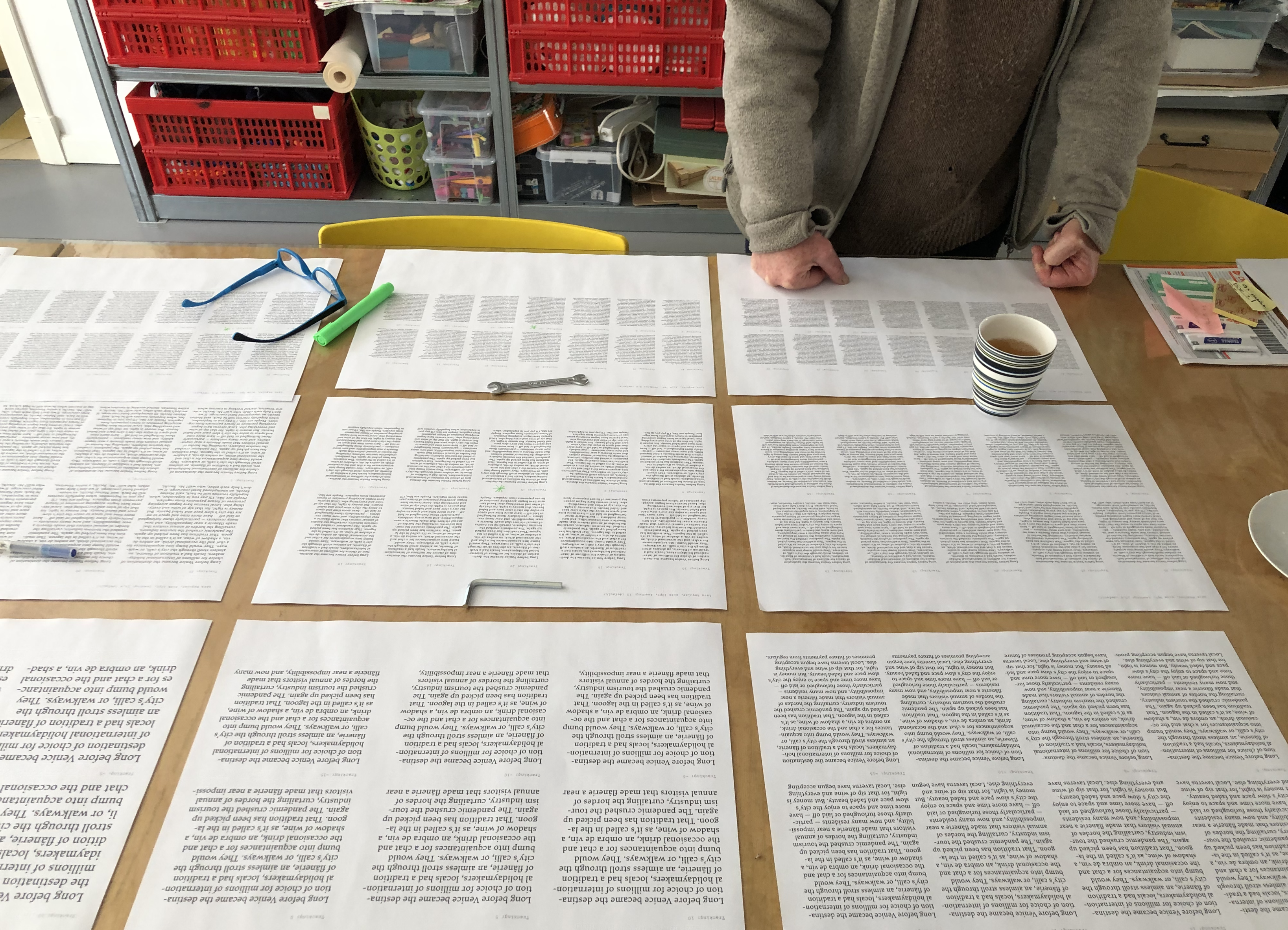
Typographer and book designer Françoise Berserik reviewing the various tracking samples set in Lava.
These manual results were compared with common tracking algorithms, Adobe’s optical spacing, and the Berthold typesetting systems, which again, seem to follow a similar curve.
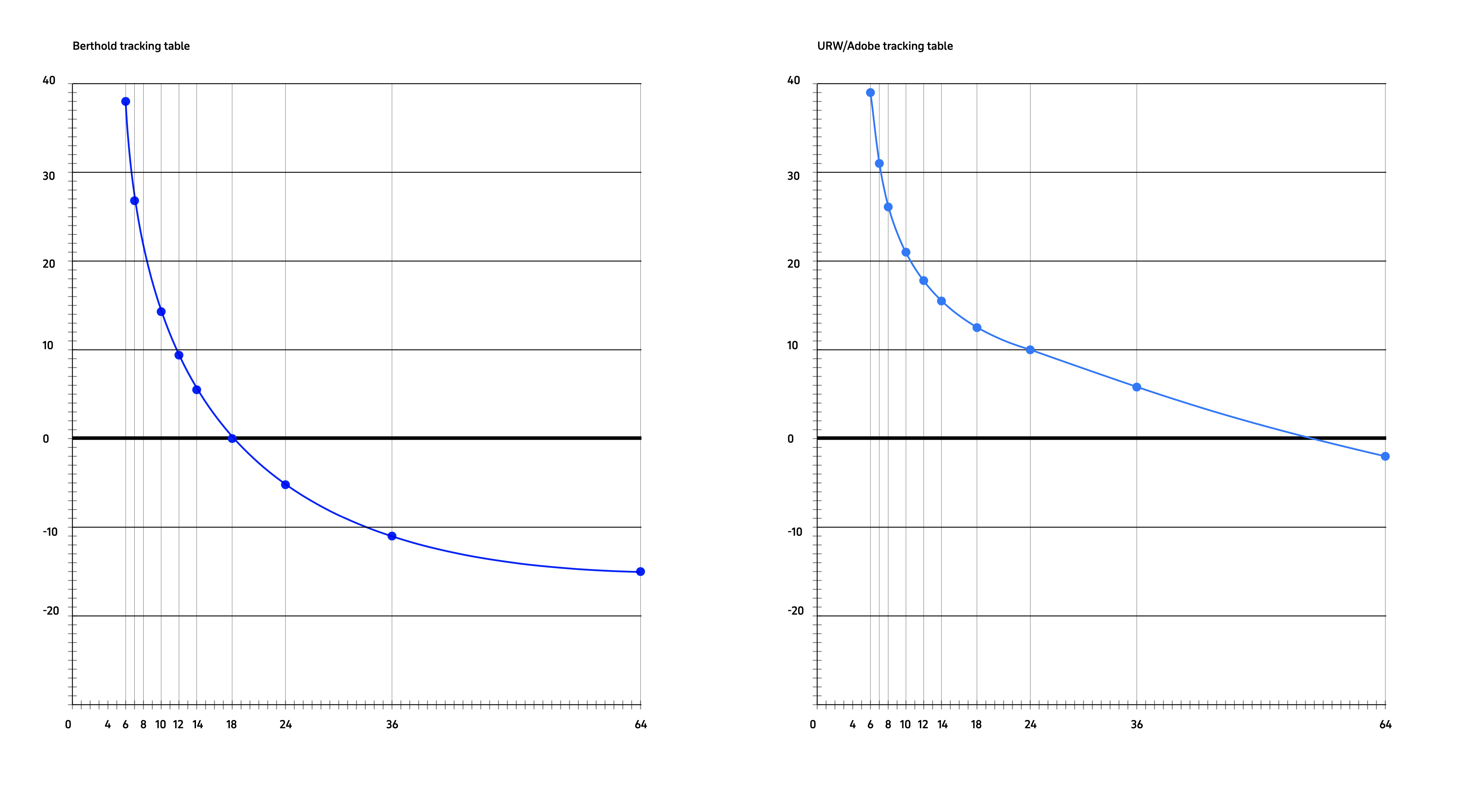
Tracking table for the Berthold typesetting systems developed in the early 1980s, where spacing of type took place automatically at the time of text output. On the right, Adobe optical kerning table, applied on Lava.
After averaging the values, disregarding the outliers, we could establish a tracking curve that appeared to work for this specific typeface family. We built a variable font, where the shapes of letters did not change, but their spacing and kerning was size specific, triggered by the user’s size selection.
That fact that the increased horizontal spacing is beneficial for reading acuity has been recently confirmed also by a Danish study (Beier et al., 2021) on older readers with low visual acuity, where wider letter spacing significantly improved the reading performance. However, we realise that use of a font is always dependent on its context, cultural preferences and perceptual biases. No absolute spacing values will work in all conditions. For example, a newspaper or a dictionary text is usually set tighter than the text in novels. Or, the reading distance may change, depending on the reader’s circumstances, thus requiring further adjustments to the text. Or signage typefaces may behave like text typefaces, with generous spacing of letters, despite being set in very large point sizes. Still, we believe that using built-in tracking adjustments is a sensible means to ensure appropriate spacing of text.
Lava is our first typeface with tracking compensation and contextual kerning that is dependent on the selected point size. We will continue to collect data from the font users, and employ it in the development of our future fonts too, because proper spacing is the essence of the art of typography, ensuring comfortable reading and harmonious text.