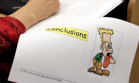
I opened Twitter this morning to find two things trending: "Comic Sans", and "Higgs boson" – the former a much-hated font, and the latter something to do with science. As unlikely as it sounds, the two things were linked. Scientists announcing the discovery of this Higgs boson thing had written up their complex findings in the childish font everyone loves to hate.
At first, I thought Twitter had misdiagnosed the font. There are lots of scripts out there that look a bit like Comic Sans; I hubristically like to think I can tell them apart, and at first glance this one looked more like Chalkboard, or Captain Comic. But after blowing up a screengrab on Photoshop, 10 minutes of close analysis revealed that, yes, this was Comic Sans after all. The awkward serif on the capital "c" was a dead giveaway.
Predictably, Twitter was outraged. "Dear @CERN," wrote one science buff with a taste for typography. "Every time you use Comic Sans on a powerpoint, God kills the Schrödinger's cat. Please think of the cat." Another groaned: "They used Comic Sans on the Higgs boson powerpoint presentation … Nope there is no hope for mankind."
This kind of reaction is nothing new. While researching a feature about Comic Sans two years ago, I spoke to many people with a visceral hatred for the font. According to Holly Combs, a designer who founded the Ban Comic Sans movement, using it in most contexts is a bit like turning up to a black-tie event in a clown costume. "On a purely aesthetic level," says typographer Paul Barnes, who co-designed the Guardian's font library, "Comic Sans is not a particularly well-crafted letterform."
In one sense, you can see where its critics are coming from, particularly in the context of atomic physics. You could argue that it's bizarre to juxtapose inscrutable words like "maximum deviation from background-only expectation observed for m ~126 GeV" with a font originally designed for a children's computer program.
But I wouldn't make that argument. If ever there was an announcement that needed to be made in Comic Sans, I think it's this one. Comic Sans may be over-used, it may look silly, and it may have been designed in a hurry. But it's also very legible, and tests have shown that it makes complex information easier to understand. There's a reason it's used by dyslexia coaches: it facilitates reading.
We joke about how inscrutable the research at Cern is, so why make it seem even more austere? Yes, the Higgs boson is a serious business – but that's all the more reason to communicate it in as friendly and accessible a way as possible.
Graphic design doesn't have to be elaborate; at its best it communicates information quickly and simply. And the chaps at Cern have understood that better than most of the font snobs out there.


Comments (…)
Sign in or create your Guardian account to join the discussion