
On Libido
A brief history of Curvy Block Lettering
What is it, at this moment and in this individual, that represents the natural urge of life? That is the question.
- Carl Jung
Where some type designers ponder for ages on how to optimize legibility, others wonder: “just how far can I push a letter while keeping it vaguely recognizable as such?”
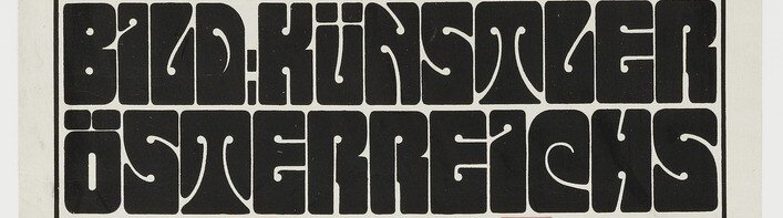
Alfred Roller (2 October 1864 – 21 June 1935), painter, designer, and founding member of the Viennese Secession, belonged to the latter category. As editor-in-chief of the Secessionist movement’s magazine, Ver Sacrum (Sacred Spring), Roller frequently designed the cover art, amongst other printed works. Here he employed his style, clearly inspired by Romanticism, but breaking away from the classicist conventions of eras prior. His work embraced shape, form and color taken directly from mother nature, but with a distinct element of abstraction, unseen in the traditional art world of 19th century Vienna.
In the early 1900’s, he developed a specific style of lettering, which was used in a 1902 poster advertising a graphic arts exhibition, as well as in a calendar published by Ver Sacrum, in which Roller’s lettering accompanied woodcuts by several of the Secessionist movement’s members.
This style of lettering can best be described as squares of roughly even size, with curvy inner cuts placed to create the shape of letters. For this reason, I will refer to the general style as Curvy Block Lettering, or CBL, throughout the rest of this post, for lack of a better term.
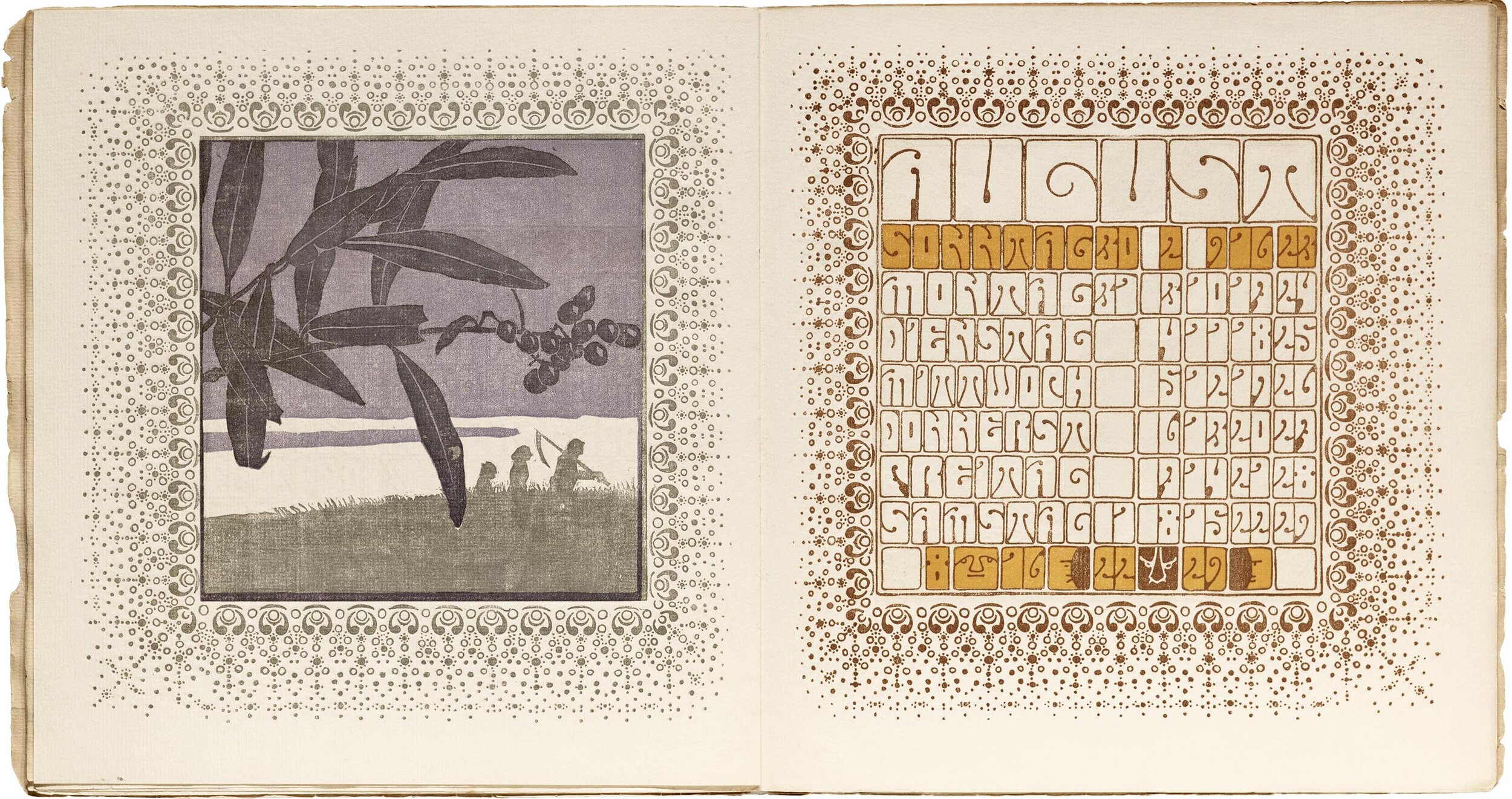
Source: Letterform Archive
Shortly after the publication of the Ver Sacrum calendar, the magazine stopped publishing: its high standards had turned it into an unprofitable rag with diminishing popularity. [1] The secessionist movement dissolved 2 years later, in 1905. Alfred Roller moved on to theater set design, a craft in which he flourished. That was, more or less, the end of CBL for the next 60 years.
Wes Wilson (July 15, 1937 – January 24, 2020) earned his chops working in a print shop in San Francisco in the early 1960’s, and throughout that decade became one of the foremost artists of a style now generally described as psychedelic.
His most famous works came out of commissions from music promoter Bill Graham, consisting of posters for a myriad of artists performing at the Fillmore Auditorium. In 14 months, he designed 56 posters for Graham, averaging nearly one a week. [2]
Wilson’s flamboyant style was a clear response to the Swiss modernism that reigned in the decade before. Wes took inspiration from many historical sources, most notably Art Nouveau (and its closely related sisters Jugendstil, Viennese Secession, Catalan Modernism, et al). At some point, he came across the work of Alfred Roller and his aforementioned CBL, which struck a note with Wilson. Not only was this style of lettering exceptionally groovy, its rectangular externals made it easy to warp and modify, a quality which made it particularly fit for Wilson’s work.
And use it he did! In the posters designed for the Fillmore Auditorium, at least half feature CBL. The lettering-style was soon picked up by Wilson’s contemporaries, such as Victor Moscoso and Tom Wilkes, among others. Although the basic concept of CBL remained the same, clear variations appeared: many feature cutouts with a ball-shaped terminal (much like those by Roller), while others are more minimal, such as this poster by Moscoso for Junior Wells:

Note especially the more restrained type at the bottom.
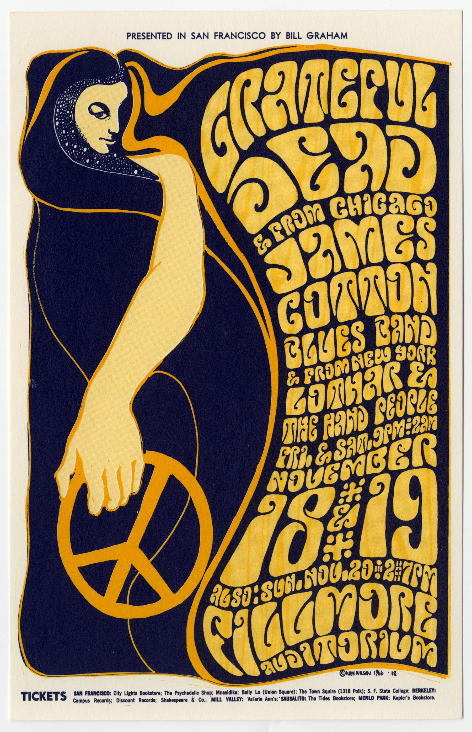
At times the parameters were strict, for instance in this poster by Wilson for The Grateful Dead, where there isn’t a single closed counter in any of the letters:
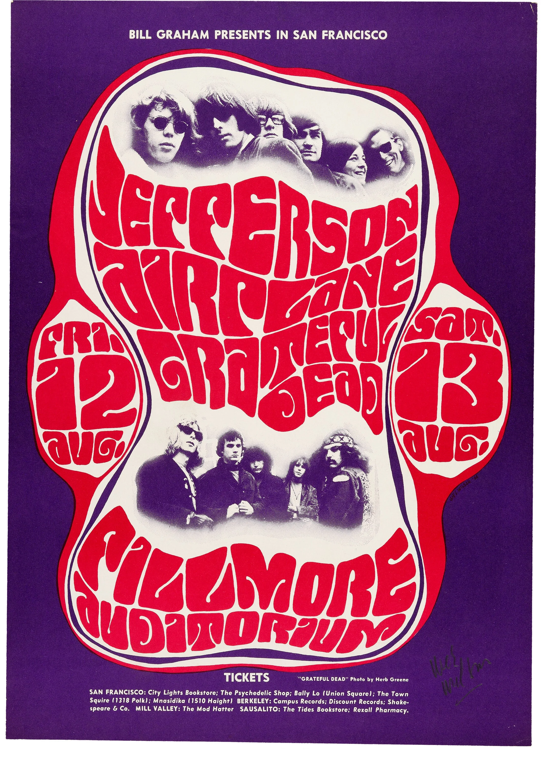
In others, the restrictions were loosened a bit, such as in this Jefferson Airplane poster, also by Wes. Note that letters like O, A, and D have closed counters, which aids legibility, although the general layout and warping of the letters undoes that purpose.
Legend has it that Graham liked Wilson’s first concert poster but said he couldn’t use it because the text was illegible, to which Wilson replied, “They’ll stop to read it because they can’t read it.” [3]

Perhaps Wilson’s best known work, this image flawlessly captures the essence of 1960’s psychedelia.
As with any good lettering style, imitation fonts of CBL were quickly made. One of the earliest of these was West Nouveau CBT, designed by Dave West and released by Photo-Lettering in 1968. It came in 3 different widths, and included a backslanted version.

Source: Flickr User Stephen Coles
Another early adaptation is “Mod Poster”, released in 1968 by Lettergraphics in phototype. It has a “wave” effect applied to the letters, presumably to somewhat imitate the curvy text drawn by Wilson, but within the range of limitations of phototype.
Other font adaptations include Urban (1969), Pinocchio (1973), and, probably the most popular of the bunch, Dreamline (1969)—not so much because it is the best interpretation, but because of the popularity of type foundry Mecanorma’s lettering transfer sheets.[4]

Mod Poster (Source)
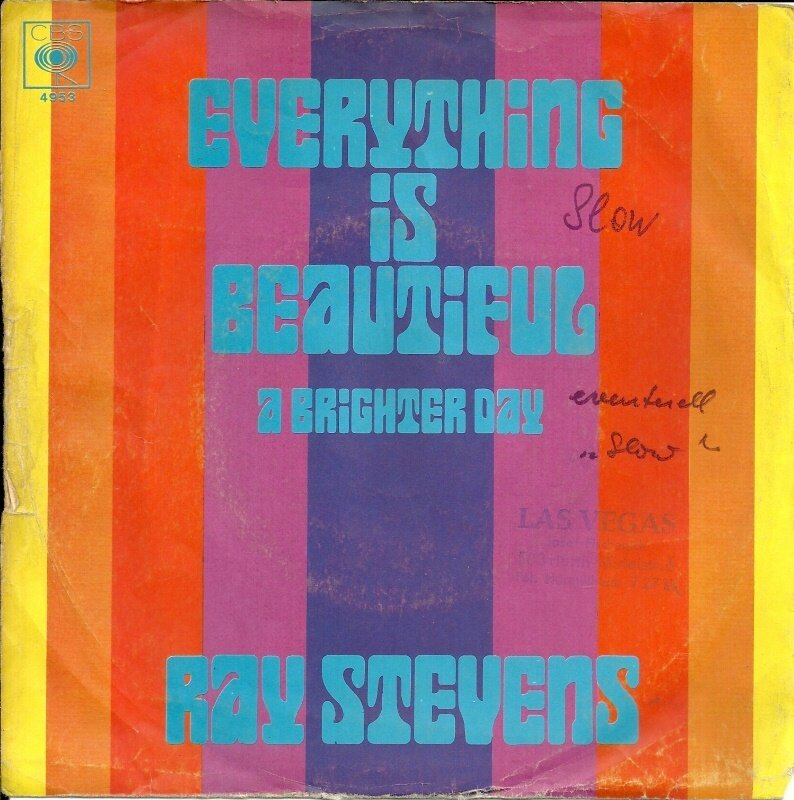
Dreamline in use on a 1970 Ray Stevens album cover. (Source)
As is the plight of any trend, the psychedelia of the late ‘60s and early ‘70s eventually yielded to other styles, as fresh subcultures and ideas popped out their heads. Wes Wilson moved to a farm in Missouri and painted for the rest of his career, and the typefaces he inspired were dropped from catalogues.
The ‘90s and early 2000s saw a wave of digitizations of every font that early digital type designers could get their hands on, which included several interpretations of CBL, from Roller to Wilson and his detractors. Most of these early digitizations lacked finesse or inspiration, although Jim Parkinson’s Mojo and Nick Curtis’ Versacrum (made directly after Roller’s work) are acceptable exceptions.
DIY CBL
It struck me, however, that none of the typefaces imitating CBL could ever properly match the real hand-lettered deal. Perfectly justified text is a hallmark of Wilson’s work, which he could easily achieve by changing the width of the letters on each line.
Doing the same with a single-style font would require you to scale the point size from line to line, which would then create awkward differences in the size of the letters’ cut-outs on each line.
It also dawned on me that variable font technology could perfectly solve this issue, in the form of a width axis and an optical sizing axis. And so, as I was procrastinating finishing my prior typeface, Bonkus, I started my journey.
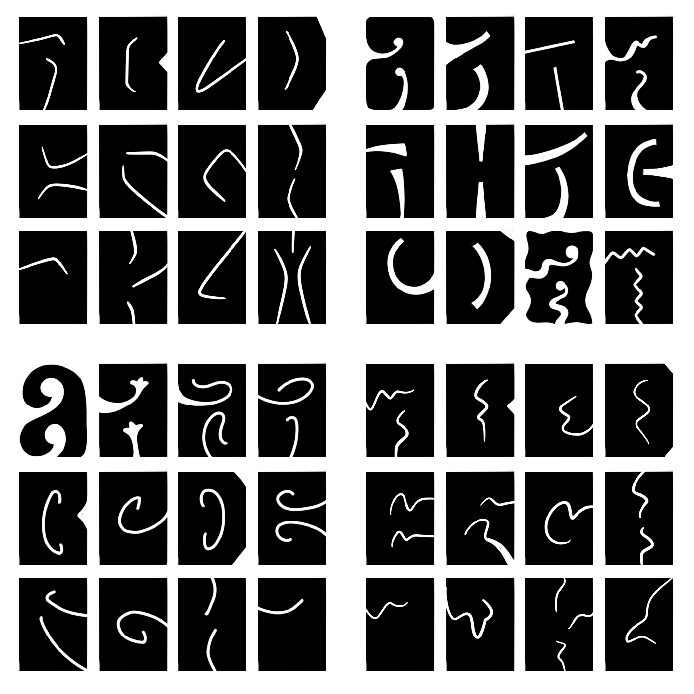
The first step: one fully variable letter. Although each letter in CBL is a rectangle and therefore requires no such thing as control characters, the H still felt as the most natural starting point. It took some proofing to decide on maximum and minimum widths and optical sizes (and looking back, maybe I should have proofed even more).
From here came the design of each letter. I did not stick to one specific source, rather opting for my favorite versions of each letterform that I came across in the work of Roller, Wilson, and their detractors, and sometimes putting my own spin on them.
Some of Wilson’s posters tried very hard not to include any open counters, which I appreciated. Some letters however, like D, B, and O, simply got too difficult to recognize without a closed counter, and as such were excused from the parameter.
Figures were a little trickier. It was somewhat important to the businessman in me that characters remained recognizable to the average non-dyslexic person, and many of the figures drawn historically did not fit that quality.
My initial pass of figures left a lot to be desired, but feedback from fellow type designer Craig Eliason sent me in the right direction.

Another interesting challenge came in the form of diacritics. An important aspect of CBL is that it has incredibly tight leading: often the space between lines of text are just as tight as the space between individual letters. Libido’s unicase, uniheight design accommodates this for the standard 26 letters, but if you were to throw the diacritics right on top, you’d suddenly lose the potential for tight leading.
Graciously, Alfred Roller already resolved this issue back in 1903, when he squashed down an O and a U in order to fit an umlaut on top.
Alfred Roller, from a 1902 Poster
Although the concept was set, not all diacritics were as easily adapted. Especially in the extended widths, certain marks like the cedilla became completely unrecognizable. Leaving them a little narrower than the rest of the letter proved to solve the issue, at the cost of some extra white space.

Trickiest of all were punctuation marks, special characters, currency symbols, and so forth, for which little precedent was set. Neither Roller nor Wilson ever had need for characters like @ and ¥ in their work, and most of the font adaptations of CBL really phoned it in when it came to non-letters. At most, they’d have a handful of basic punctuation and an ampersand, but would use a default sans-serif @, or simply leave out the trickier glyphs altogether.
I set myself the challenge to include a complete glyphset that matched the rest of the typeface in character. The first attempt on the punctuation marks tried to imitate the inner whitespace cutouts of the letters, but this didn’t really work. I settled on a more simplified design, but still organic in nature. Other marks like the pilcrow and the copyright symbol simply needed some good old fashioned elbow grease to reach their final forms.

At this point, I was feeling pretty good, but also felt like I wasn’t quite there yet. I reached out to the venerable James Edmondson of OHno Type Co, who graciously accepted my request for feedback. While I was expecting nitpicks on diacritics and anchor point placements, James instead told me (I paraphrase): ”This is a good font but people will just use it to make tacky Wes Wilson knock-offs; can you do something with it to make it fresh?”
A darned good point. Perhaps I had gotten so preoccupied with whether I could, that I didn’t stop to think if I should. To be fair, my main intention for my typeface (which at this point I was calling “Psyblock”) was to set Wes Wilson style texts more graciously. It wasn’t my execution that was put into question, but my intention.
In response to James’ feedback, I sketched out nearly two dozen alternate takes on the CBL concept, from extremely minimal to absurdly weird.
While playing around with the vectors, I tried converting every curve to a straight line, just to see what would happen. The end result was quite interesting, especially after playing around with anchor placement a little more, and exaggerating the cutouts in certain letters.
What appealed to me in this approach is that the “ragged” version of my typeface could be contained within the same variable font (although, as it later turned out, doing this brought about so many issues that I decided to separate the two cuts for the final release).
Experiments with CBL
PSYCHODELANALYTICS
One final question to cover: why the name Libido? The answer lies in my interest in the work of psychoanalyst Carl Jung. While we think of the libido primarily as our sex drive, a meaning defined by Freud, Jung saw the libido as the totality of our inner psychic energy, which we most commonly perceive as desire. In Symbols of Transformation he writes:
“[Libido] denotes a desire or impulse which is unchecked by any kind of authority, moral or otherwise. Libido is appetite in its natural state. From the genetic point of view it is bodily needs like hunger, thirst, sleep, and sex, and emotional states or affects, which constitute the essence of libido.” [5]
In a sense, the Libido is our life drive, our creation drive (as opposed to our death & destruction drive, Thanatos, which happens to be the name for an upcoming typeface).
I have no intention to write a snobbish artist’s statement which claims that somehow, my typeface incarnates the psychic energy inside all of us. Rather, Libido (the font) is a result of my own libido: a force which, like flowing water, cannot be mastered, but merely directed.
Much like Roller and Wilson before me, my libido happens to drive me to create letters, and more often than not, it steers me to form over function. To fight it would be madness.
See, try, and buy Libido here.
Special thanks for help and feedback: Roberlan Paresqui, Alex Coven, Sergio Ramírez Llamas, James Edmondson, Stephen Coles, Craig Eliason, Abi Rasheed, Stephen Nixon, Ray Larabie.
Sources:
[1]: https://adrianyekkes.blogspot.com/2012/03/ver-sacrum-magazine-and-vienna-secession.html
[2]: https://www.wes-wilson.com/bill-graham-presents.html
[3]: https://posterhouse.org/blog/wes-wilson-from-art-nouveau-to-psychedelic/
[4]: https://fontsinuse.com/uses/8734/the-jimi-hendrix-experience-let-me-light-your#comment-610145
[5]: http://rapeutation.com/symbolstransformationjung.pdf