TXC Pearl Regular
TTT
Hi, I’m TXC Pearl
TXC Pearl is an uppercase condensed sans influenced by both American wood type and Jugendstil lettering found in German newspaper advertisements published in Texas during the 19th century


The first pearl of a string: TXC Pearl
TXC is shorthand for ‘Texanische’, a typographic study of the Texas Hill Country and a ‘vintage’ type collection by Texas-raised designer Andy Anzollitto. ‘While Texas is often presented as having a singular, monomythic history’, he says, ‘the places and people within its confines tell stories of complexity and multitude.’

Covering a vast area of Central Texas, including cities like San Antonio and Austin, the Texas Hill Country is renowned for its rolling hills, fine wine, and authentic cuisine. During the 19th century, it was an ever-changing frontier—provincial outer lands with governments changing frequently over the decades. In the short life of the Republic of Texas (1836–1846), the young nation brokered a deal with a group of Germans to settle the region. These Germans were revolutionists, utopians, and political exiles – a unique variety of strange cowboys, who also happened to print and read newspapers in their native tongue.

Anzollitto conceived and designed Texanische after his visits to some key places such as the Dietert Historical Archives, where he collected historical background information; the Jahnsen family ranch, which can trace its roots back to some of the first Germans who immigrated to the region; the Comal County Cemetery, for further documentation of stone-carved lettering styles; and the Sophienburg Museum & Archive, where he learned about a collection of metal types that were once the property of the local newspaper Neu Braunfelser Zeitung.

‘Typeface design’, says Anzollitto, ‘can be used as an investigative tool to explore a place or social history. Letterforms can operate as vessels, carrying meaning and prior associations for a reader or group. From this perspective, I looked to better understand what was unknown to me about my hometown.’
TXC Pearl looks at old Texan-German newspapers and makes connections between the type used for typeset advertisements and their lettering. In the old Texan-German newspapers the decorated types that were fashionable at the time (like Victorian or Art Nouveau display faces) are interspersed with early German sanserif samples. Seeing these two sources alongside each other, the designer imagined an outcome in between where the Art Nouveau impulses were tempered by the rational patterns of sanserifs.
These lettered references provided the spark that grew into the main signifiers of the typeface design. While not directly plucked from historical examples, the design of TXC Pearl was based on an extensive analysis of specimens and catalogues produced by German typefounders of the late 19th century, such as Berthold or the Schelter & Giesecke type foundries. ‘The restraint of the underlying structure of a grotesque is used to heighten the effect in moments of deviation,’ claims Anzollitto. ‘By providing a structured pattern of expected shapes, the small moments of departure (like in the letter B) were able to react to that structure and noticeably break from the anticipated pattern.’

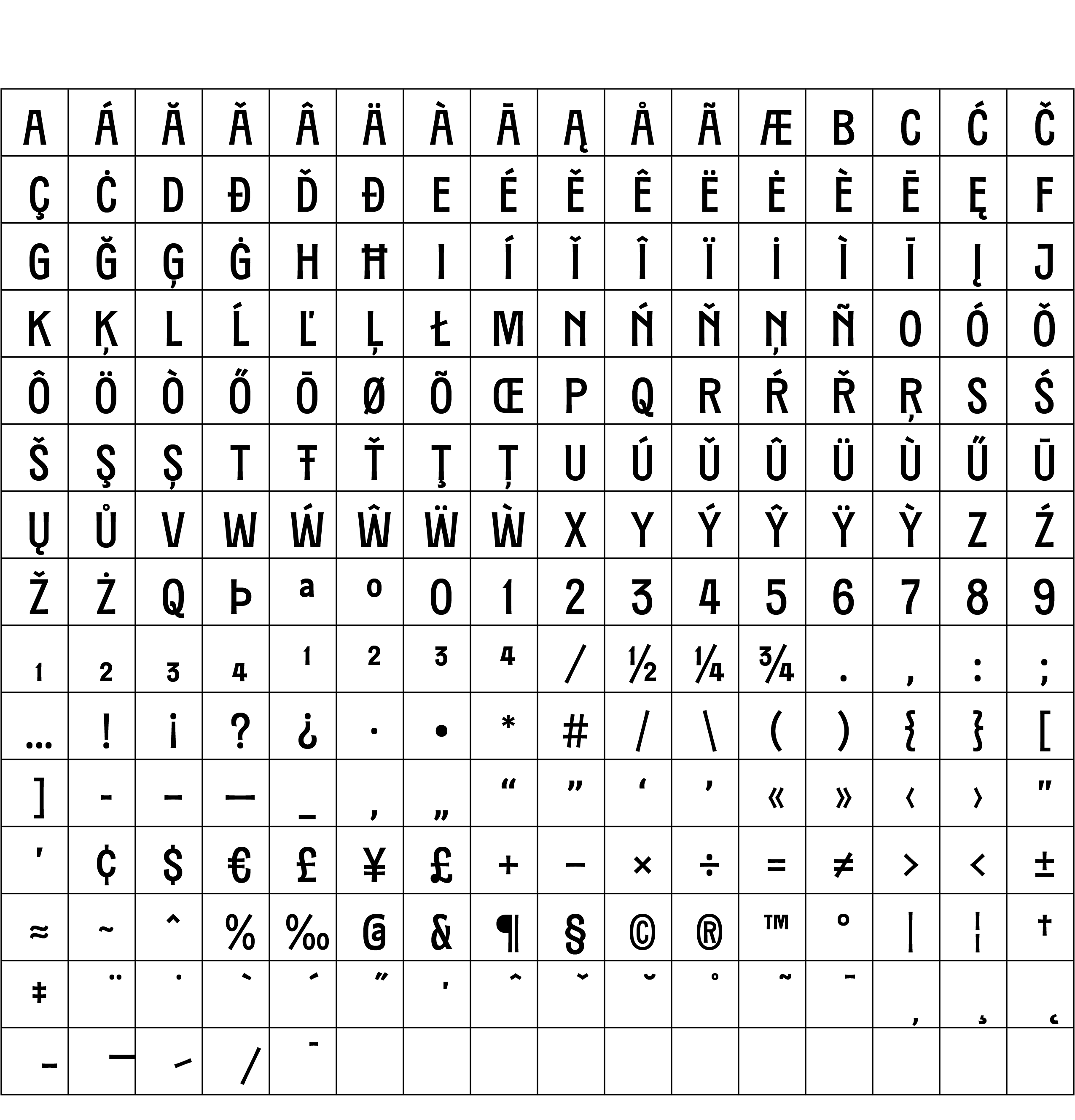
TXC Pearl is the first Texanische release. It is a caps only sanserif of condensed proportions with a strong Jugendstil taste. Its round shapes are slightly squarish while the vertical stems and the horizontal arms are gently flared (on occasion reminiscent of lightly-seriffed strokes). The most notable details are the flat apexes on A and M, the flat vertexes on V and W, the E and F with the central bars moved upwards, the P and R with small bowls as well as the diagonal stroke in the lower bowl of B.

TXC Pearl is a playful expression of the narrative of a place, carrying forward into the future the stories of the past. Like each face in the Texanische type collection, TXC Pearl expresses a distinctive memory of the Texas frontier.
—
After this first TXC release, two more are on the way: a blackletter based on the Schwabacher style and a Latin antiqua (the German term for romans) inspired by Barnhart Brothers and Spindler’s 19th-century designs.
Are you a student? You can get our Educational Licences saving 90% on the full price of our fonts!
Do you want to try our fonts? Fill this form and test all CAST typefaces free of charge – including some still work-in-progress original typedesigns of ours!