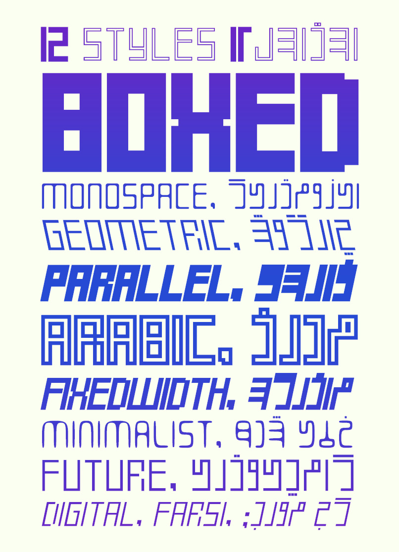
We have all seen the very big difference between Latin and Persian alphabets. One has vertical, almost isometric, mono-spaced letters and the other one has ups and downs on and off the baseline, also different weights and widths are another issue. When we use these two alphabets in a design, letters doesn’t match. But we accept that, because there was no other choice.
To download these fonts please visit here:
Worldwide at MyFonts: https://www.myfonts.com/collections/si47ash-fonts-foundry
So, I decided to do something about this and I realized that I should change the Persian alphabet in a modern typographic way.
I have wrote about this here.
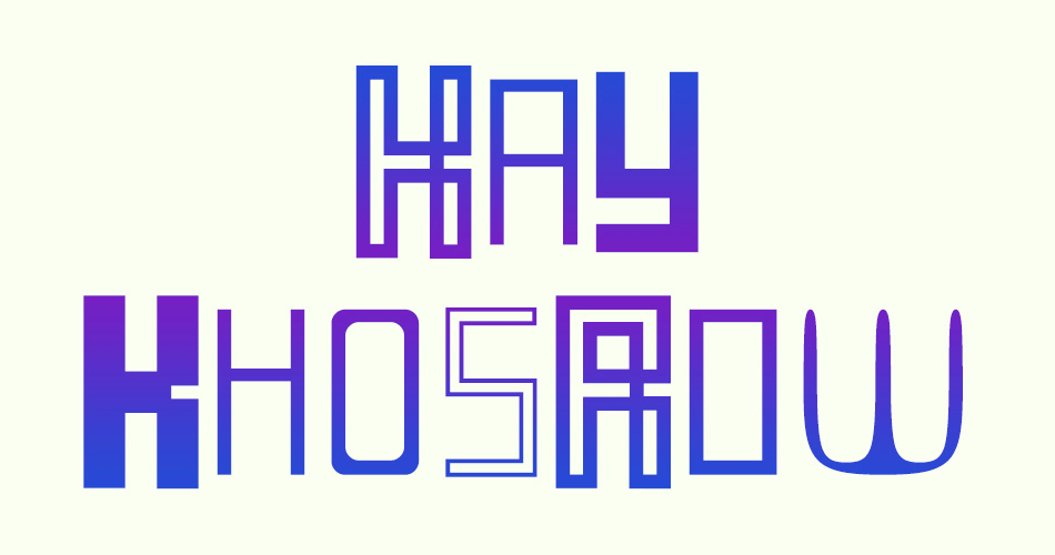
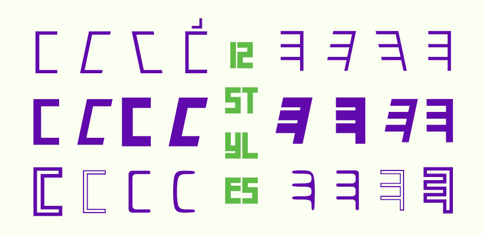
So, now we are going to take a look at 12 styles of KayKhosrow fonts and see how they write Persian and Latin texts exactly similar.
You can read the full design brief and take a look at 3 other styles which are the first Multicolored Unicode Persian/Latin fonts, ever at this link.