
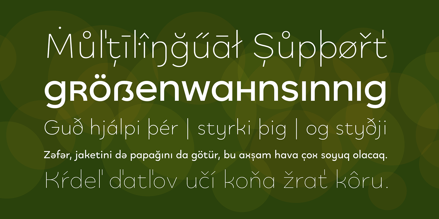
Quinoa is a new typeface by Catharsis Fonts that combines the seemingly opposite concepts of clean geometric architecture and organic humanist warmth. While it is designed for display and editorial purposes, its accessible forms make for comfortable reading even at text sizes. It covers multilingual Latin, Cyrillic, Greek, Hebrew, Arabic, and Armenian.
The Quinoa family spans three stylistic cuts (Quinoa, Quinoa Titling, and Quinoa Round) with matching hand-slanted obliques, each of which comes in six weights. The Titling cut offers a number of alternate capital letter designs with lowercase-inspired forms for a refreshing unicase look, whereas the Round cut removes the spurs from arched letters like n. A host of other OpenType features including ligatures, contextual alternates, figure sets, and character variants are built into all cuts.
Quinoa is available for purchase at MyFonts.


Acknowledgements. I am thankful to the TypeDrawers and the Typografie.info communities for great feedback and support. In particular, Thorsten Daum has been tremendously helpful with suggestions and quality control. Thanks to Craig Eliason and Jan Willem Wennekes for their help with the Latin, Alexander L. Stetsiuk for Cyrillic, Ofir Shavit and Jonathan N. Washington for Hebrew, Khaled Hosny for Arabic, and Hrant H. Papazian for Armenian.


