Mozsár
custom typeface
custom typeface
Mozsár is a café and restaurant with a slightly bohemian and a slightly constructivist atmosphere in the city center of Budapest.
I designed a typeface for Mozsár. The font tries to reflect the atmosphere of Mozsár. It was an experiment too by using only geometric shapes, which do not obey to typographic rules. You can see the result below.
I designed a typeface for Mozsár. The font tries to reflect the atmosphere of Mozsár. It was an experiment too by using only geometric shapes, which do not obey to typographic rules. You can see the result below.
You can get Mozsár font here.

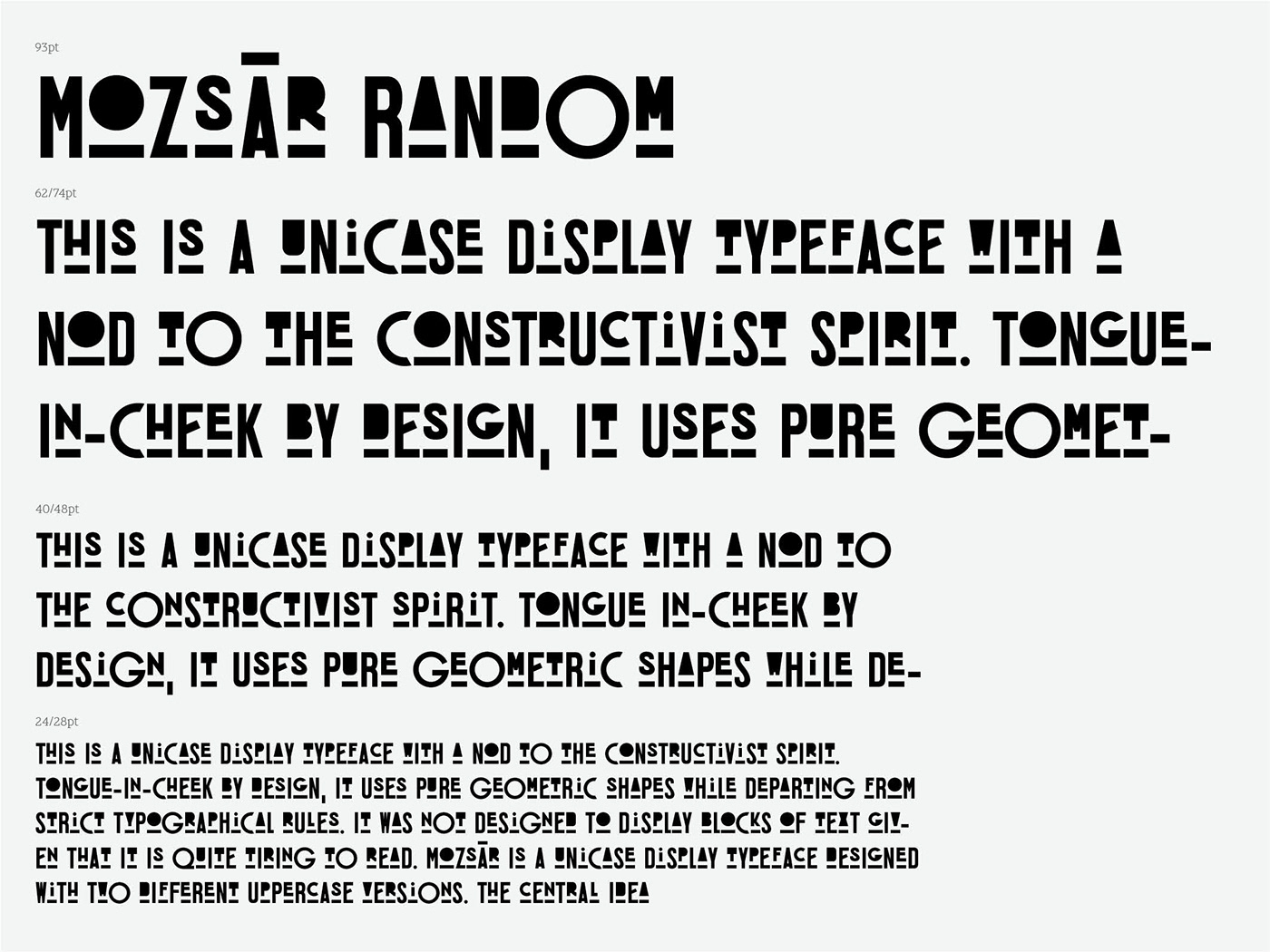
This is a unicase display typeface with a nod to the constructivist spirit. Tongue-in-cheek by design, it uses pure geometric shapes while departing from strict typographical rules. It was not designed to display blocks of text given that it is quite tiring to read.
Mozsár is a unicase display typeface designed with two different uppercase versions. The central idea behind this typeface was experimental in nature, namely that the two variants would randomly mix while text is being typed in Adobe Indesign. It was intended for display purposes.
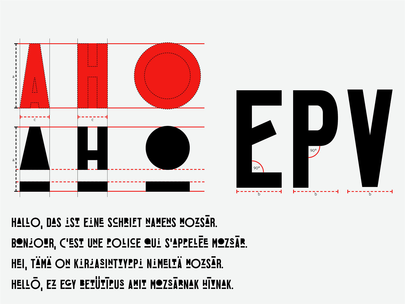
While the width and height of the letter shapes are predominantly equal, exceptions were made in order to lend a tone of unexpectedness to the text. Curves are identical in both versions of a letter, and the intersections of the axes are always perpendicular with the obvious exceptions of ‘A’ ‘V’ ‘K’ ‘R’ ‘X’ ‘V’ ‘W’ ‘Y’ ‘Z’ and the middle arm of ‘E’. In order to render a playful quality, OpenType’s semi-random feature was used, which consistently alternates the two versions letter-by-letter, so the first version is always followed by the second, and vice versa.


You can get Mozsár font here.


